Tōshūsai Sharaku Palette 4
Pale Topaz
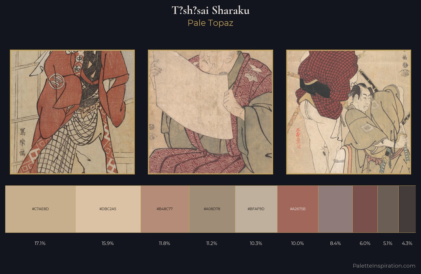
Pale High-key and low-chroma - delicate, bleached, washed with light.
Topaz Golden yellow - the color of topaz gemstone, warm and slightly saturated.
Palette Analysis
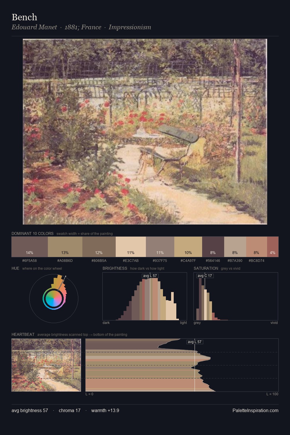
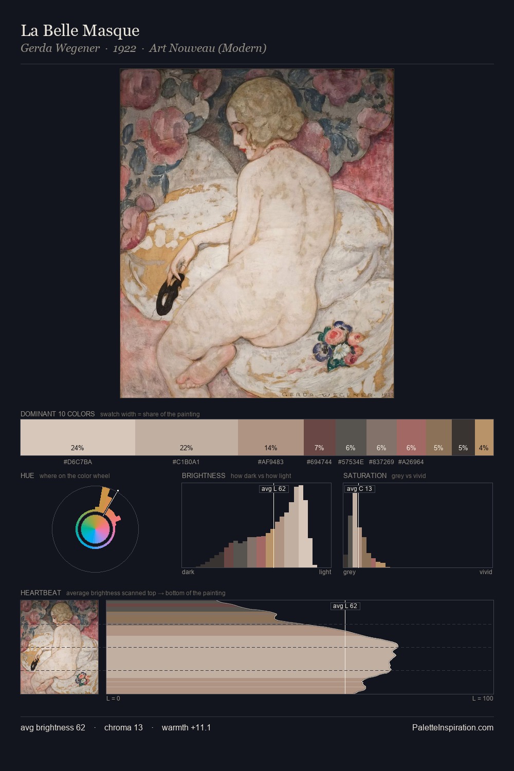
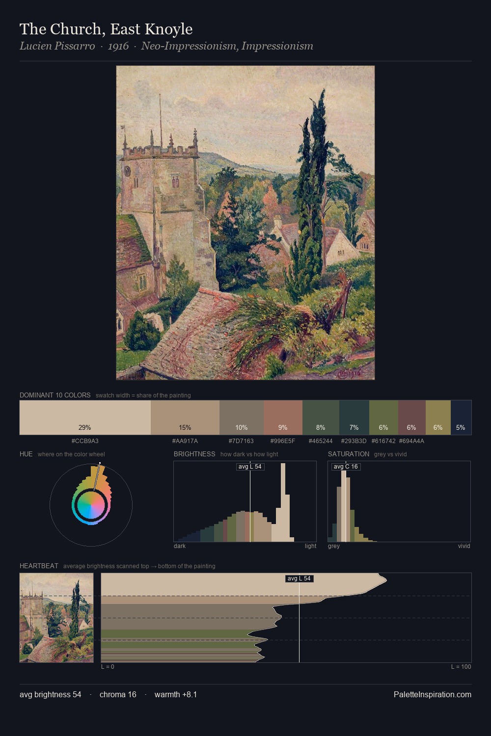
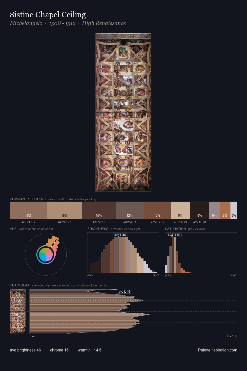
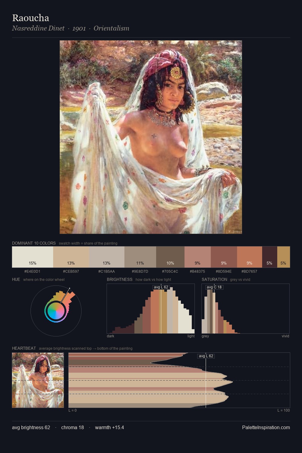
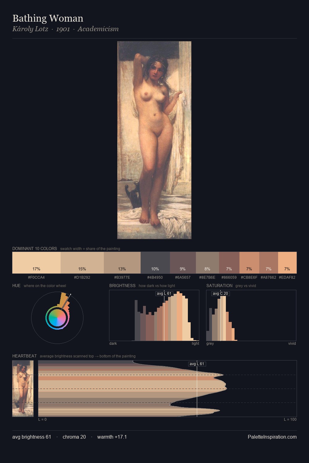
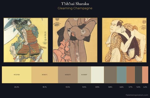
T?sh?sai Sharaku is high in key: pale, luminous, and filled with optical air. Temperature reads distinctly warm: the reds and earth tones from T?sh?sai Sharaku carry the compositional weight. Saturation is deliberately withheld - the beauty here lies in the near-monochromatic gradations rather than colour difference. The most saturated colour, #79504B, is reserved to 6.0% of the surface, where it acts as a focal punctuation. 47 units of value spread create a palette that is varied but unified - contrast in the service of harmony. This is palette 4 of T?sh?sai Sharaku's sequence - a single chapter in a chromatic story told across many works.
Example use cases
- ceramics & pottery
- boutique hospitality
- menswear
- heritage food brands
- craft & artisan brands
I Love This!
Use This Palette
Copy, export, or download for your project
Copy, export, or download for your project
Copy:
Download:
Share: