Tōshūsai Sharaku Palette 3
Palette Analysis
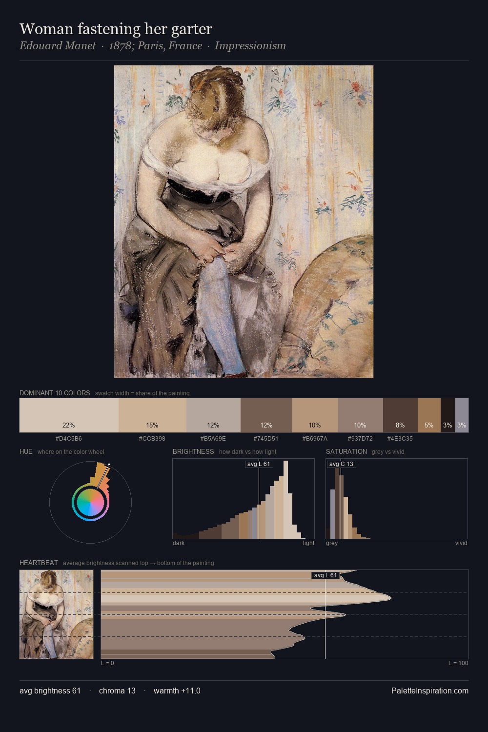
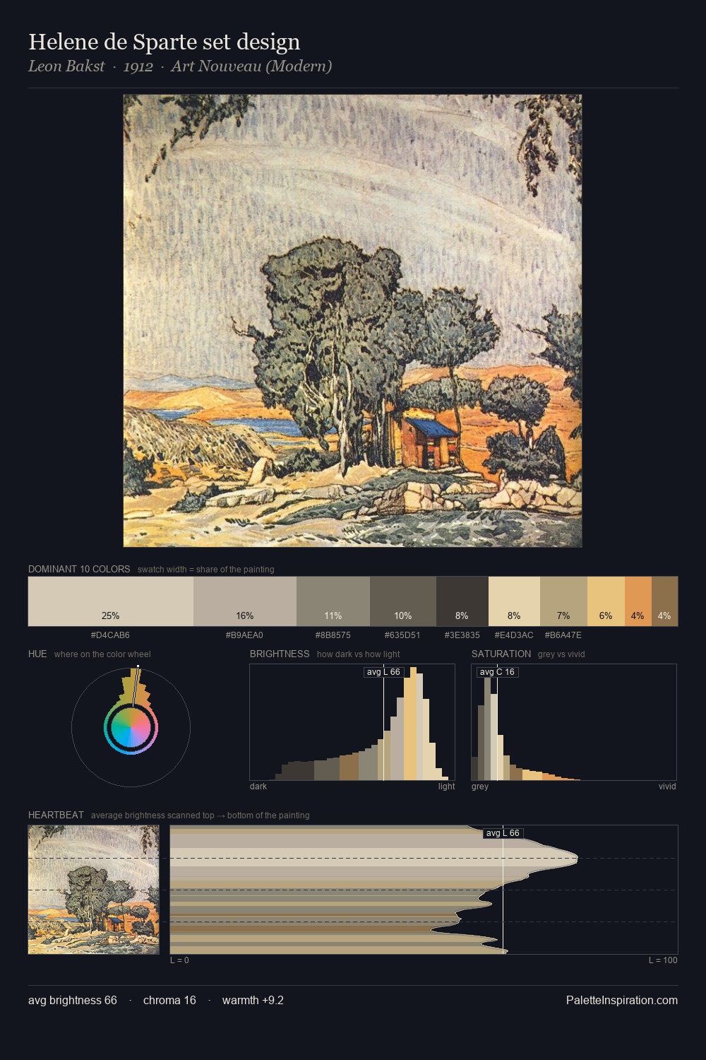
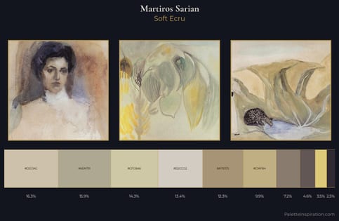
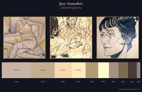
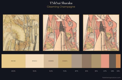
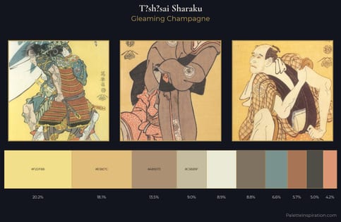
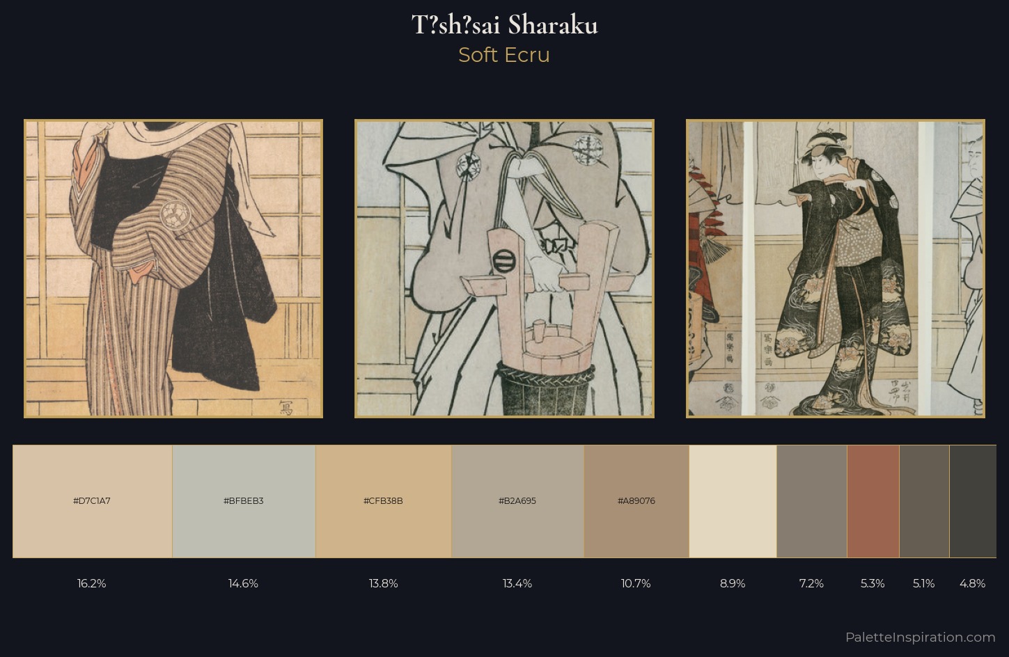
The high-key values of T?sh?sai Sharaku give it an effulgent, almost bleached quality. Cool tones set the register here - the blues and greens easily outweigh any warm accents. Chroma is kept low across all colours, producing the soft, enveloping quality that characterises tonal painting. #9A644F delivers the chromatic peak at only 5.3% - a small shot of colour with outsized visual impact. 50 units of value spread create a palette that is varied but unified - contrast in the service of harmony. The mid-to-high key, cool bias, and moderate chroma point to outdoor observation - sky and diffused daylight as the dominant light source. In the context of T?sh?sai Sharaku's full range of palettes, group 3 represents one movement in an ongoing chromatic dialogue.
Example use cases
- ceramics & pottery
- boutique hospitality
- menswear
- heritage food brands
- craft & artisan brands
I Love This!
Copy, export, or download for your project