Tōshūsai Sharaku Palette 1
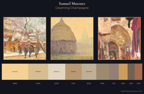
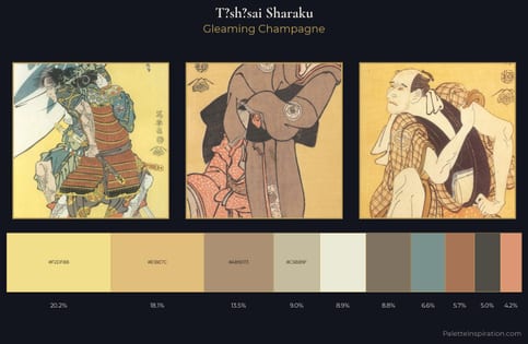
Gleaming Champagne
Gleaming Bright and polished - high-key, often warm, suggesting reflective or luminous surfaces.
Champagne Pale gold - the color of sparkling wine, high-key and lightly warm.
Palette Analysis
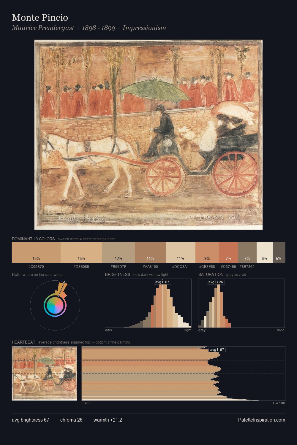
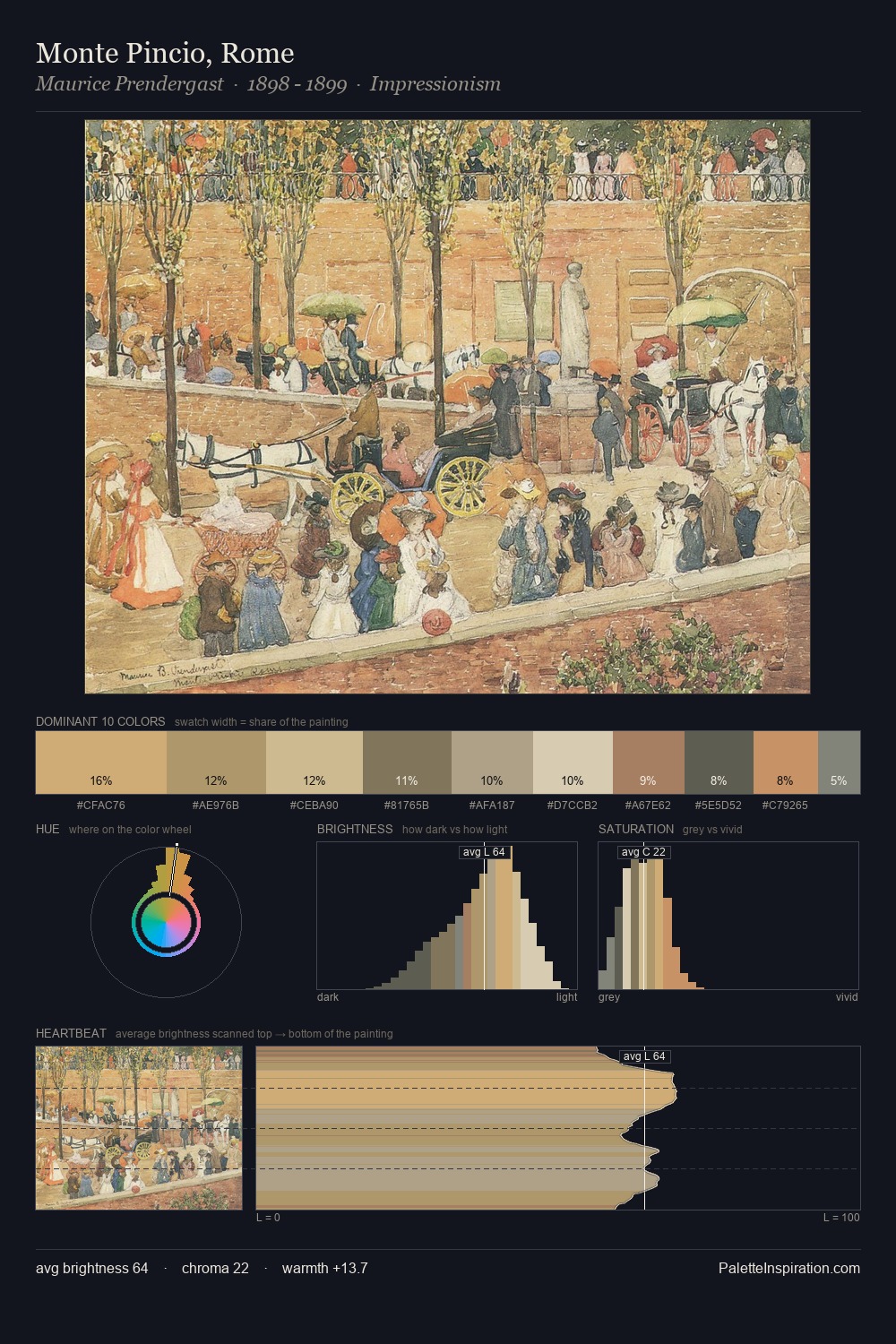
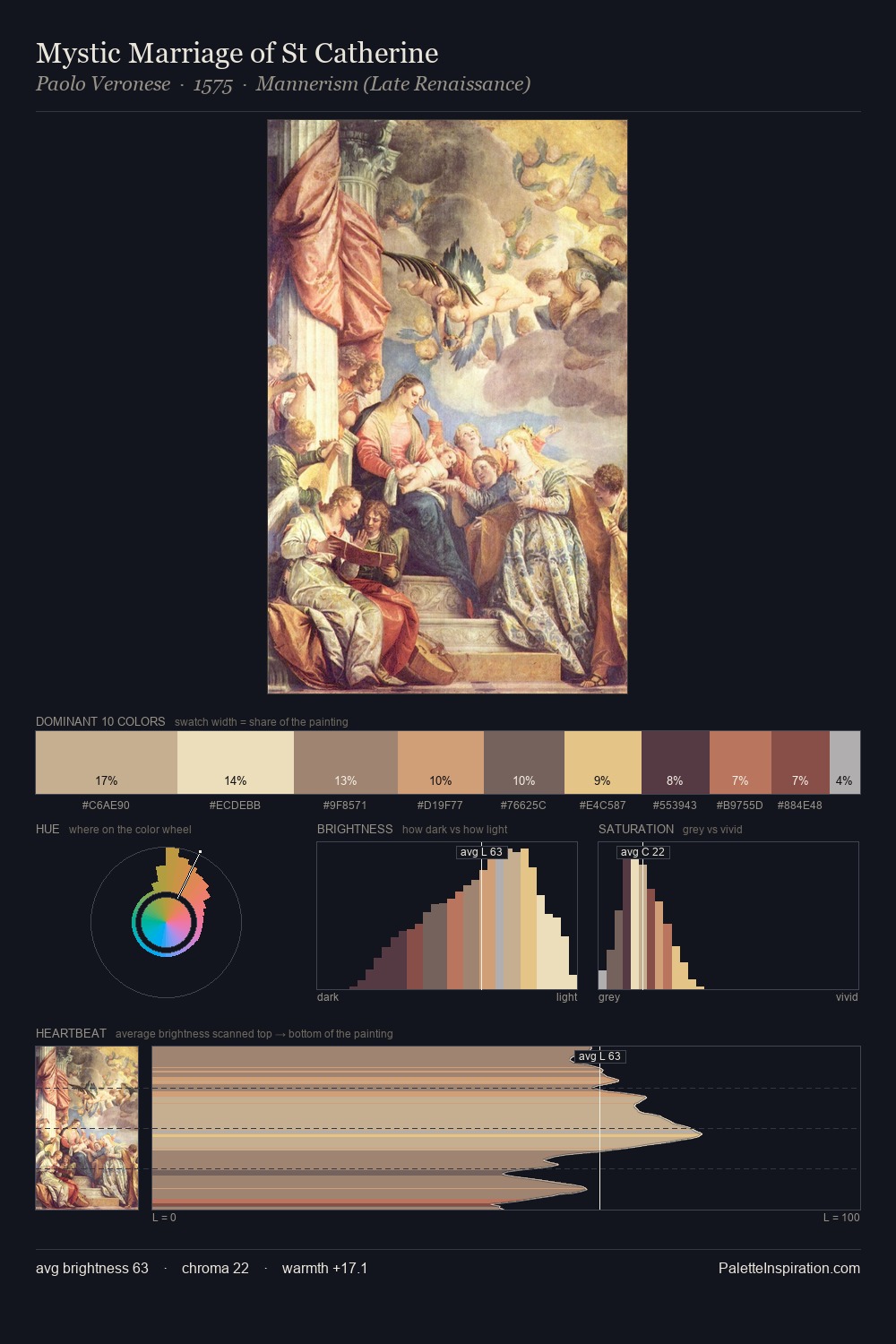
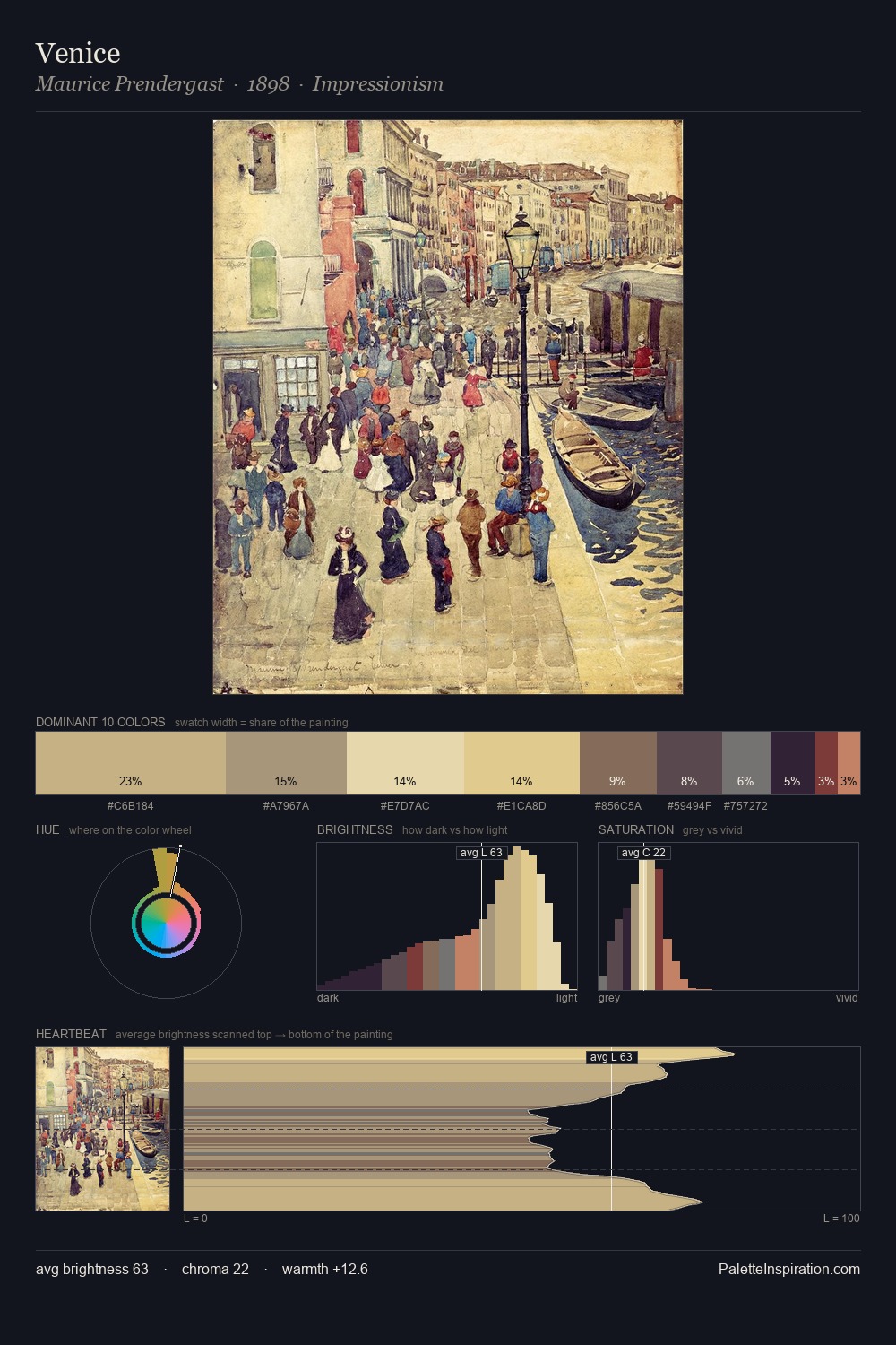
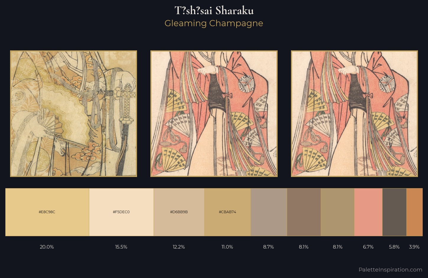
The high-key values of T?sh?sai Sharaku give it an effulgent, almost bleached quality. Warm hues command this palette; T?sh?sai Sharaku favours the reds, oranges, and yellows of firelight and earth. Chroma is held at a comfortable level - distinct colours, but no single hue is allowed to overwhelm. The highest-chroma note - #CBAB74 - appears at just 11.0%, deployed as a precision accent against the quieter ground. The value range of 44 units sits in the comfortable middle: enough depth, enough light, neither extreme. This is palette 1 of T?sh?sai Sharaku's sequence - a single chapter in a chromatic story told across many works.
Example use cases
- publishing
- corporate identity
- consumer apps
- hospitality
- design agencies
I Love This!
Use This Palette
Copy, export, or download for your project
Copy, export, or download for your project
Copy:
Download:
Share: