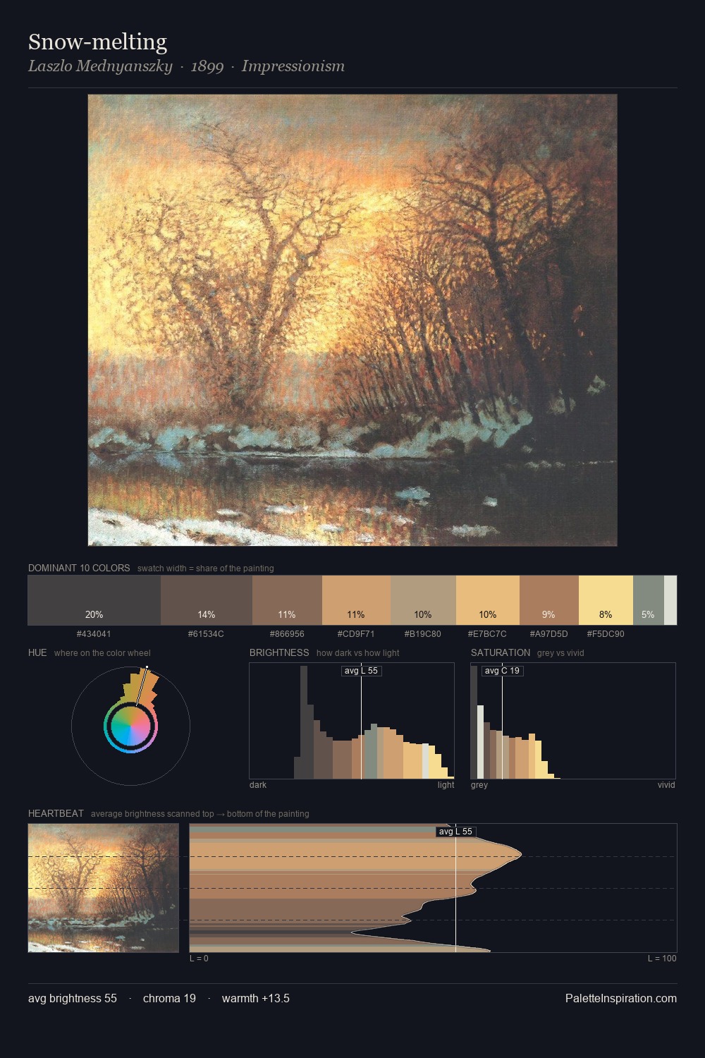
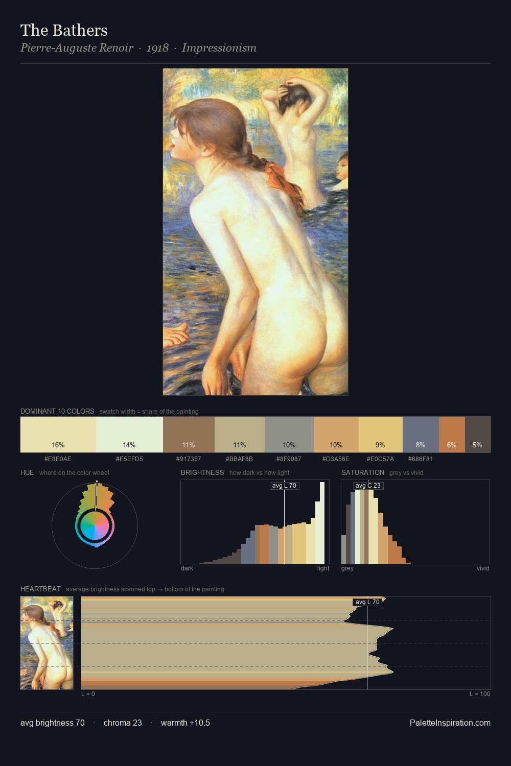
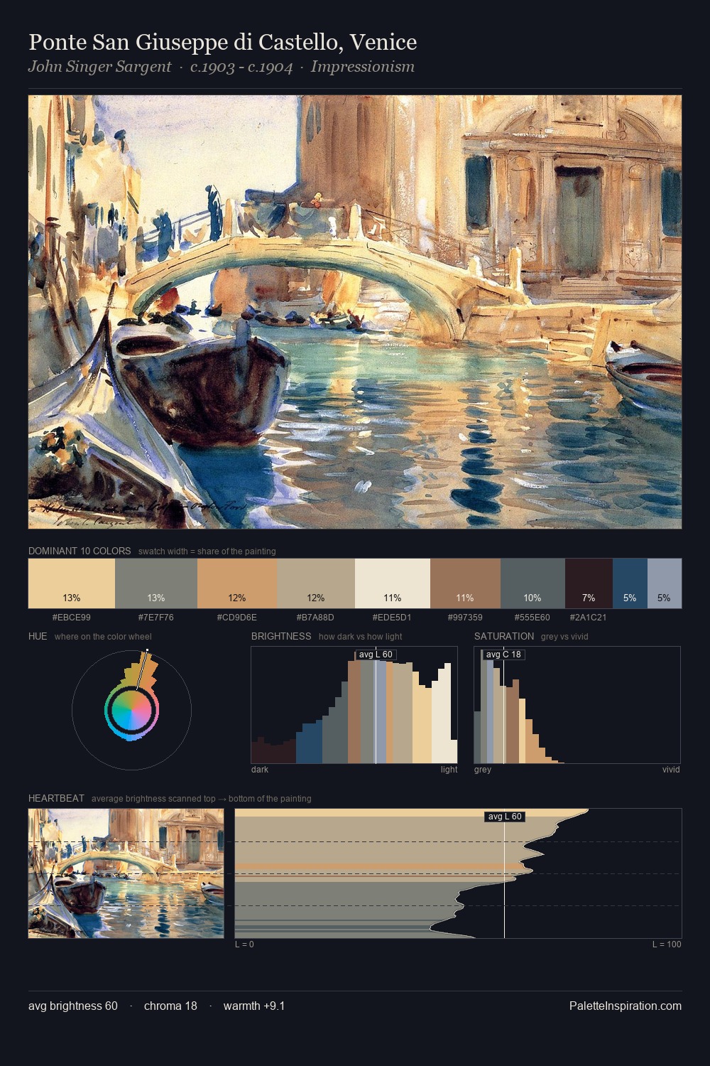
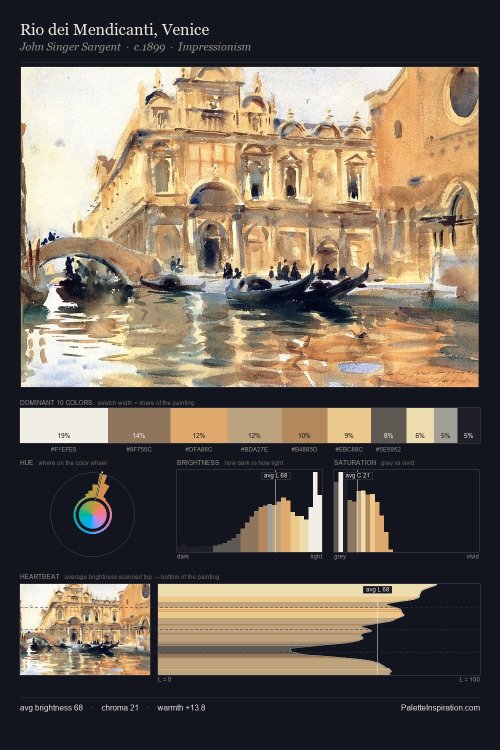
Tōshūsai Sharaku Palette 2
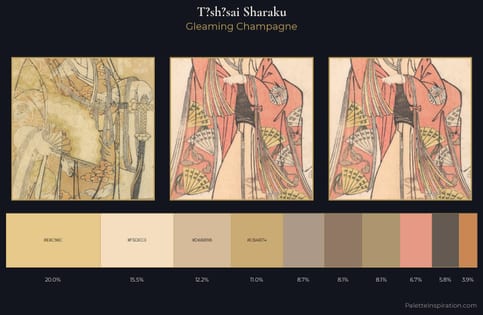
Gleaming Champagne
Gleaming Bright and polished - high-key, often warm, suggesting reflective or luminous surfaces.
Champagne Pale gold - the color of sparkling wine, high-key and lightly warm.
Palette Analysis
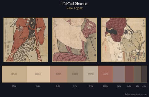
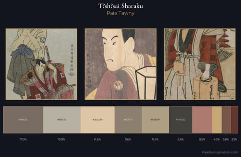
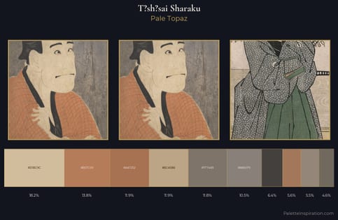
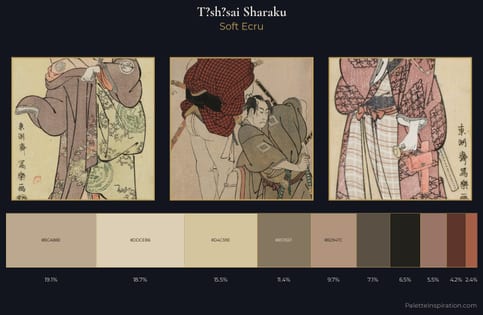
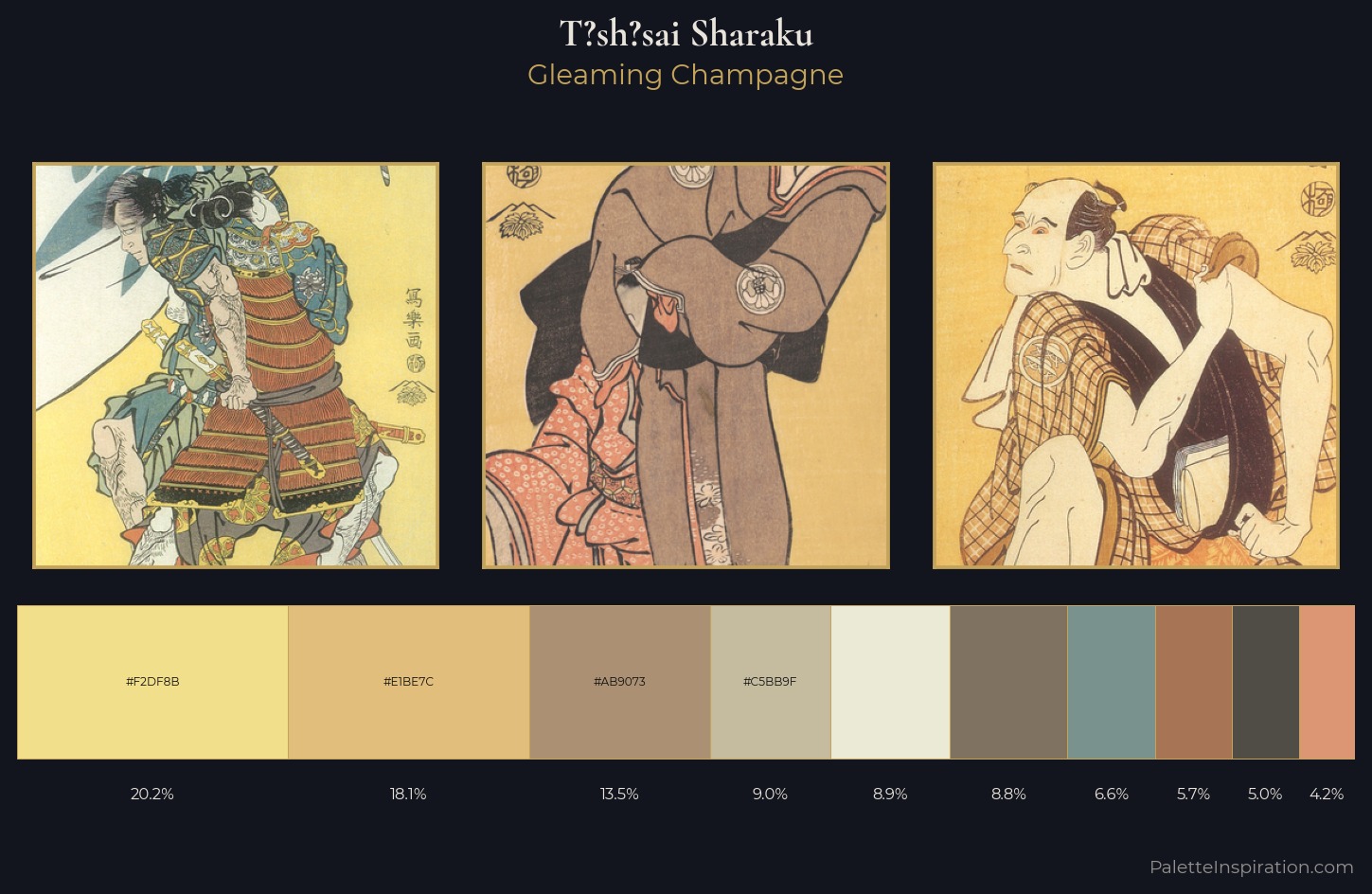
Values in T?sh?sai Sharaku tilt decisively toward white, giving the palette its luminous character. T?sh?sai Sharaku builds on cool foundations: the palette favours the blue-cyan-green arc. Chroma is held at a comfortable level - distinct colours, but no single hue is allowed to overwhelm. Rather than a studied accent, #F2DF8B takes 20.2% - a bold allocation that saturates the composition's atmosphere. At 51 units across the value scale, the palette keeps contrast readable without letting it dominate. The palette has the character of outdoor light: cool, mid-bright, with colour rendered faithfully rather than expressively. This is palette 2 of T?sh?sai Sharaku's sequence - a single chapter in a chromatic story told across many works.
Example use cases
- ceramics & pottery
- boutique hospitality
- menswear
- heritage food brands
- craft & artisan brands
I Love This!
Use This Palette
Copy, export, or download for your project
Copy, export, or download for your project
Copy:
Download:
Share: