Tom Thomson Master Palette
Palette Analysis
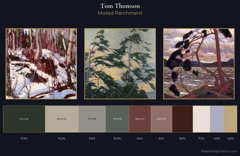
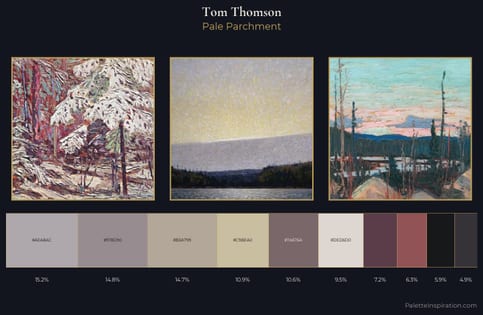
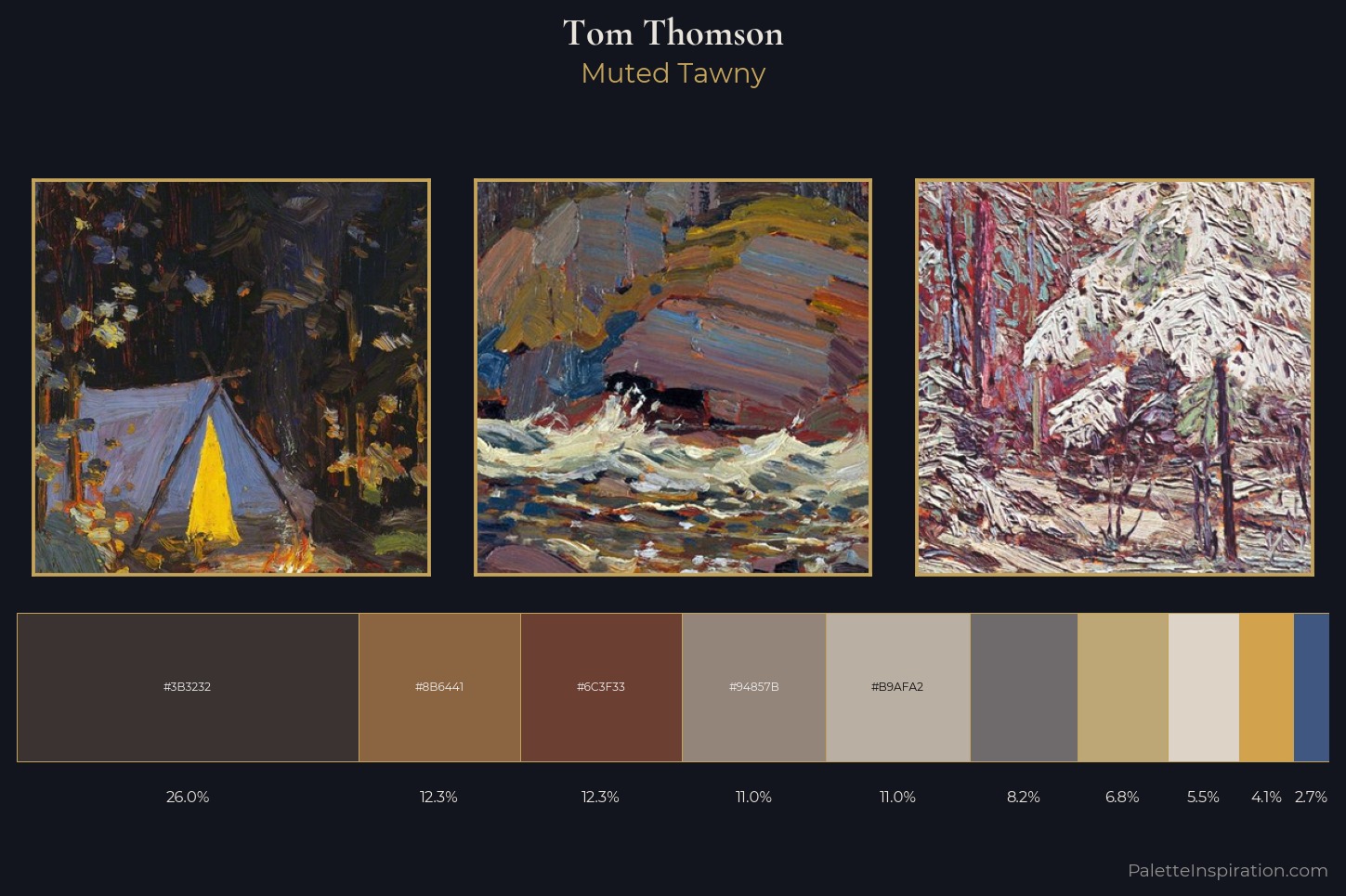
Tom Thomson keeps values measured and balanced, a hallmark of tonal restraint. Temperature reads distinctly warm: the reds and earth tones from Tom Thomson carry the compositional weight. Every colour is desaturated; the palette proceeds through near-neutrals and gently-coloured greys. The dominant colour, #3B3232, takes 26.0% of the total area, establishing the overall mood before any other hue is introduced. At 2.7%, #405881 carries the palette's sharpest chromatic charge: an accent that earns its place precisely because it is withheld. 54 units of value spread create a palette that is varied but unified - contrast in the service of harmony. These proportions encode Tom Thomson's instinctive sense of how much of each quality the eye can hold.
Example use cases
- archival print
- university identity
- rare books
- cultural institutions
- nonprofit identity
I Love This!
Copy, export, or download for your project