Tom Thomson Palette 2
Pale Parchment
Pale High-key and low-chroma - delicate, bleached, washed with light.
Parchment Aged warm neutral - the color of old manuscript parchment, tan and slightly yellowed.

Palette Analysis
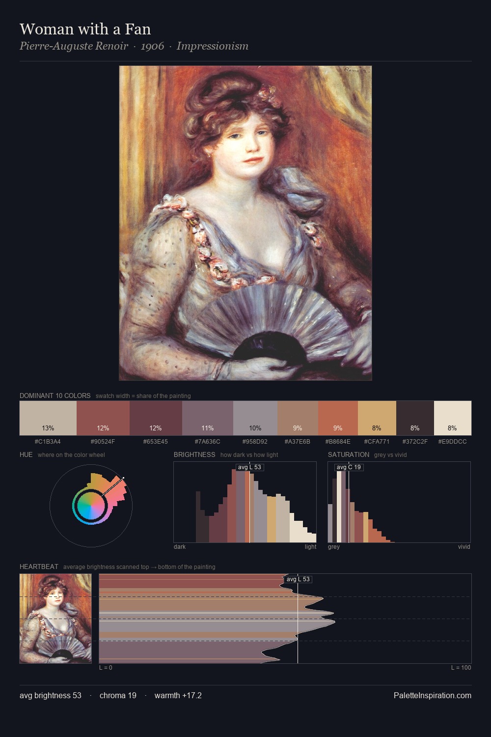
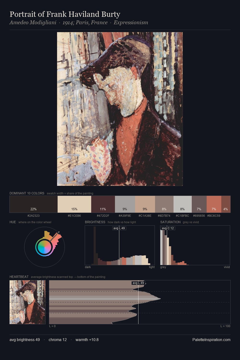
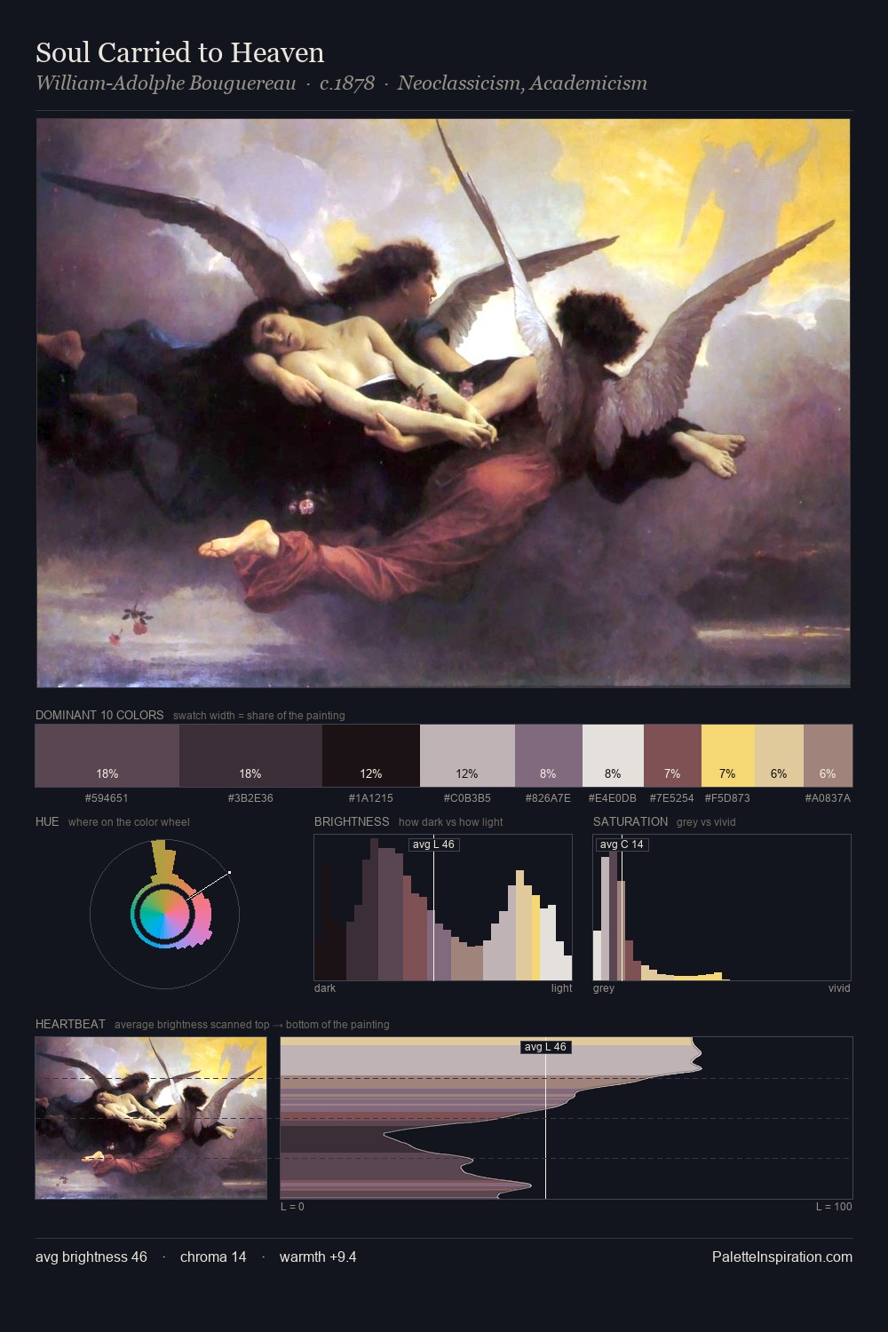
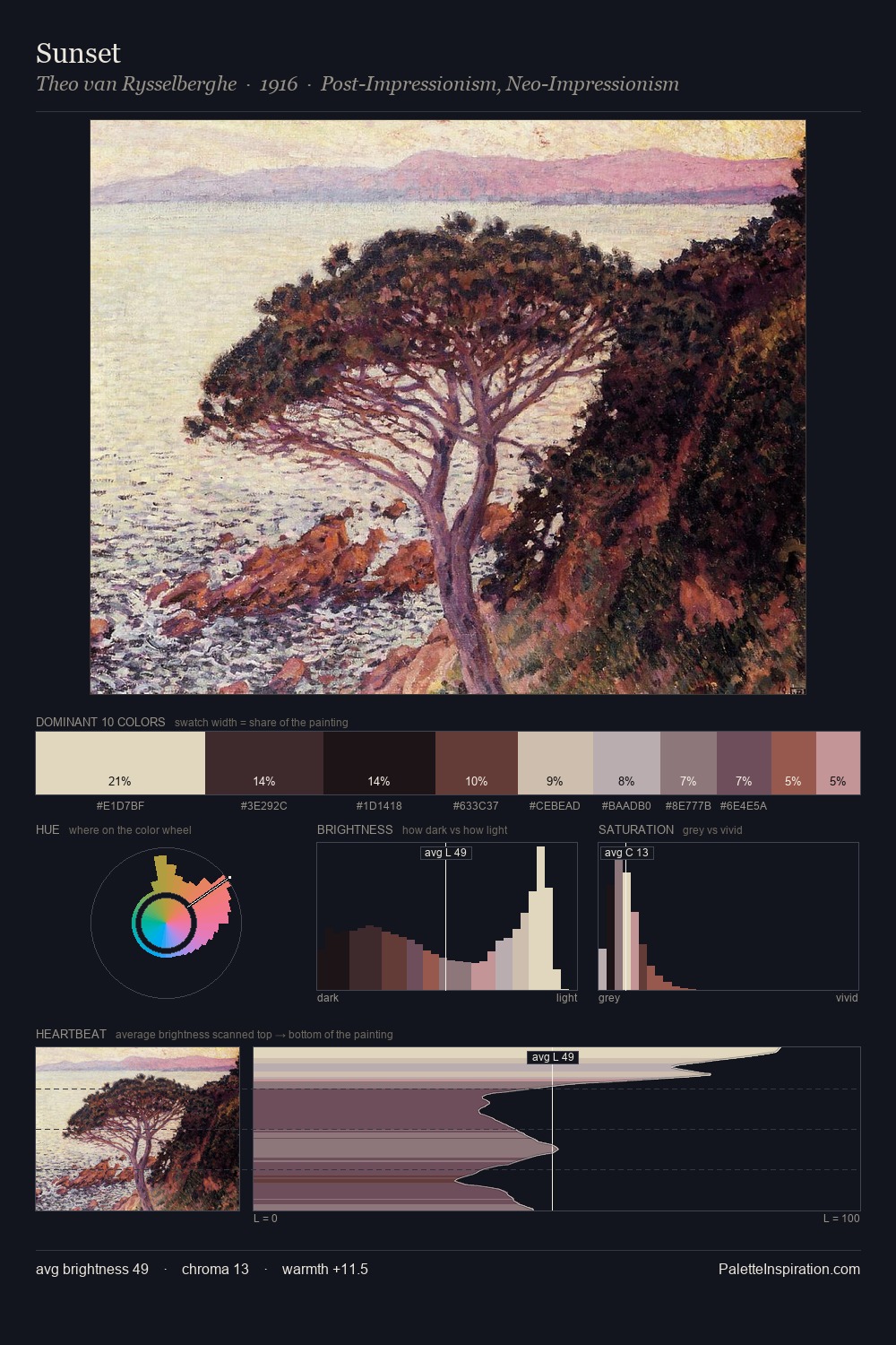
Tom Thomson distributes its values across the middle register, creating harmony without high contrast. Tom Thomson orchestrates warmth above all else - reds, ambers, and siennas take the lead. Chroma is kept low across all colours, producing the soft, enveloping quality that characterises tonal painting. The saturated accent, #915356, registers at 6.3% - sparse enough to feel like a deliberate surprise. From deepest dark to palest light, the palette traverses 67 units of the value scale - a span that creates natural depth. In the context of Tom Thomson's full range of palettes, group 2 represents one movement in an ongoing chromatic dialogue.
Example use cases
- exhibition design
- foundation branding
- estate management
- art education
- museums & galleries
I Love This!
Use This Palette
Copy, export, or download for your project
Copy, export, or download for your project
Copy:
Download:
Share: