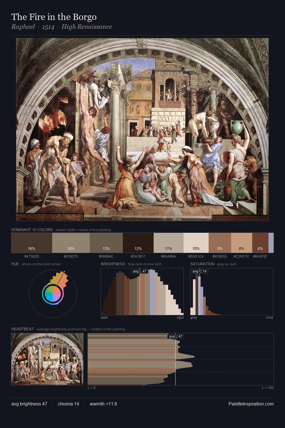
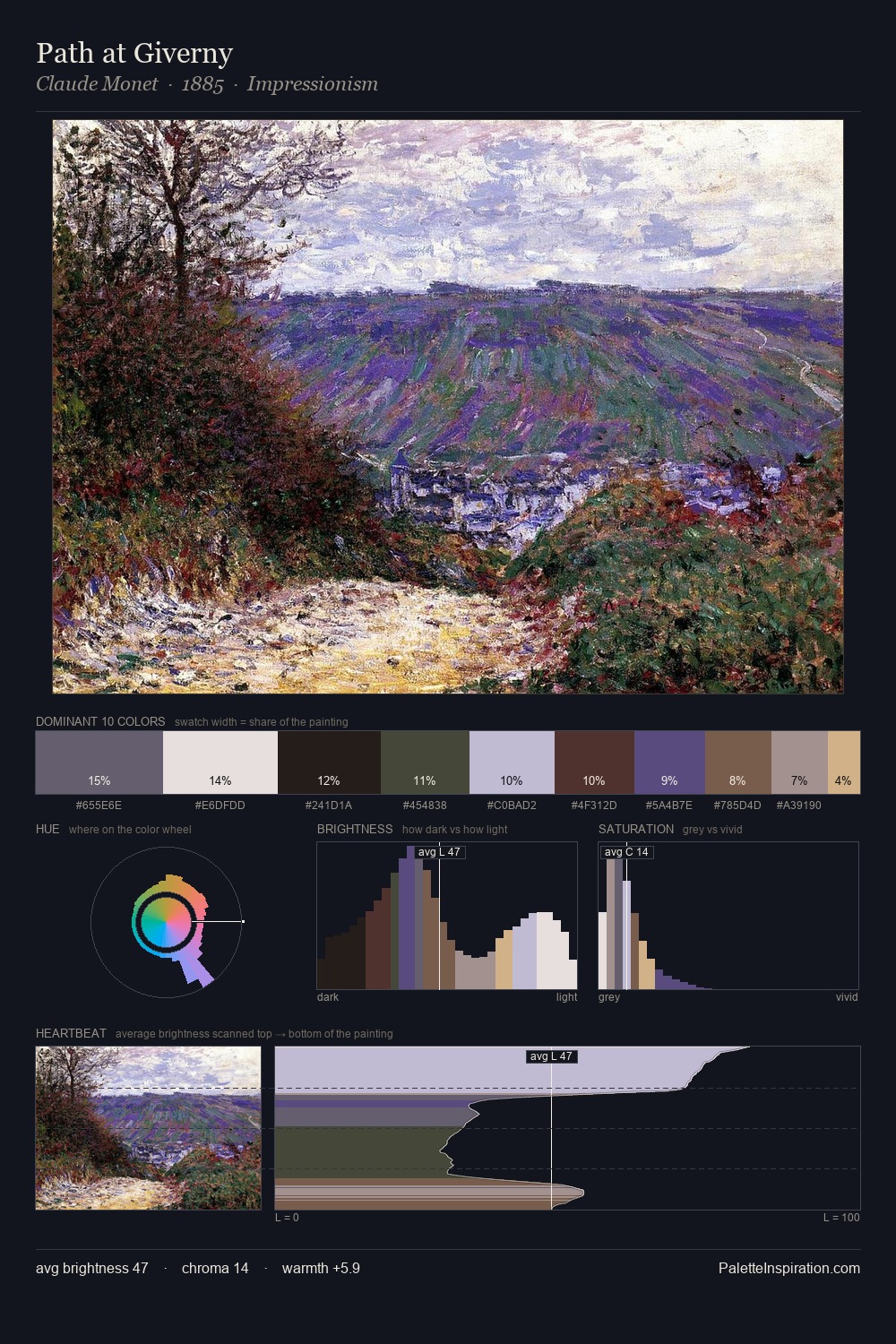
Tom Thomson Palette 1

Palette Analysis
Tom Thomson distributes its values across the middle register, creating harmony without high contrast. A distinctly cool atmosphere runs through this palette: sky, water, and mist given colour form. Muted throughout, the palette achieves its effects through value and temperature rather than chromatic force. Only 5.6% is devoted to #BDA77A, yet that small allocation delivers the palette's entire chromatic tension. 64 units of value range underpin the palette's structural clarity: the eye always knows where light falls. The mid-to-high key, cool bias, and moderate chroma point to outdoor observation - sky and diffused daylight as the dominant light source. Tom Thomson's palette 1 carries its own internal logic while remaining in conversation with the artist's broader colour intelligence.
Example use cases
- exhibition design
- foundation branding
- estate management
- art education
- museums & galleries
I Love This!
Copy, export, or download for your project