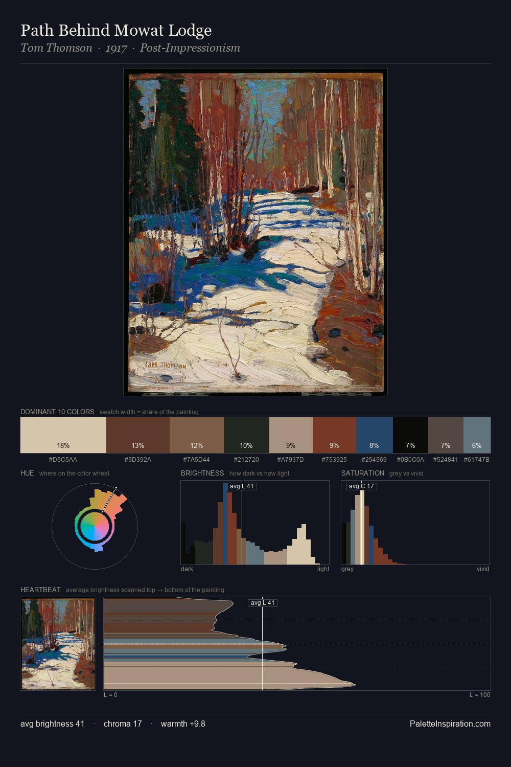
Tom Thomson Palette 6
Muted Tawny
Muted Deliberately desaturated - chroma pulled toward gray, the restraint of tonal painting.
Tawny Warm orange-brown - a traditional term for the color of tanned leather or lion fur.

Palette Analysis
Mid-key values give Tom Thomson its characteristic quietness - nothing blazes, nothing disappears. Neither warm nor cool has the upper hand here; the equilibrium between the two generates the palette's visual energy. Saturation is deliberately withheld - the beauty here lies in the near-monochromatic gradations rather than colour difference. Only 10.3% is devoted to #7F644F, yet that small allocation delivers the palette's entire chromatic tension. From deepest dark to palest light, the palette traverses 58 units of the value scale - a span that creates natural depth. Tom Thomson's palette 6 carries its own internal logic while remaining in conversation with the artist's broader colour intelligence.
Example use cases
- ceramics & pottery
- boutique hospitality
- menswear
- heritage food brands
- craft & artisan brands
I Love This!
Use This Palette
Copy, export, or download for your project
Copy, export, or download for your project
Copy:
Download:
Share: