Theodor Severin Kittelsen Palette 3

Palette Analysis
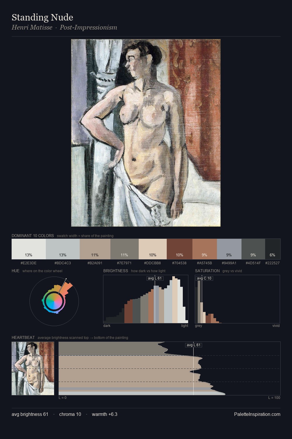
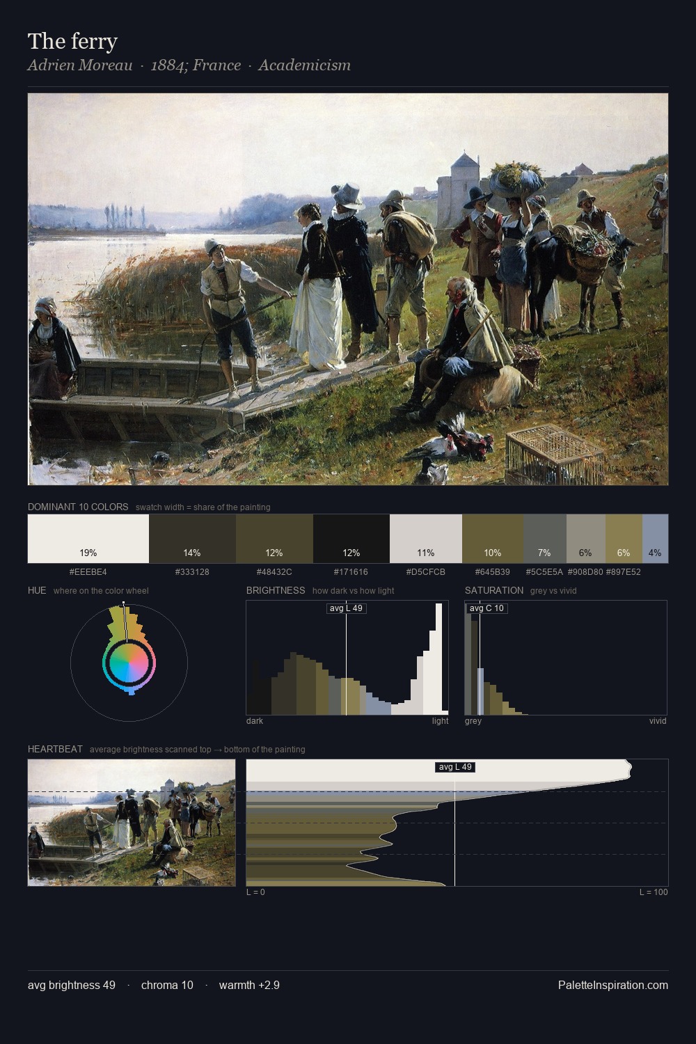
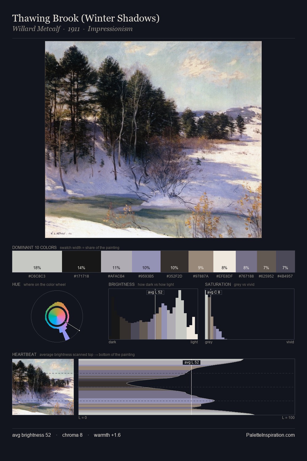
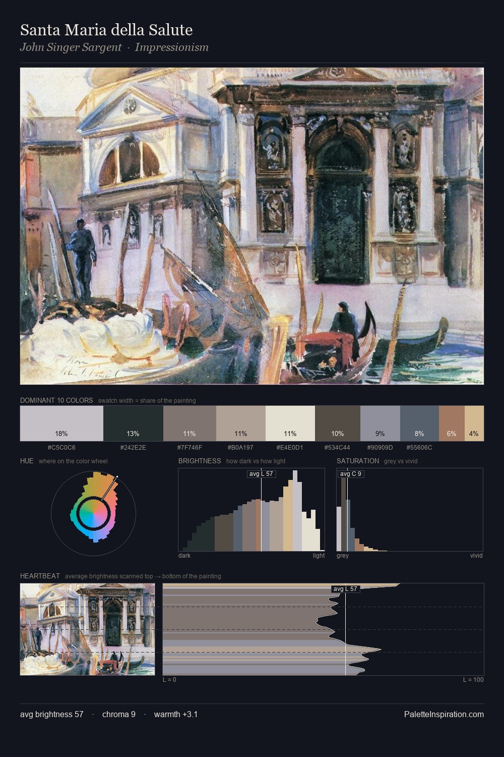
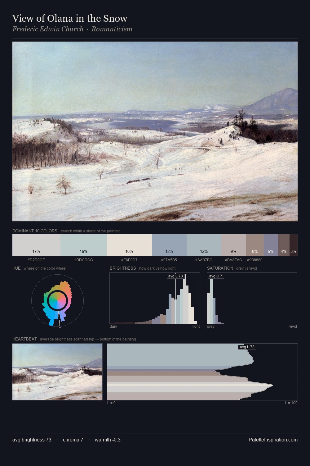
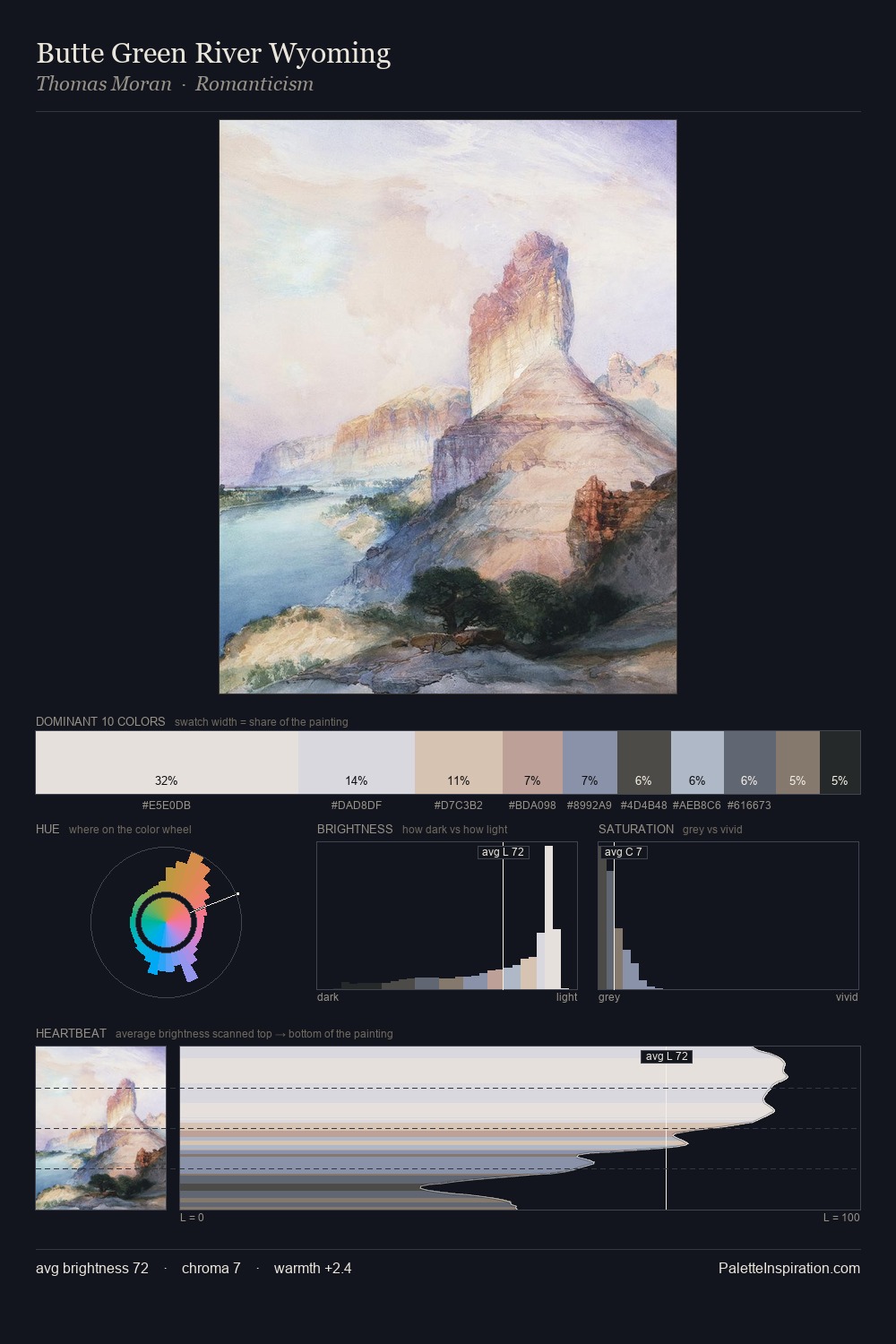
Values in Theodor Severin Kittelsen tilt decisively toward white, giving the palette its luminous character. Theodor Severin Kittelsen builds on cool foundations: the palette favours the blue-cyan-green arc. Saturation is deliberately withheld - the beauty here lies in the near-monochromatic gradations rather than colour difference. The most saturated colour, #D9CCBC, is reserved to 7.4% of the surface, where it acts as a focal punctuation. From deepest dark to palest light, the palette traverses 64 units of the value scale - a span that creates natural depth. High luminosity and cool temperature suggest the plein-air condition: unfiltered daylight and open sky. In the context of Theodor Severin Kittelsen's full range of palettes, group 3 represents one movement in an ongoing chromatic dialogue.
Example use cases
- florist branding
- event design
- real estate
- jewelry retail
- hospitality branding
I Love This!
Copy, export, or download for your project