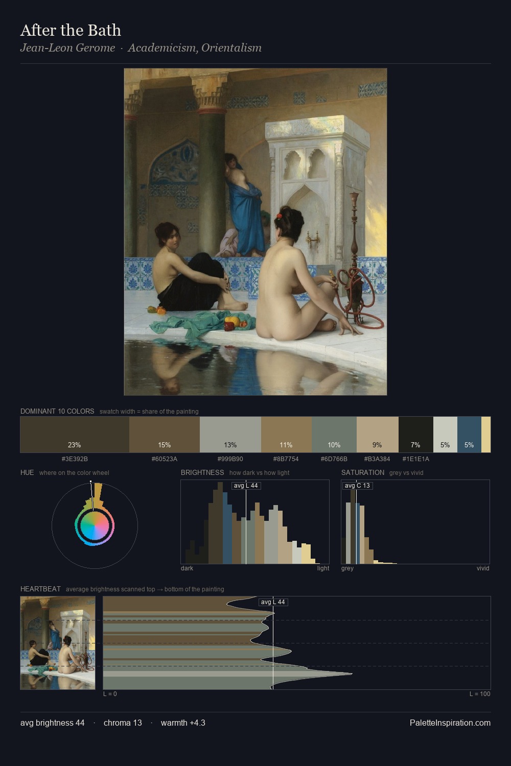
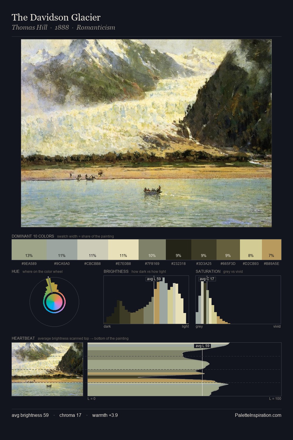
Theodor Severin Kittelsen Palette 8

Palette Analysis
Theodor Severin Kittelsen distributes its values across the middle register, creating harmony without high contrast. Cool hues prevail: blues, greens, and greys anchor the palette's emotional temperature. Every colour is desaturated; the palette proceeds through near-neutrals and gently-coloured greys. The most saturated colour, #B49E6D, is reserved to 11.4% of the surface, where it acts as a focal punctuation. Value range is moderate at 52 units - enough contrast for legibility, not so much as to fragment the tonal unity. The palette has the character of outdoor light: cool, mid-bright, with colour rendered faithfully rather than expressively. Palette 8 sits within the larger chromatic argument that Theodor Severin Kittelsen's complete body of work advances.
Example use cases
- exhibition design
- foundation branding
- estate management
- art education
- museums & galleries
I Love This!
Copy, export, or download for your project