Theodor Severin Kittelsen Palette 1

Palette Analysis
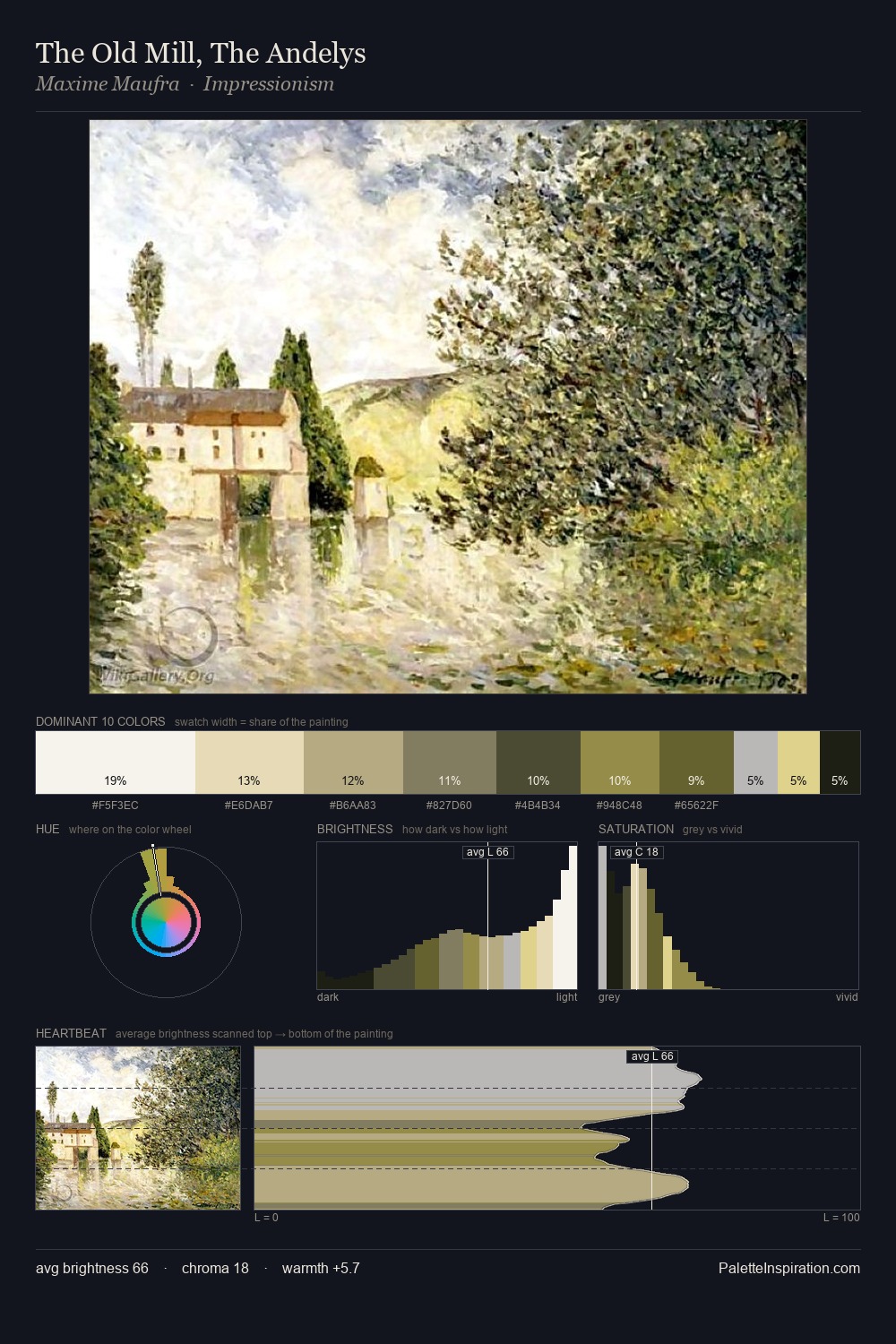
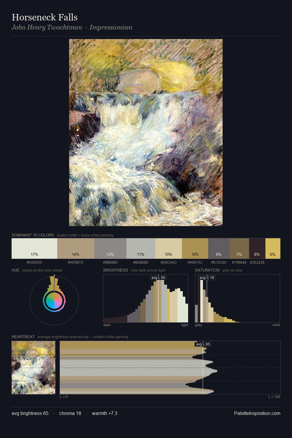
Theodor Severin Kittelsen is high-key - luminous, open, and weighted toward light. Cool hues prevail: blues, greens, and greys anchor the palette's emotional temperature. The absence of saturated colour is itself an expressive choice: this is a palette of restraint and atmosphere. At 9.2%, #C3AD70 carries the palette's sharpest chromatic charge: an accent that earns its place precisely because it is withheld. The palette spans 43 value units: a measured range that delivers coherence over drama. The palette has the character of outdoor light: cool, mid-bright, with colour rendered faithfully rather than expressively. Theodor Severin Kittelsen's palette 1 carries its own internal logic while remaining in conversation with the artist's broader colour intelligence.
Example use cases
- ceramics & pottery
- boutique hospitality
- menswear
- heritage food brands
- craft & artisan brands
I Love This!
Copy, export, or download for your project
Related Palettes

Theodor Severin Kittelsen Palette 2
Blazing Reverie

Theodor Severin Kittelsen Palette 3
Gleaming Alabaster

Theodor Severin Kittelsen Palette 4
Gleaming Ivory

Theodor Severin Kittelsen Palette 5
Blazing Muslin

Theodor Severin Kittelsen Palette 6
Soft Ecru

Theodor Severin Kittelsen Palette 7
Soft Calico