Rockwell Kent Palette 4

Palette Analysis
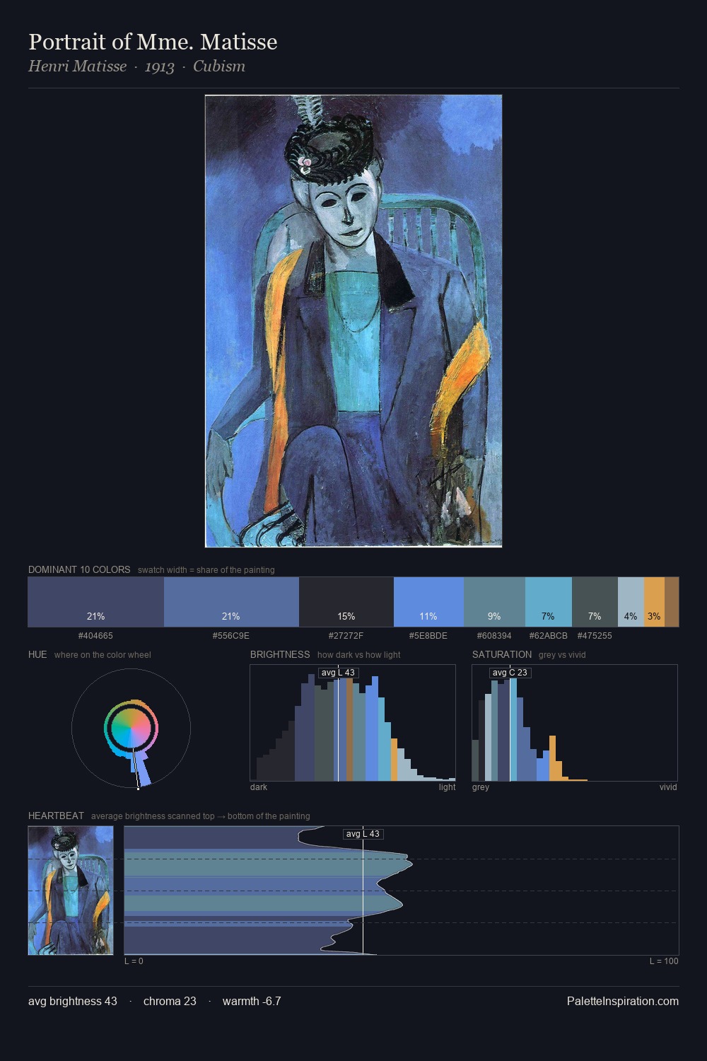
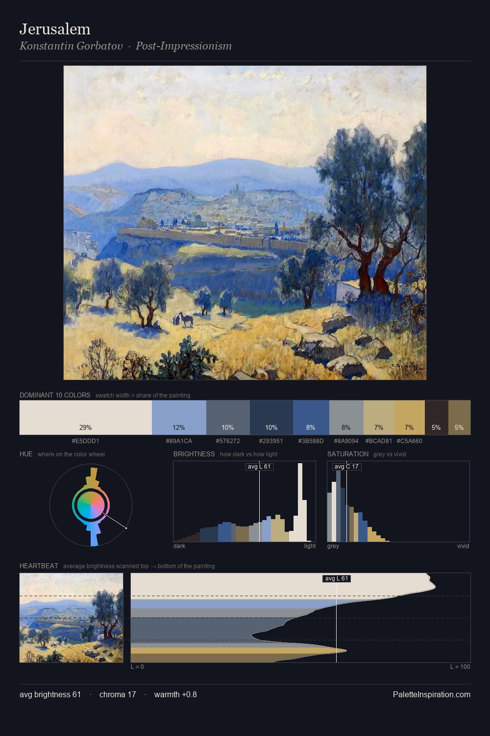
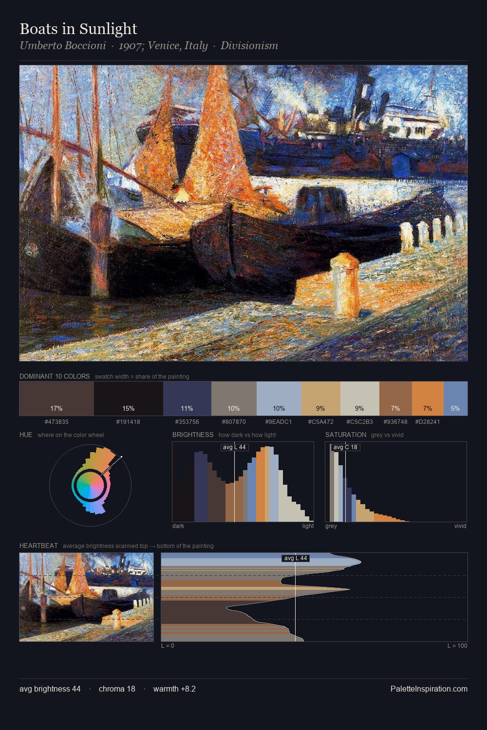
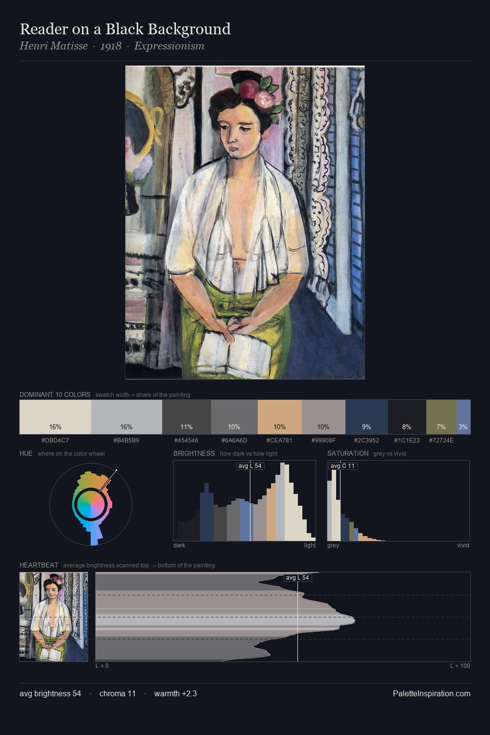
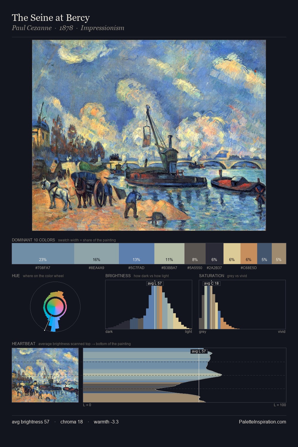
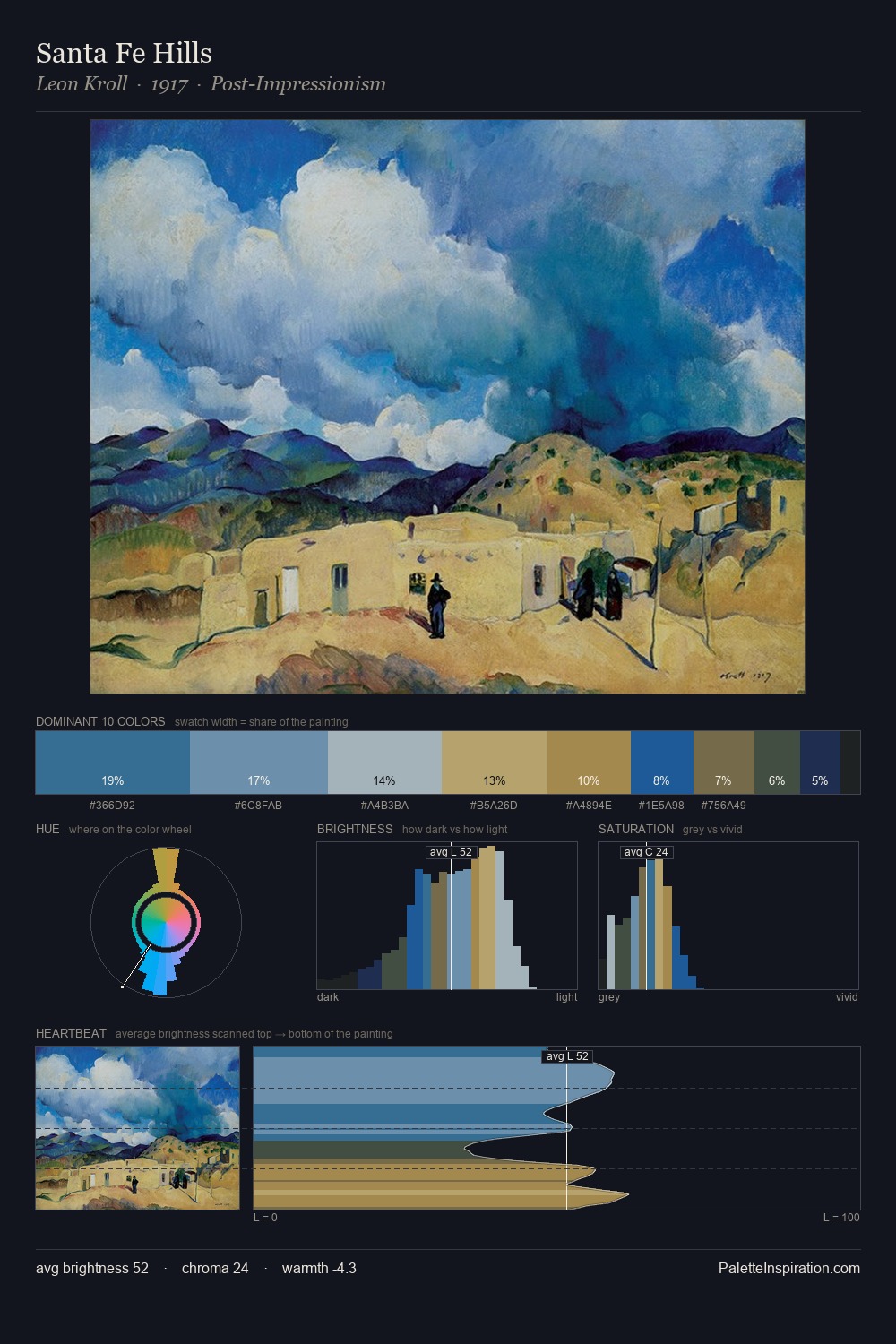
Rockwell Kent sits in the centre of the value range, lending the palette a sense of even, sustained light. Rockwell Kent tilts toward cool - blues and silver-greys carry the structural weight. Saturation is deliberately withheld - the beauty here lies in the near-monochromatic gradations rather than colour difference. 37.2% of the palette belongs to #1B1C24, a concentration that makes it the unmistakable visual centre. The highest-chroma note - #436DA9 - appears at just 6.1%, deployed as a precision accent against the quieter ground. 51 units of value spread create a palette that is varied but unified - contrast in the service of harmony. The palette has the character of outdoor light: cool, mid-bright, with colour rendered faithfully rather than expressively. Rockwell Kent's palette 4 carries its own internal logic while remaining in conversation with the artist's broader colour intelligence.
Example use cases
- legal services
- corporate identity
- industrial design
- professional services
- fintech
I Love This!
Copy, export, or download for your project