Dosso Dossi Palette 6

Palette Analysis
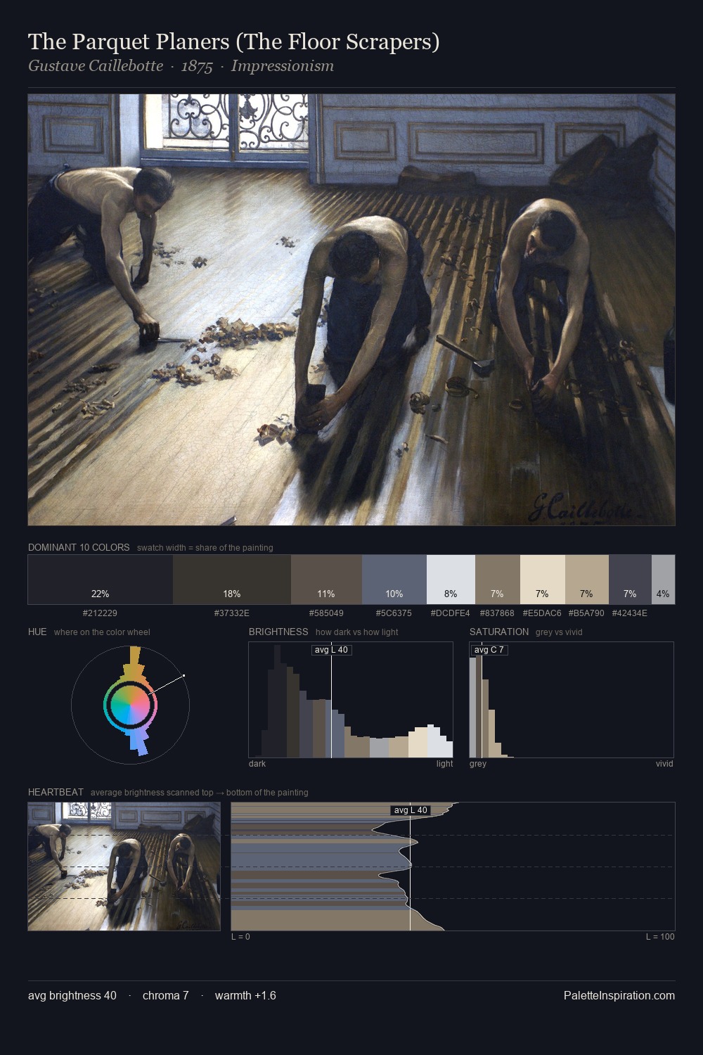
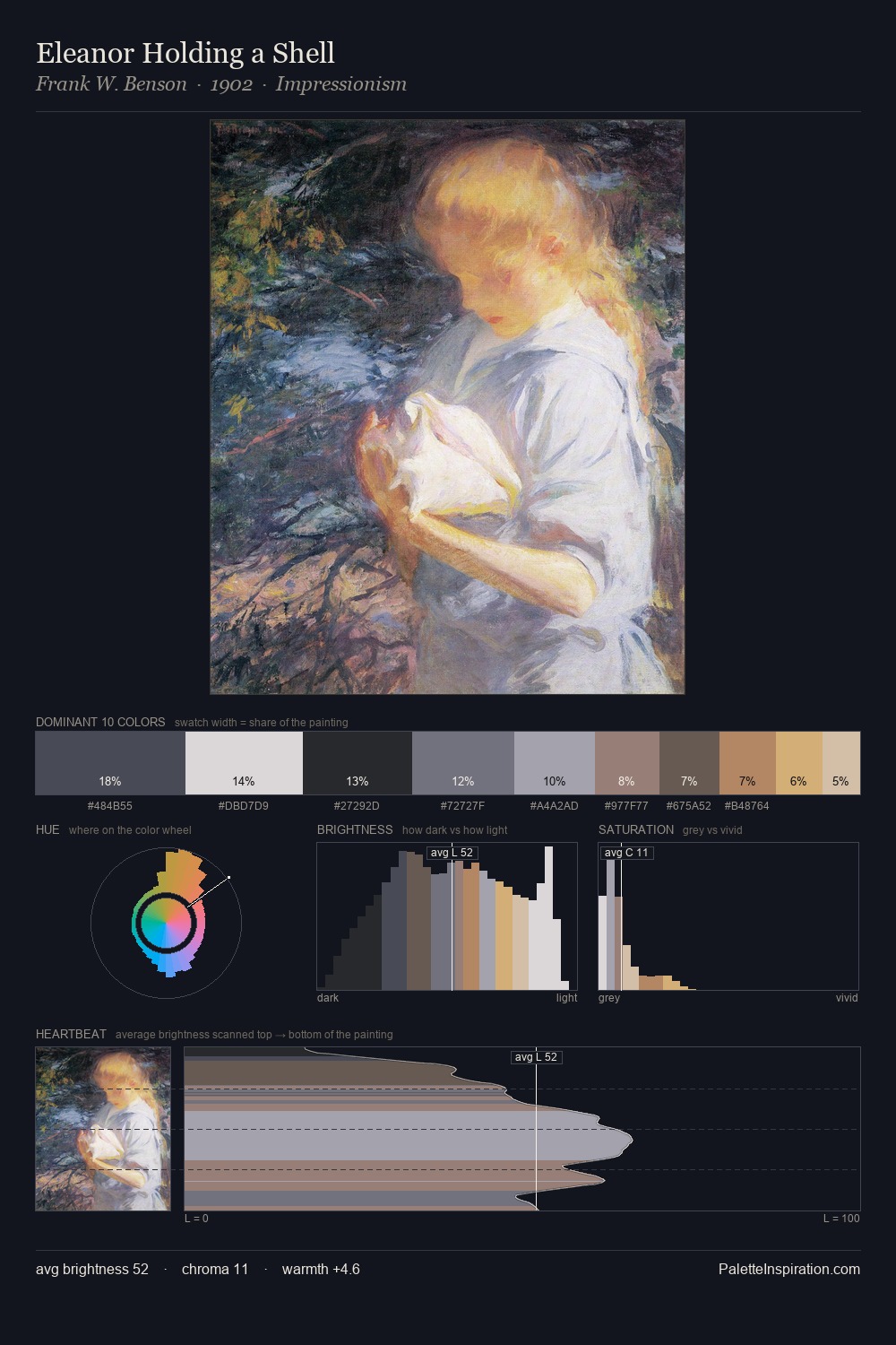
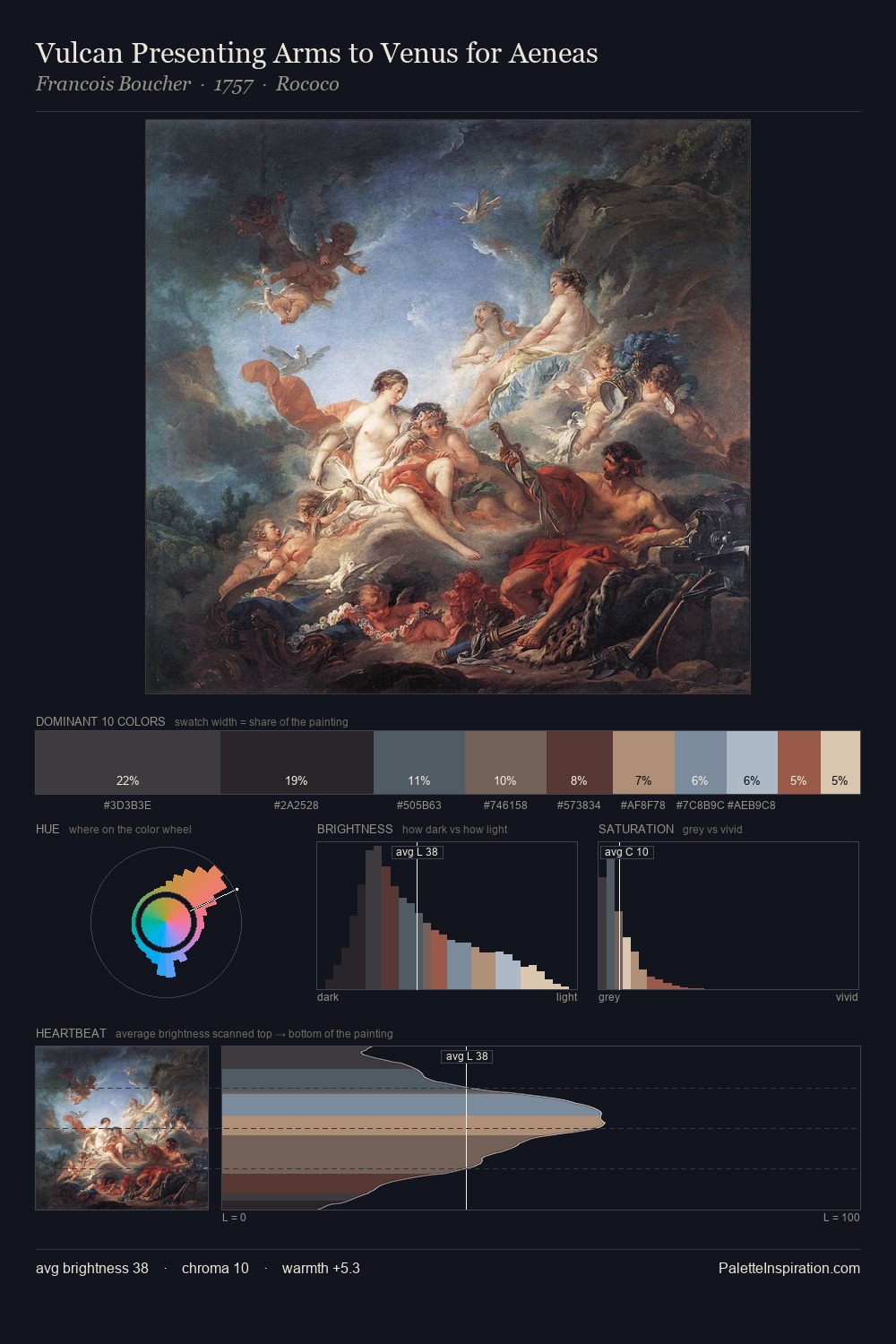
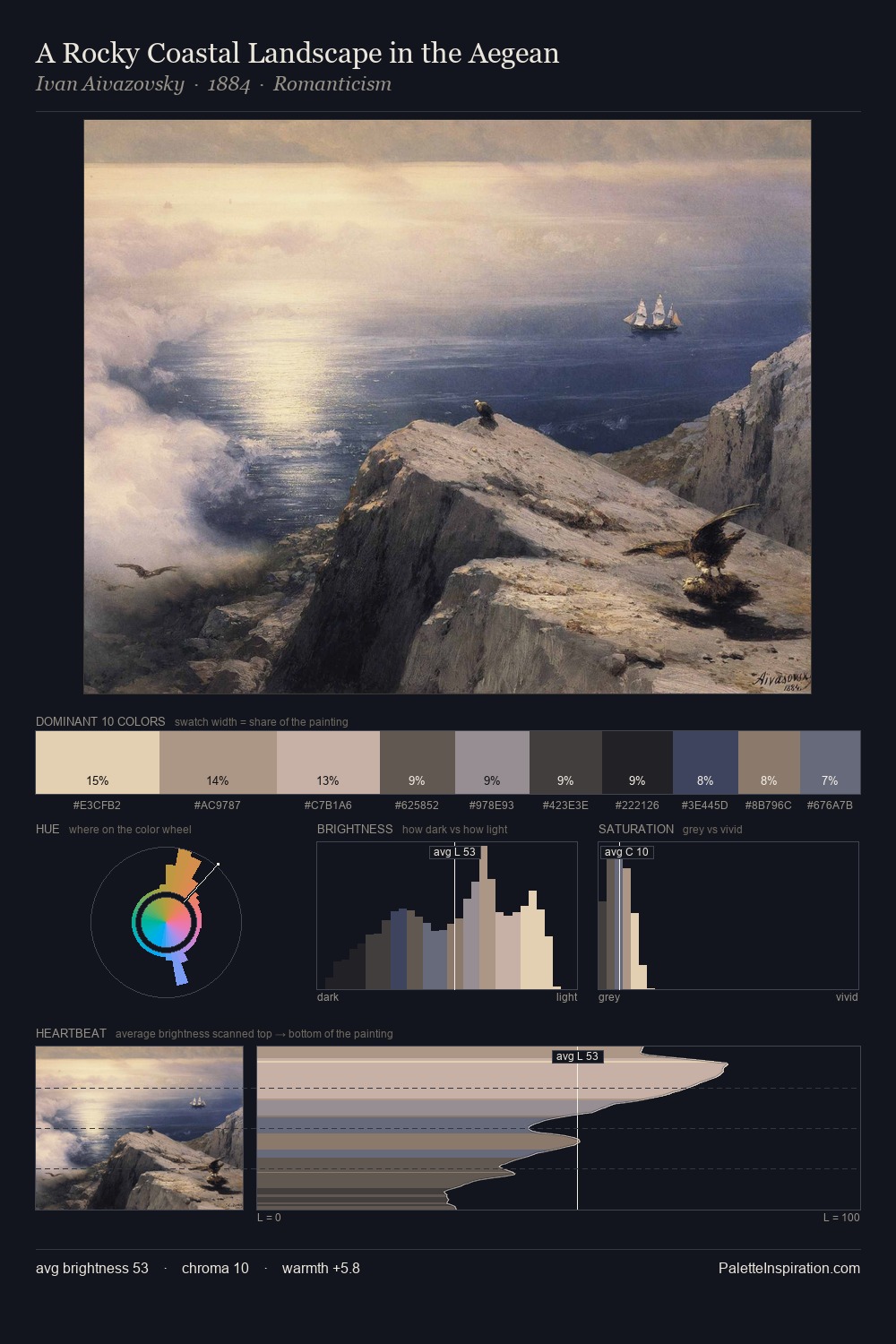
Dosso Dossi occupies the comfortable middle of the value scale, avoiding both extremes to hold the eye in a sustained middle grey. Cool tones set the register here - the blues and greens easily outweigh any warm accents. Muted throughout, the palette achieves its effects through value and temperature rather than chromatic force. The most saturated colour, #C2B4A3, is reserved to 5.6% of the surface, where it acts as a focal punctuation. Spanning 54 units on the value axis, the palette achieves the balance between tonal flatness and fragmentation. The palette has the character of outdoor light: cool, mid-bright, with colour rendered faithfully rather than expressively. Palette 6 sits within the larger chromatic argument that Dosso Dossi's complete body of work advances.
Example use cases
- publishing
- corporate identity
- consumer apps
- hospitality
- design agencies
I Love This!
Copy, export, or download for your project