Dosso Dossi Palette 1

Palette Analysis
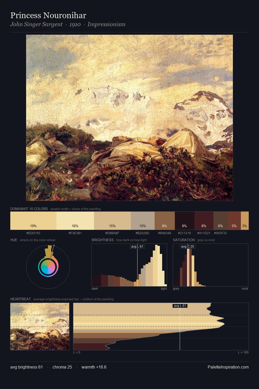
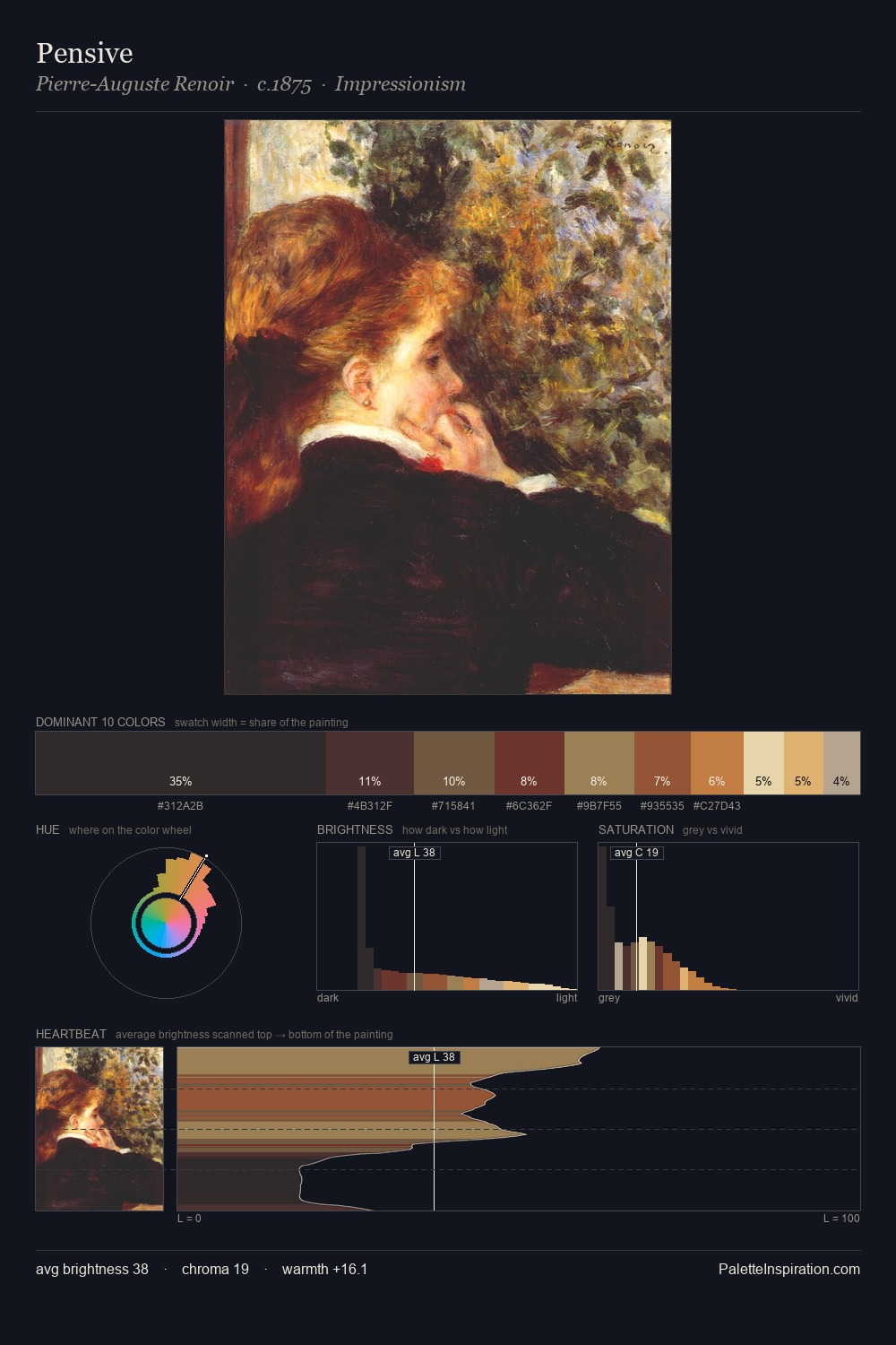
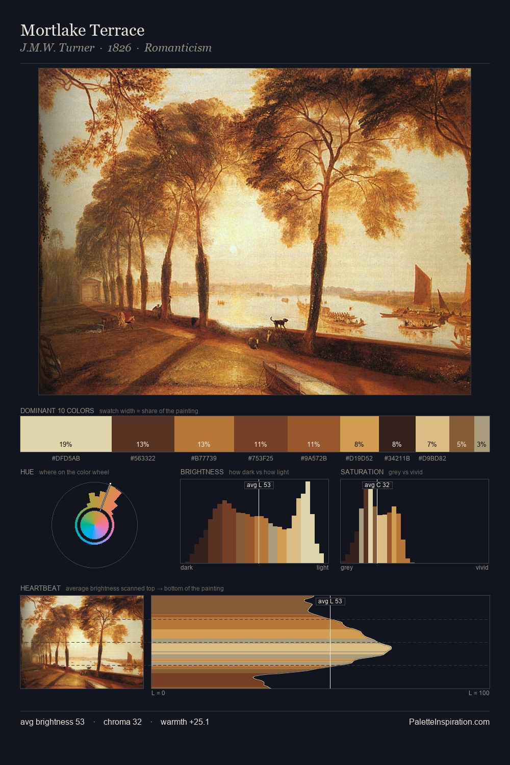
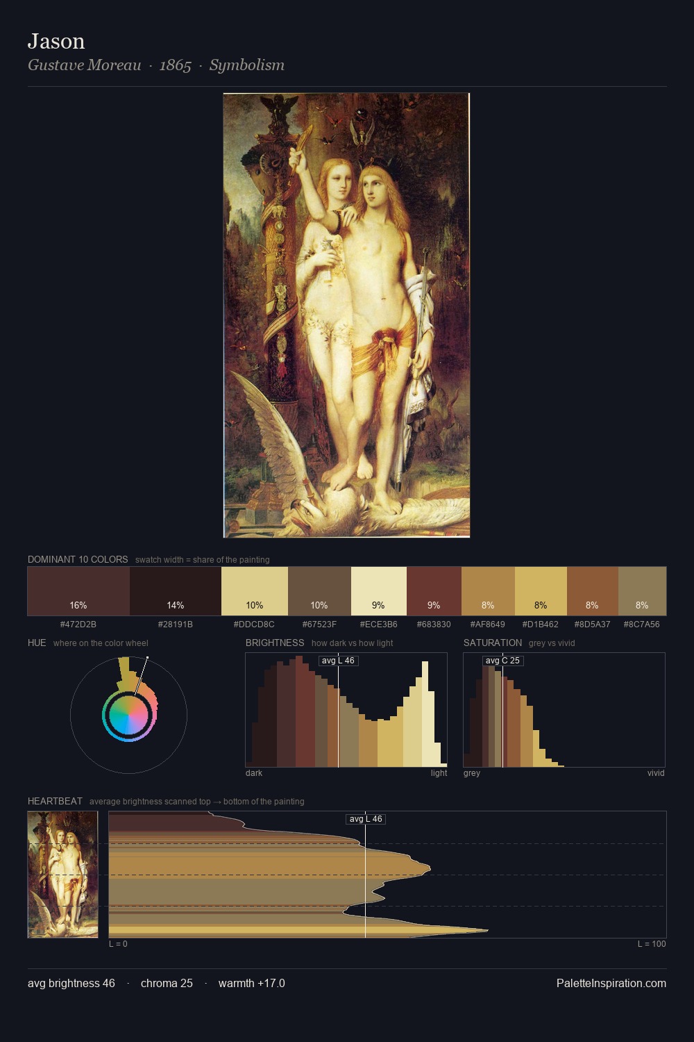
Values in Dosso Dossi rest in the mid-range - neither dramatically lit nor steeped in shadow. Warm and cool tones are held in careful balance - neither family dominates, creating tension and resolution simultaneously. Mid-range chroma keeps the palette grounded - colourful but not strident. The highest-chroma note - #683424 - appears at just 8.1%, deployed as a precision accent against the quieter ground. From deepest dark to palest light, the palette traverses 69 units of the value scale - a span that creates natural depth. The palette reads as an Impressionist one - light-biased, chromatically direct, and built on temperature contrast rather than value opposition. In the context of Dosso Dossi's full range of palettes, group 1 represents one movement in an ongoing chromatic dialogue.
Example use cases
- art galleries
- creative studios
- consumer goods
- lifestyle media
- professional services
I Love This!
Copy, export, or download for your project