Dosso Dossi Palette 5

Palette Analysis
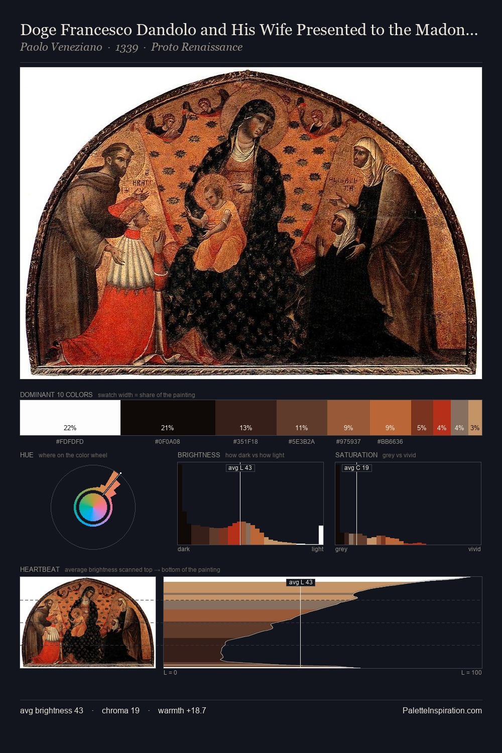
Dosso Dossi occupies the comfortable middle of the value scale, avoiding both extremes to hold the eye in a sustained middle grey. Warm hues command this palette; Dosso Dossi favours the reds, oranges, and yellows of firelight and earth. Muted throughout, the palette achieves its effects through value and temperature rather than chromatic force. #FEFDFD at 37.5% of the palette: an overwhelming presence that pulls all other colours into its gravitational field. The highest-chroma note - #CF7743 - appears at just 2.9%, deployed as a precision accent against the quieter ground. A value spread of 84 units gives the palette both depth and air - shadows are genuinely dark, lights genuinely light. Palette 5 sits within the larger chromatic argument that Dosso Dossi's complete body of work advances.
Example use cases
- publishing
- corporate identity
- consumer apps
- hospitality
- design agencies
I Love This!
Copy, export, or download for your project