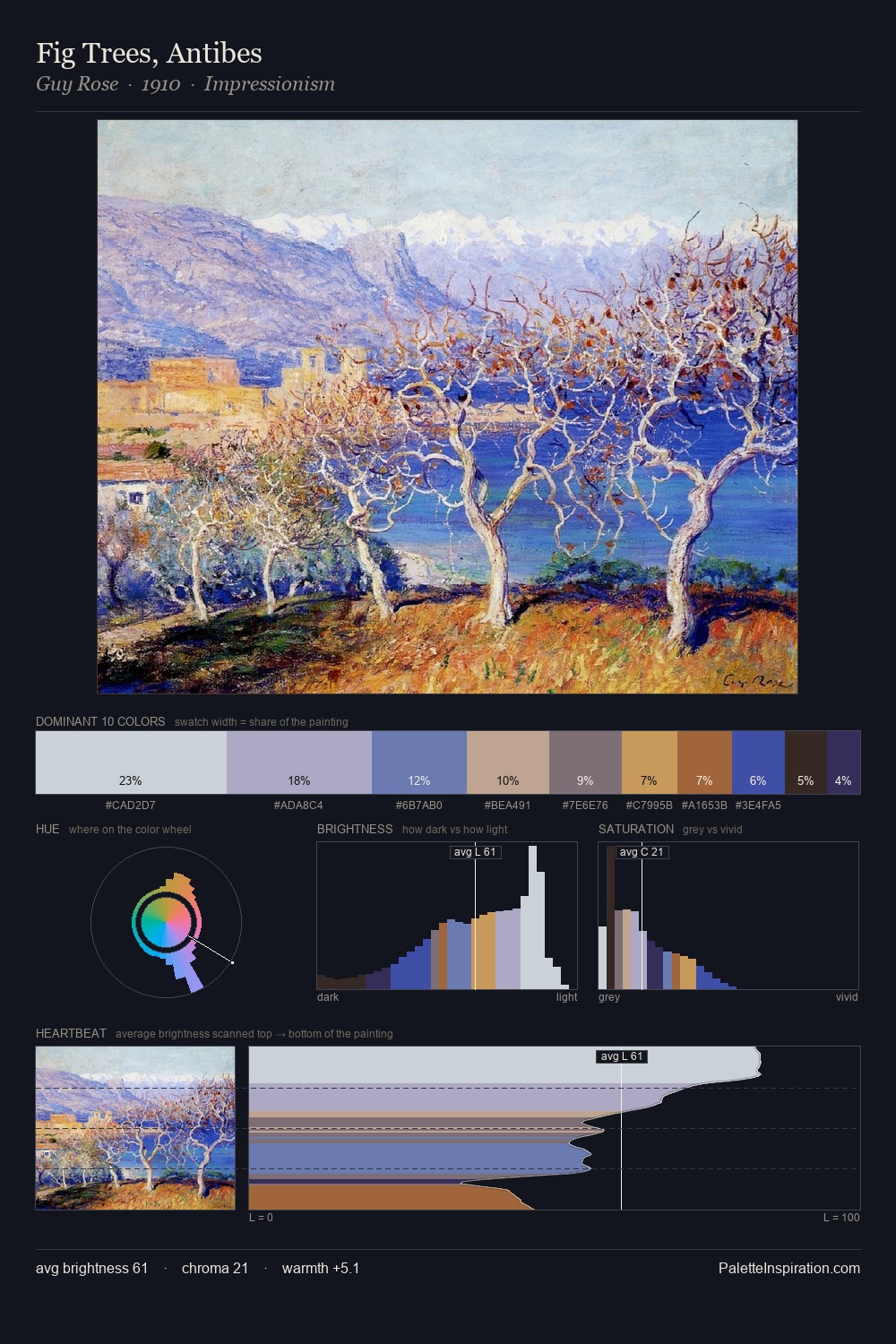
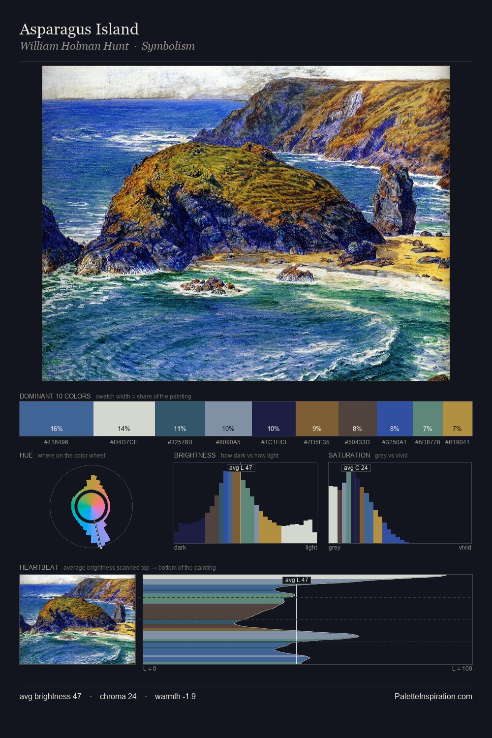
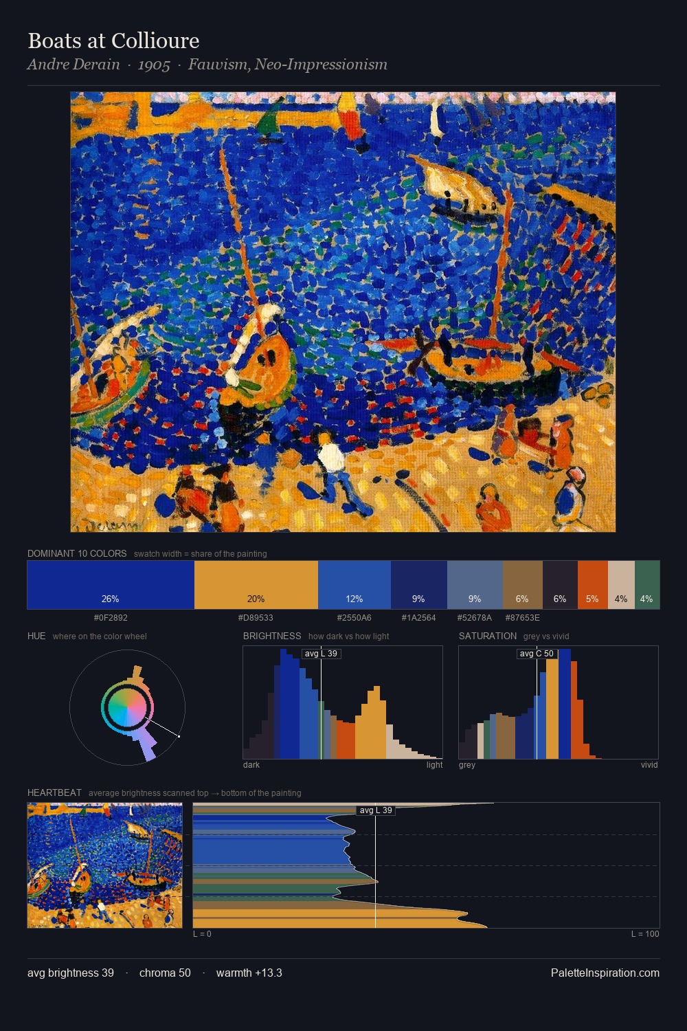
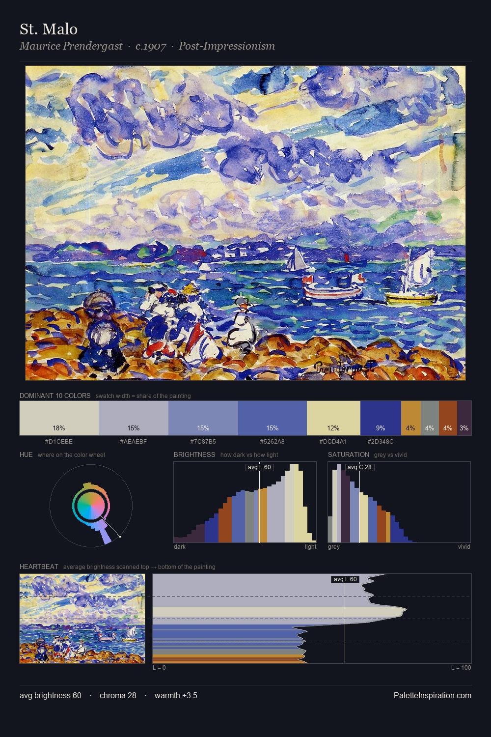
Rockwell Kent Master Palette

Palette Analysis
Mid-key values give Rockwell Kent its characteristic quietness - nothing blazes, nothing disappears. Blues and teal-greys govern the palette, lending it an aquatic or atmospheric quality. All colours lean toward grey, building depth through value rather than colour punch. The highest-chroma note - #476FD4 - appears at just 2.0%, deployed as a precision accent against the quieter ground. Value range is moderate at 52 units - enough contrast for legibility, not so much as to fragment the tonal unity. The palette has the character of outdoor light: cool, mid-bright, with colour rendered faithfully rather than expressively. Taken together, these qualities constitute Rockwell Kent's chromatic voice - distinctive enough to be read across an entire body of work.
Example use cases
- publishing
- corporate identity
- consumer apps
- hospitality
- design agencies
I Love This!
Copy, export, or download for your project