Rockwell Kent Palette 2
Muted Vellum
Muted Deliberately desaturated - chroma pulled toward gray, the restraint of tonal painting.
Vellum Smooth pale tan - the color of prepared calf-skin vellum, warmer than parchment.

Palette Analysis
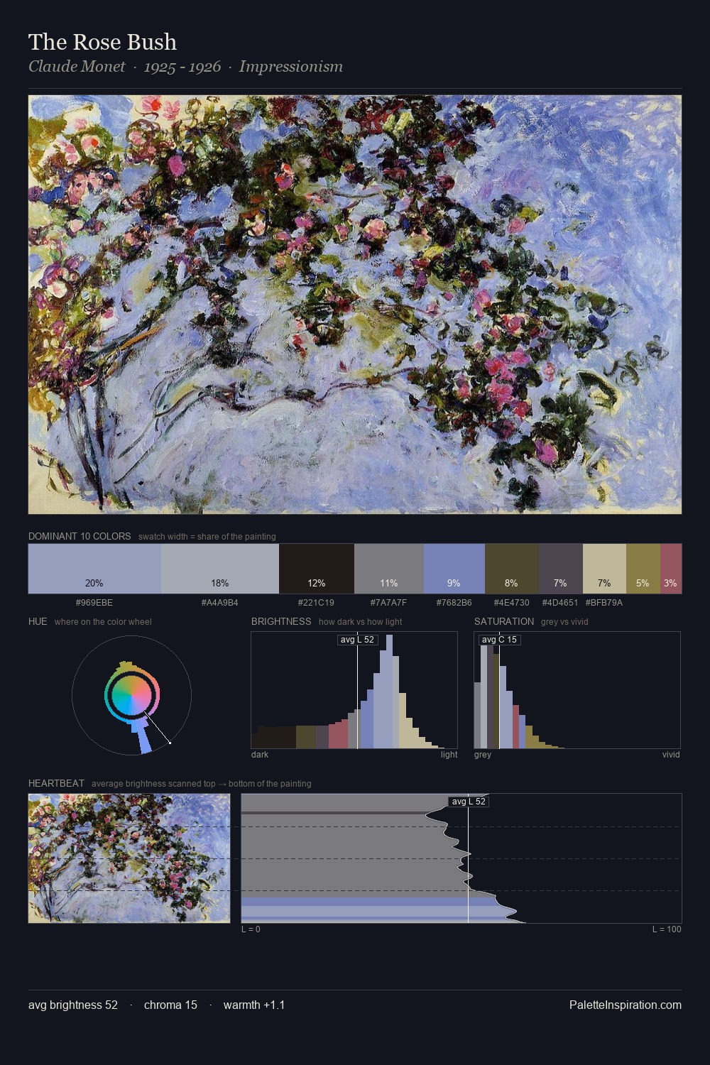
Rockwell Kent occupies the comfortable middle of the value scale, avoiding both extremes to hold the eye in a sustained middle grey. Heat pervades this palette; warm chromatic identities outweigh cool ones at almost every weight. Muted throughout, the palette achieves its effects through value and temperature rather than chromatic force. #8C6637 functions as the palette's exclamation mark: highest chroma, lowest percentage (9.9%). 60 units of value range underpin the palette's structural clarity: the eye always knows where light falls. Palette 2 sits within the larger chromatic argument that Rockwell Kent's complete body of work advances.
Example use cases
- exhibition design
- foundation branding
- estate management
- art education
- museums & galleries
I Love This!
Use This Palette
Copy, export, or download for your project
Copy, export, or download for your project
Copy:
Download:
Share: