Paul Ranson Palette 9

Palette Analysis
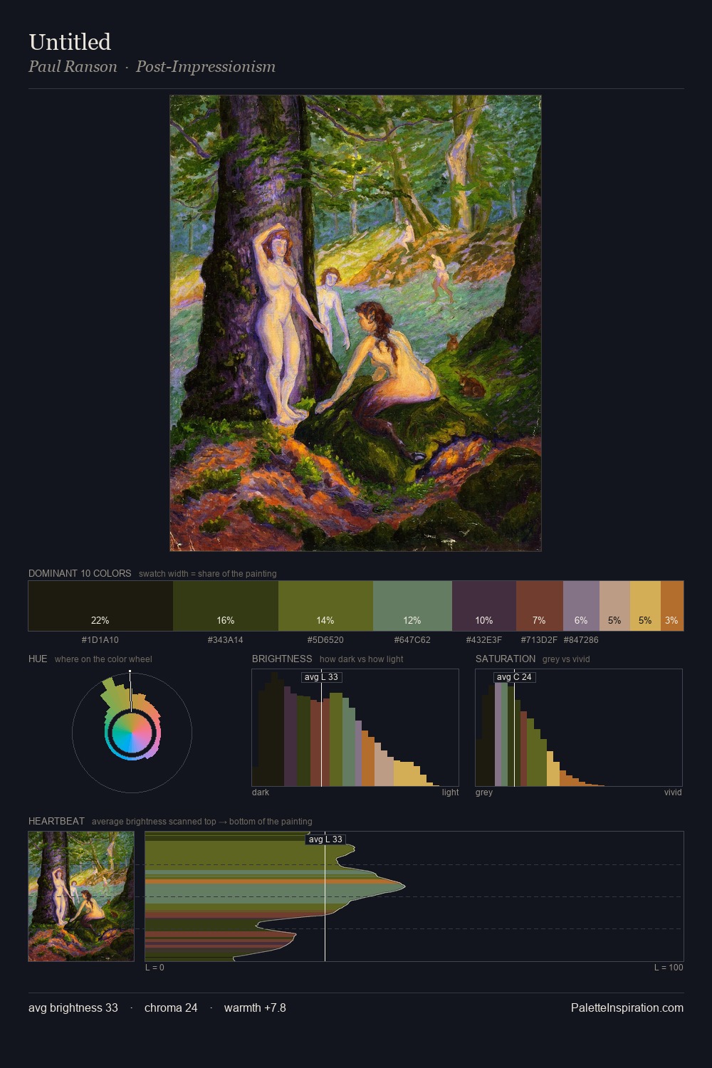
Paul Ranson occupies the comfortable middle of the value scale, avoiding both extremes to hold the eye in a sustained middle grey. Heat pervades this palette; warm chromatic identities outweigh cool ones at almost every weight. Chroma hovers near zero; colour declares itself through subtle shifts in hue rather than outright saturation. #160F10 claims 34.1% of the surface, functioning as the work's tonal foundation. The highest-chroma note - #C5995B - appears at just 6.1%, deployed as a precision accent against the quieter ground. 53 units of value spread create a palette that is varied but unified - contrast in the service of harmony. Paul Ranson's palette 9 carries its own internal logic while remaining in conversation with the artist's broader colour intelligence.
Example use cases
- premium streaming
- cocktail bars
- fashion campaigns
- book covers
- music labels
I Love This!
Copy, export, or download for your project