Paul Ranson Palette 2
Muted Vermillion
Muted Deliberately desaturated - chroma pulled toward gray, the restraint of tonal painting.
Vermillion Brilliant red-orange - the classic mercury sulfide pigment, vivid and warm.

Palette Analysis
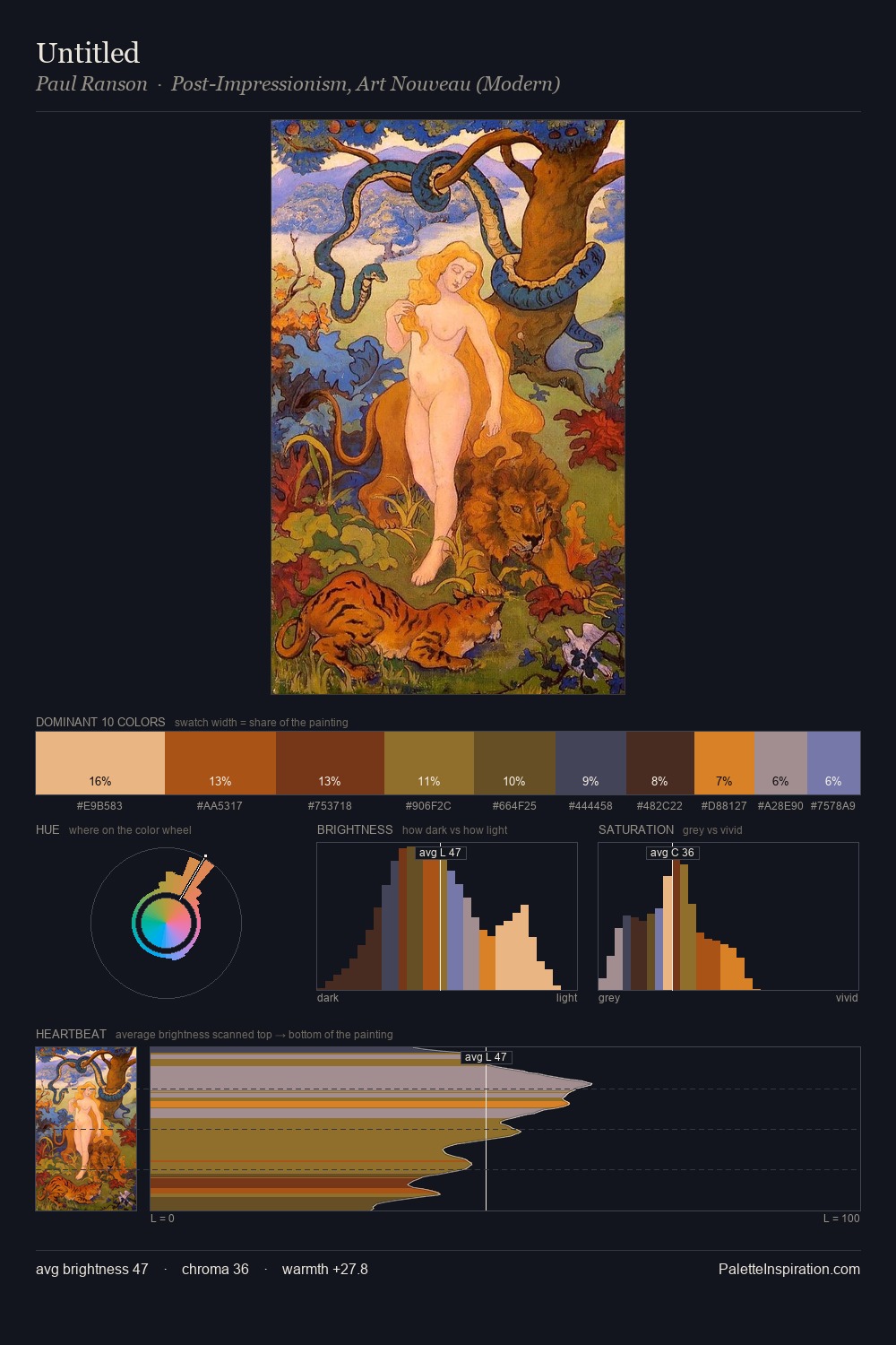
Paul Ranson occupies the comfortable middle of the value scale, avoiding both extremes to hold the eye in a sustained middle grey. The dominant temperature is warm, with earth tones and fire-hues setting the emotional key. Mid-saturation across the board: the palette has colour character without chromatic excess. Only 10.2% is devoted to #A64414, yet that small allocation delivers the palette's entire chromatic tension. The value range of 44 units sits in the comfortable middle: enough depth, enough light, neither extreme. Palette 2 sits within the larger chromatic argument that Paul Ranson's complete body of work advances.
Example use cases
- publishing
- corporate identity
- consumer apps
- hospitality
- design agencies
I Love This!
Use This Palette
Copy, export, or download for your project
Copy, export, or download for your project
Copy:
Download:
Share: