Paul Ranson Palette 3
Veiled Tawny
Veiled Partially obscured light - mid-dark with a hazy, scrim-filtered quality.
Tawny Warm orange-brown - a traditional term for the color of tanned leather or lion fur.

Palette Analysis
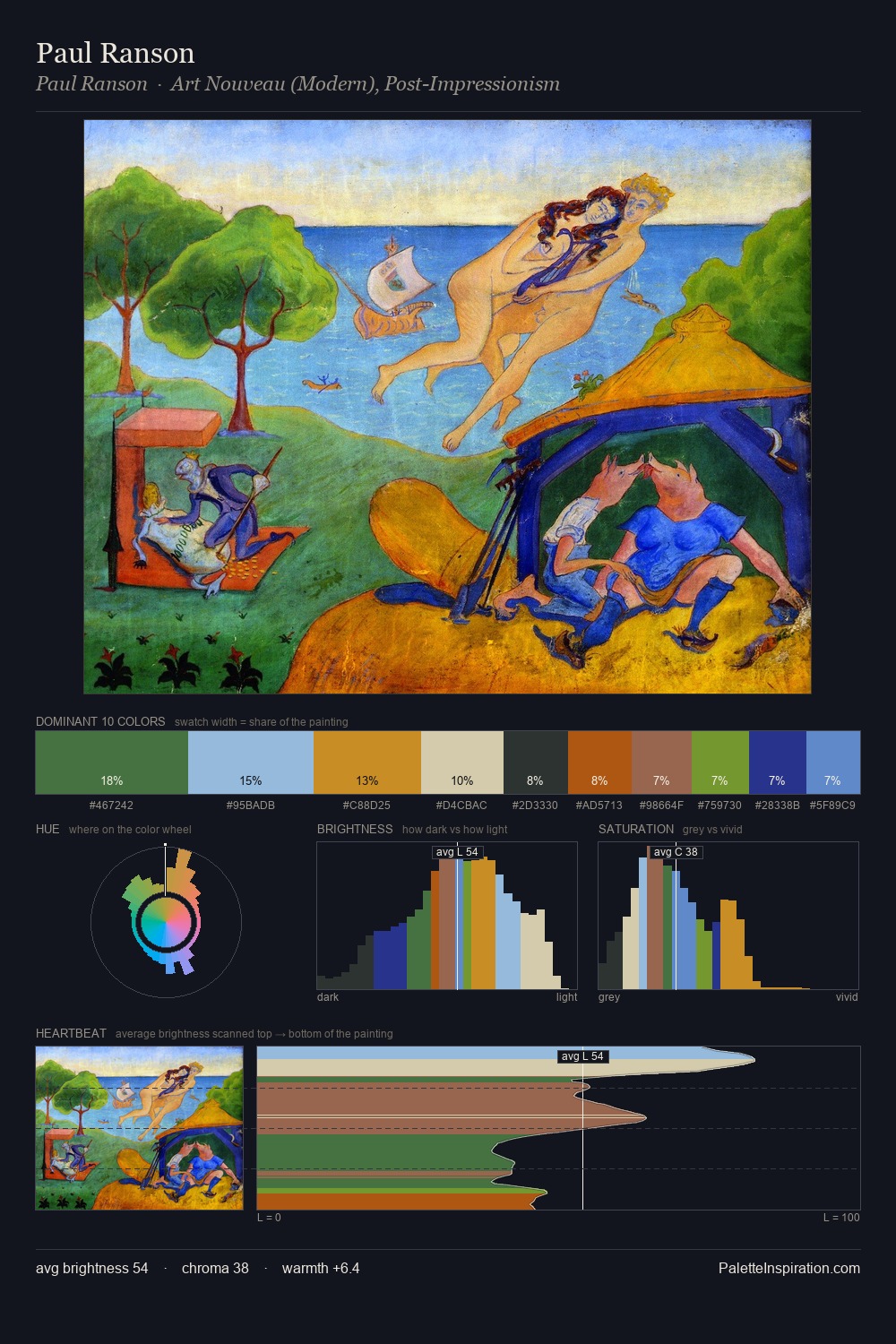
Paul Ranson keeps values measured and balanced, a hallmark of tonal restraint. Blues and teal-greys govern the palette, lending it an aquatic or atmospheric quality. A restrained, mid-chroma palette: every hue is present and legible, but nothing shouts. The most saturated colour, #5280C6, is reserved to 5.9% of the surface, where it acts as a focal punctuation. Value range is moderate at 52 units - enough contrast for legibility, not so much as to fragment the tonal unity. The mid-to-high key, cool bias, and moderate chroma point to outdoor observation - sky and diffused daylight as the dominant light source. This is palette 3 of Paul Ranson's sequence - a single chapter in a chromatic story told across many works.
Example use cases
- publishing
- corporate identity
- consumer apps
- hospitality
- design agencies
I Love This!
Use This Palette
Copy, export, or download for your project
Copy, export, or download for your project
Copy:
Download:
Share: