Paul Ranson Palette 7
Dusky Teal
Dusky Twilight register - warm mid-darks, the palette of dusk and fading light.
Teal Blue-green - the color of teal duck plumage, cool and saturated.

Palette Analysis
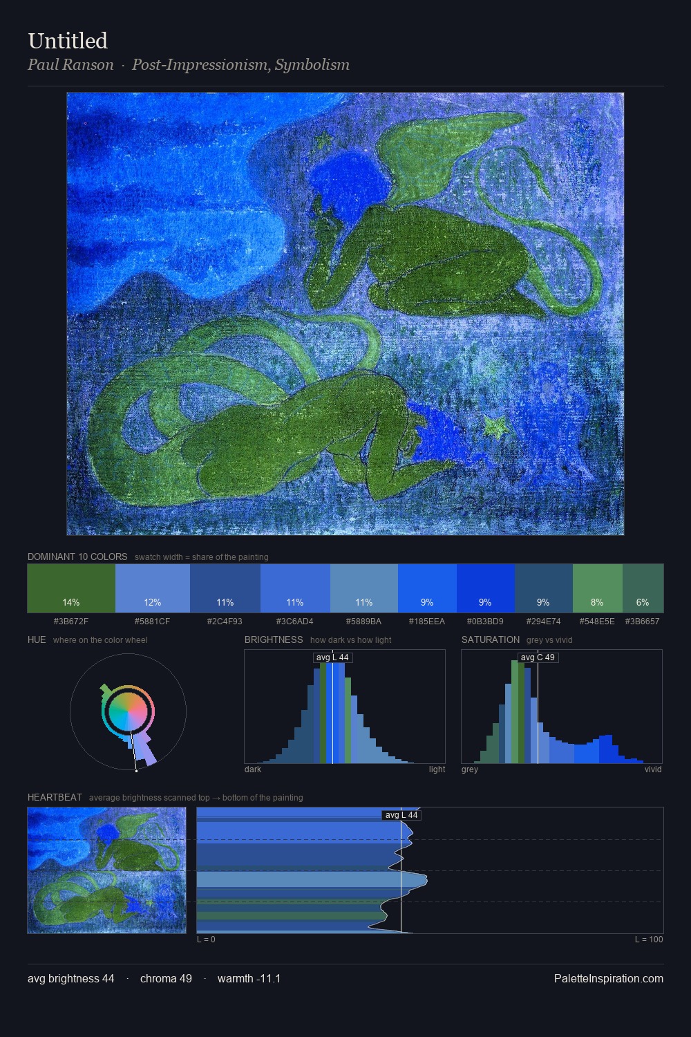
Paul Ranson keeps values measured and balanced, a hallmark of tonal restraint. A distinctly cool atmosphere runs through this palette: sky, water, and mist given colour form. Mid-range chroma keeps the palette grounded - colourful but not strident. The highest-chroma note - #0C3EE3 - appears at just 6.2%, deployed as a precision accent against the quieter ground. Only 19 units separate the lightest and darkest tones - a narrow band that enforces tonal cohesion. The palette has the character of outdoor light: cool, mid-bright, with colour rendered faithfully rather than expressively. Palette 7 sits within the larger chromatic argument that Paul Ranson's complete body of work advances.
Example use cases
- publishing
- corporate identity
- consumer apps
- hospitality
- design agencies
I Love This!
Use This Palette
Copy, export, or download for your project
Copy, export, or download for your project
Copy:
Download:
Share: