Paul Ranson Palette 8
Somber Pewter
Somber Subdued and serious - low-key, low-chroma, emotionally weighted toward gravity.
Pewter Mid-tone warm gray - the color of pewter alloy, between silver and lead.

Palette Analysis
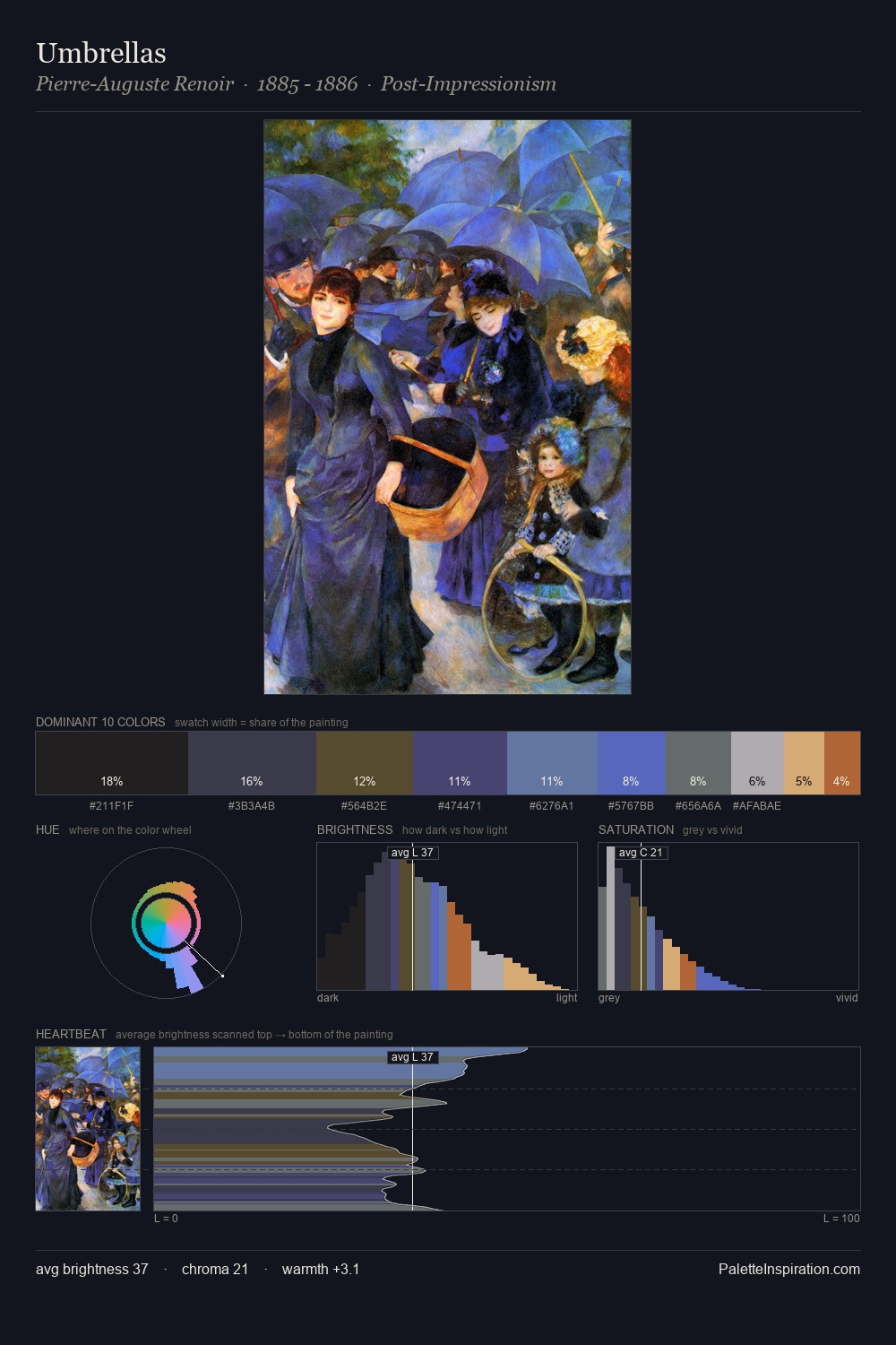
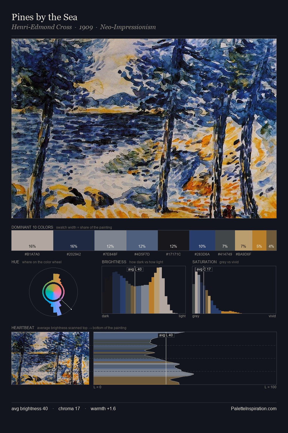
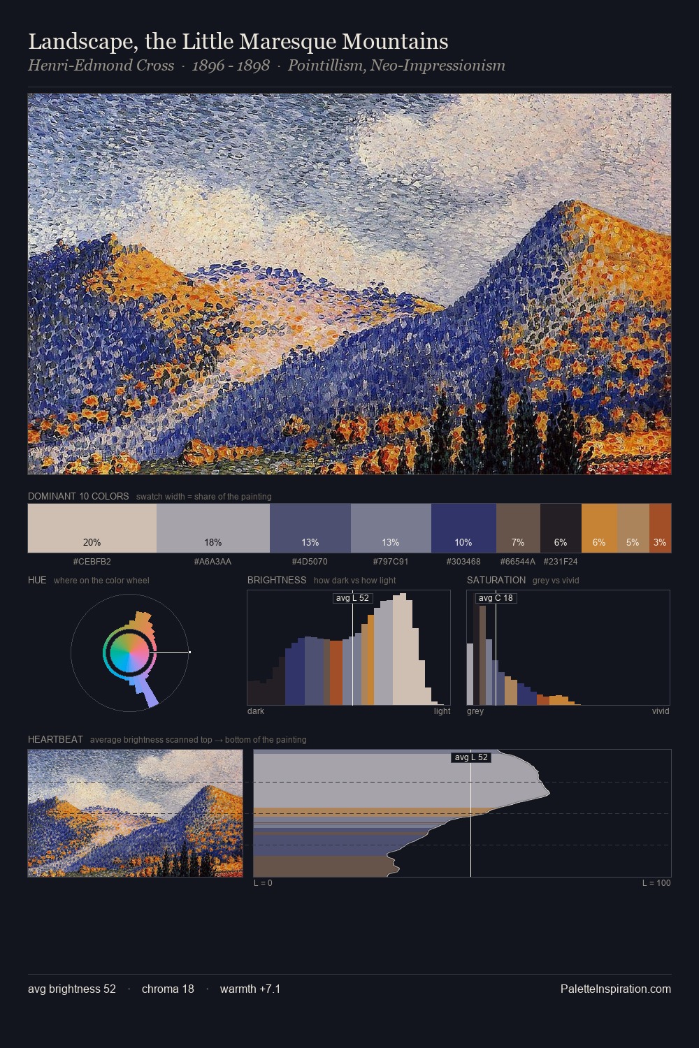
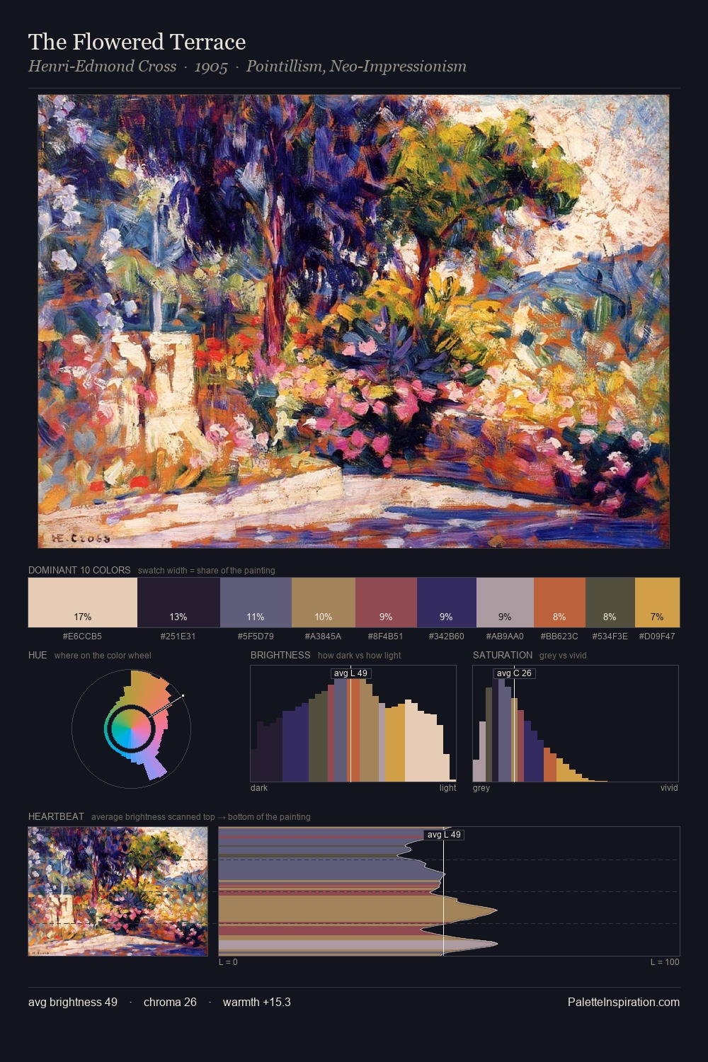
Values in Paul Ranson rest in the mid-range - neither dramatically lit nor steeped in shadow. Temperature is cool-dominant, with blue and green families claiming the largest areas. All colours lean toward grey, building depth through value rather than colour punch. At 3.0%, #D6A76D carries the palette's sharpest chromatic charge: an accent that earns its place precisely because it is withheld. The value range of 54 units sits in the comfortable middle: enough depth, enough light, neither extreme. The palette has the character of outdoor light: cool, mid-bright, with colour rendered faithfully rather than expressively. This is palette 8 of Paul Ranson's sequence - a single chapter in a chromatic story told across many works.
Example use cases
- fintech
- enterprise SaaS
- cybersecurity
- consulting firms
- legal services
I Love This!
Use This Palette
Copy, export, or download for your project
Copy, export, or download for your project
Copy:
Download:
Share: