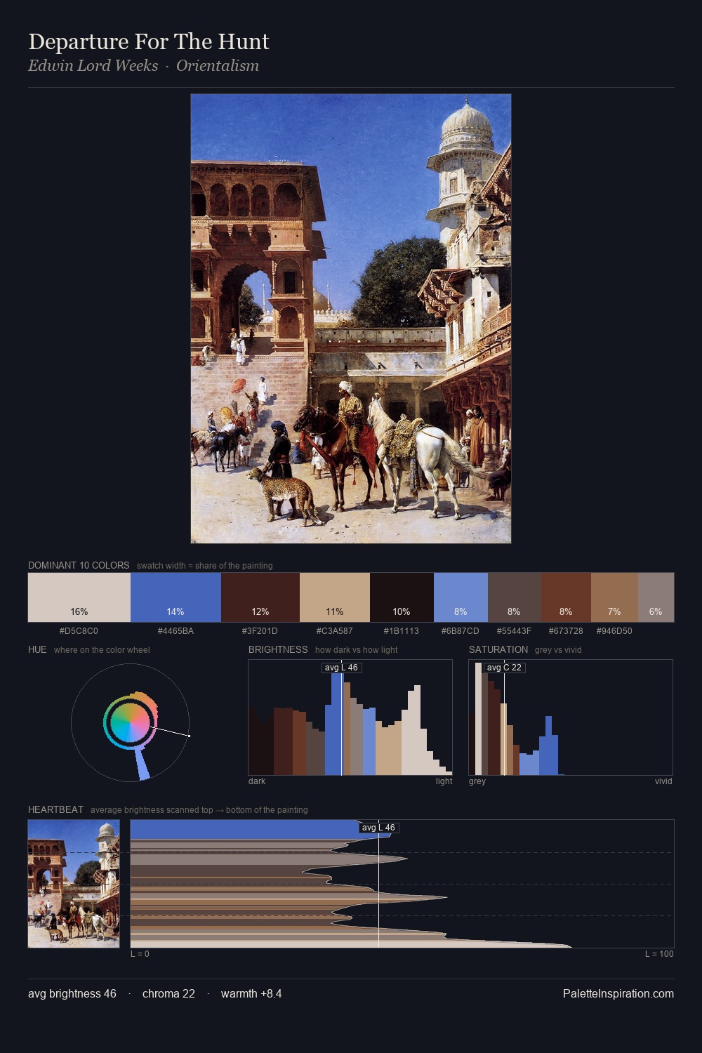
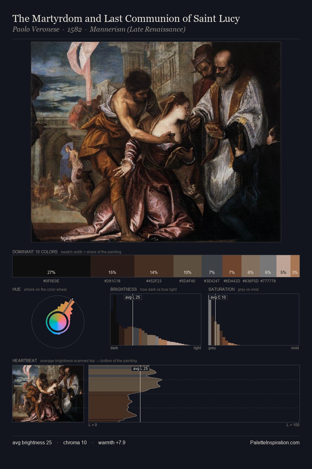
Otto van Veen Palette 5

Palette Analysis
Otto van Veen works almost entirely in the lower half of the value scale, privileging depth over brilliance. Yellow, ochre, sienna: warm hues that Otto van Veen deploys as the palette's primary energy. Saturation is deliberately withheld - the beauty here lies in the near-monochromatic gradations rather than colour difference. A single dominant - #151314 at 33.5% - sets the character of the whole composition. At 3.6%, #987B57 carries the palette's sharpest chromatic charge: an accent that earns its place precisely because it is withheld. A value spread of 63 units gives the palette both depth and air - shadows are genuinely dark, lights genuinely light. This tonal restraint is characteristic of the Otto van Veen approach: colour serves light, not the reverse. Otto van Veen's palette 5 carries its own internal logic while remaining in conversation with the artist's broader colour intelligence.
Example use cases
- theater design
- jewelry brands
- tobacco-adjacent retail
- event branding
- film & entertainment
I Love This!
Copy, export, or download for your project