Bartholomeo Bettera Palette 3
Palette Analysis
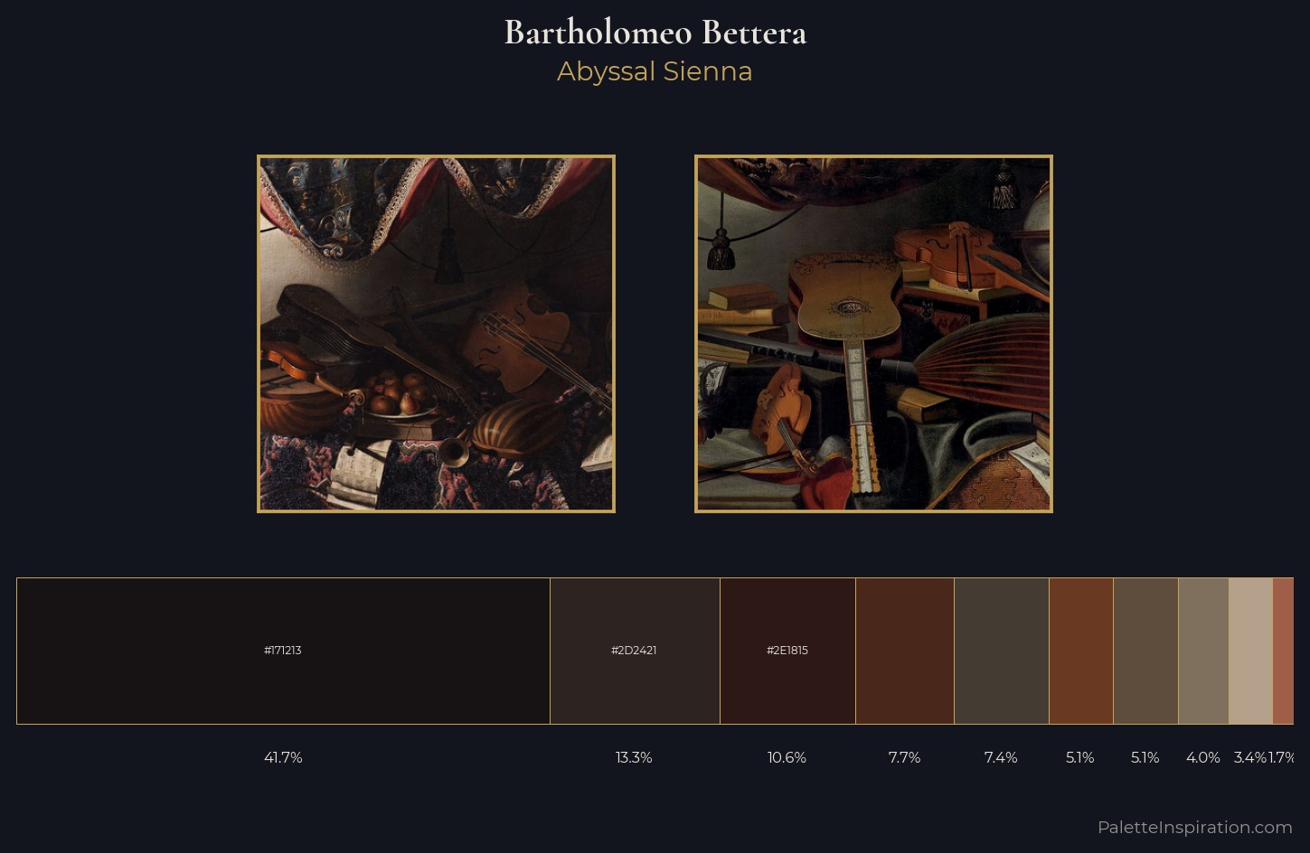
Bartholomeo Bettera works almost entirely in the lower half of the value scale, privileging depth over brilliance. Yellow, ochre, sienna: warm hues that Bartholomeo Bettera deploys as the palette's primary energy. Saturation is deliberately withheld - the beauty here lies in the near-monochromatic gradations rather than colour difference. At 41.7%, #171213 functions less as a colour accent and more as a complete atmospheric environment. Only 1.7% is devoted to #9F5E48, yet that small allocation delivers the palette's entire chromatic tension. Value range is moderate at 53 units - enough contrast for legibility, not so much as to fragment the tonal unity. Together these qualities place Bartholomeo Bettera firmly in the tonal tradition - concerned with mood and atmosphere rather than chromatic display. Palette 3 sits within the larger chromatic argument that Bartholomeo Bettera's complete body of work advances.
Example use cases
- film & entertainment
- fine dining
- spirits branding
- menswear
- theater design
I Love This!
Copy, export, or download for your project