Otto van Veen Palette 6

Palette Analysis
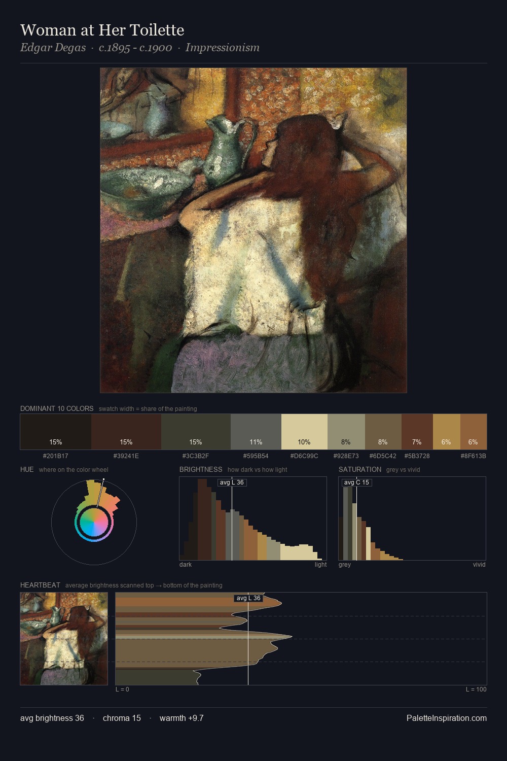
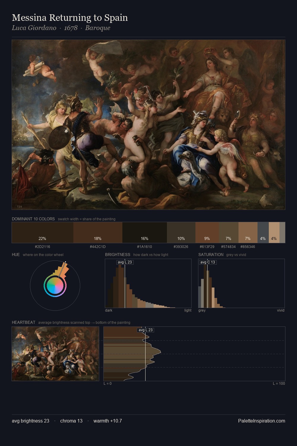
Darkness anchors Otto van Veen; light is rationed, creating dramatic contrast rather than open air. Warm and cool tones are held in careful balance - neither family dominates, creating tension and resolution simultaneously. Every colour is desaturated; the palette proceeds through near-neutrals and gently-coloured greys. A single dominant - #15140D at 25.2% - sets the character of the whole composition. At 4.6%, #835B32 carries the palette's sharpest chromatic charge: an accent that earns its place precisely because it is withheld. The palette spans 47 value units: a measured range that delivers coherence over drama. The combination of low values, muted chroma, and compressed range is the signature of the Tonalist mode - painting as atmosphere. Palette 6 sits within the larger chromatic argument that Otto van Veen's complete body of work advances.
Example use cases
- theater design
- jewelry brands
- tobacco-adjacent retail
- event branding
- film & entertainment
I Love This!
Copy, export, or download for your project