Otto van Veen Palette 4

Palette Analysis
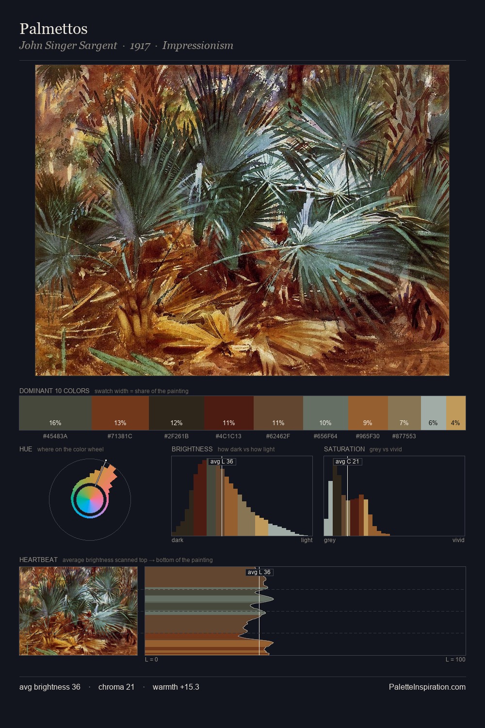
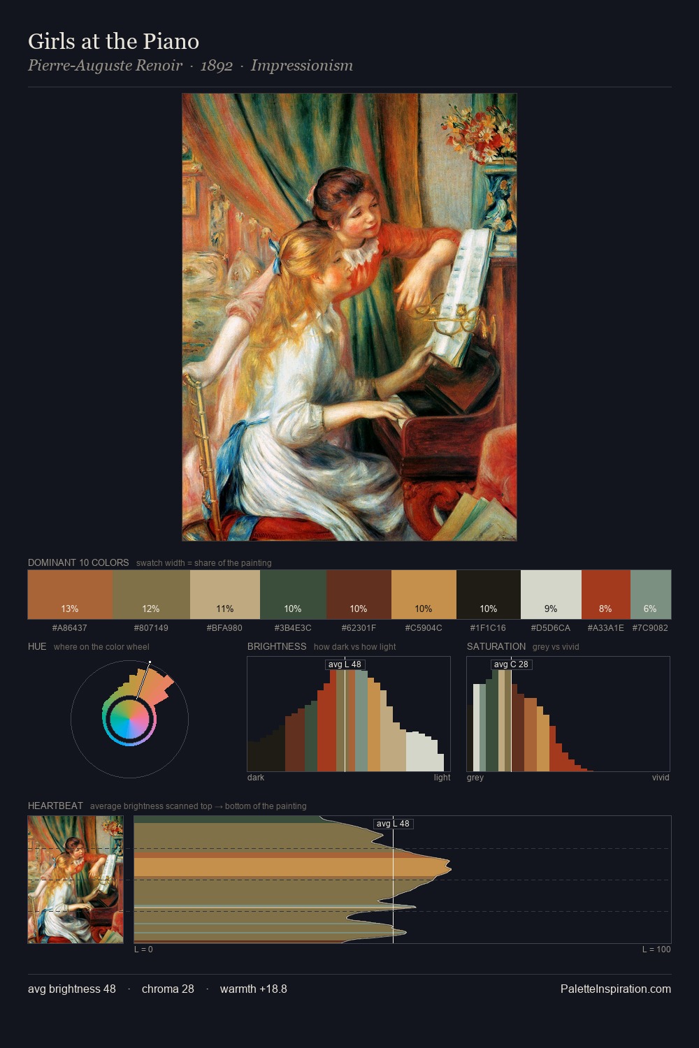
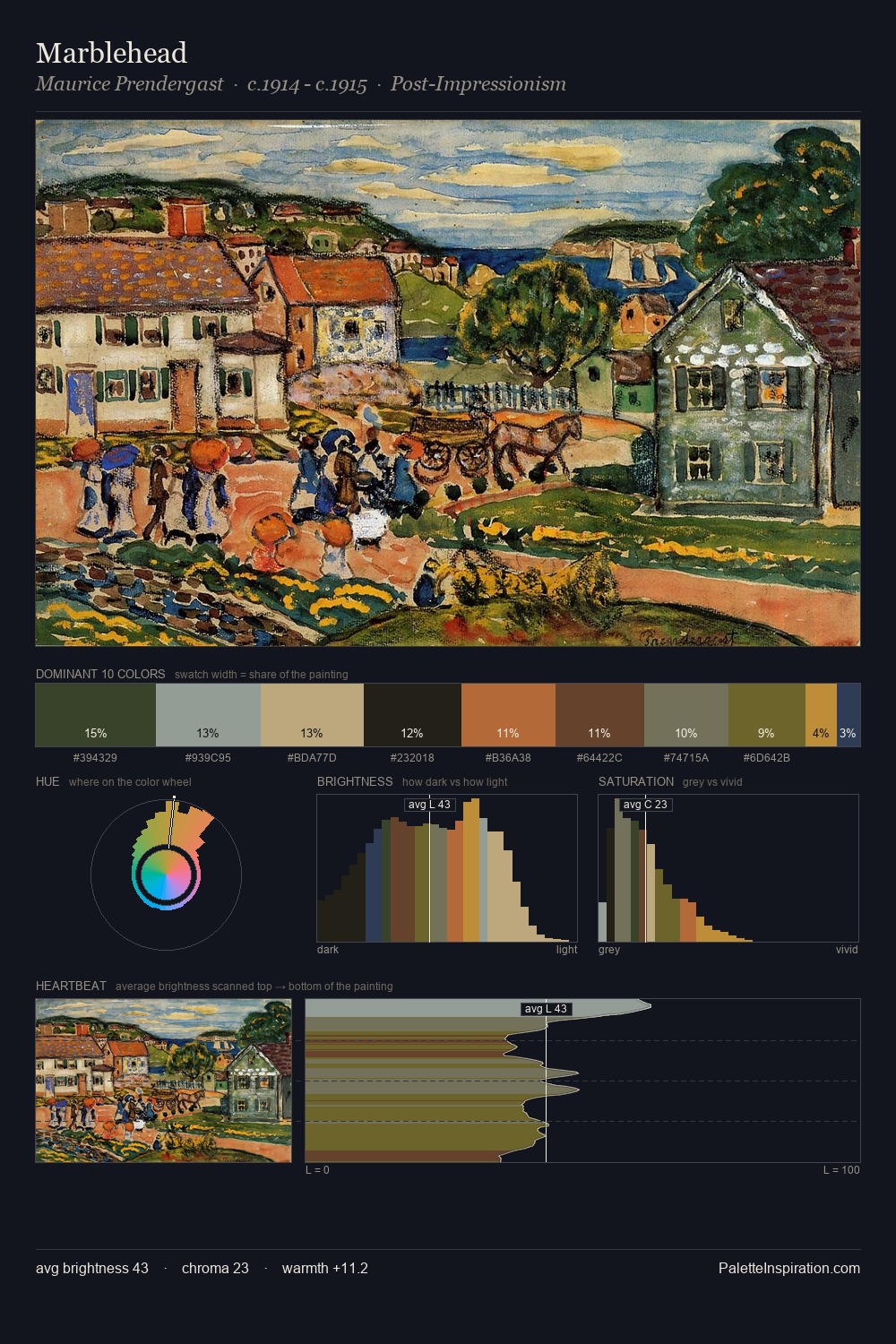
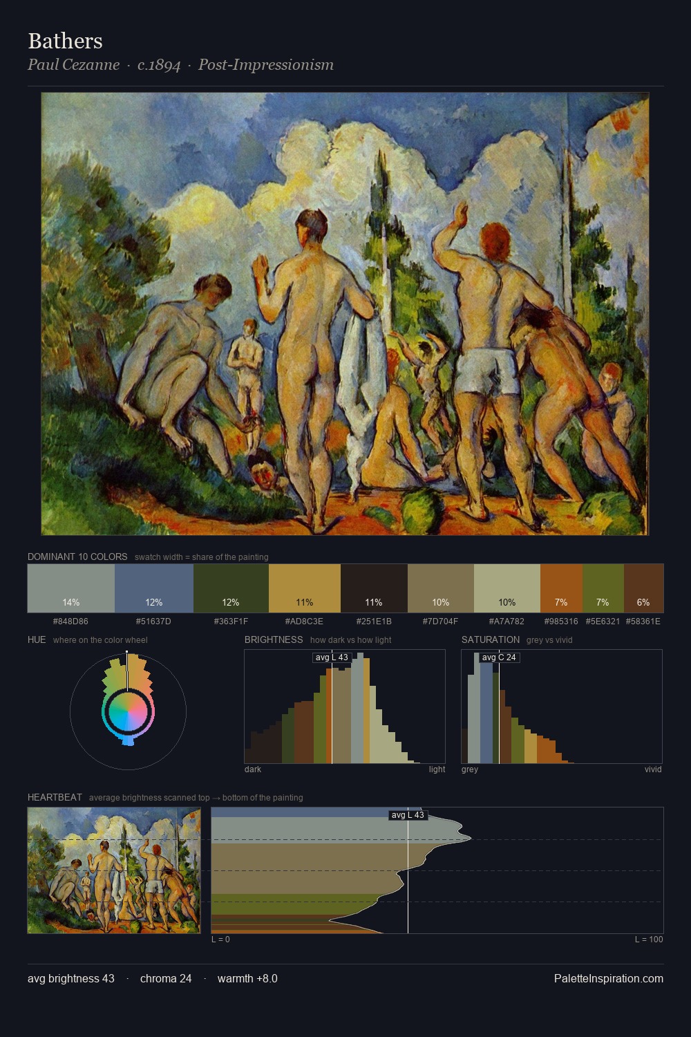
Otto van Veen occupies the comfortable middle of the value scale, avoiding both extremes to hold the eye in a sustained middle grey. Otto van Veen builds on cool foundations: the palette favours the blue-cyan-green arc. Chroma hovers near zero; colour declares itself through subtle shifts in hue rather than outright saturation. #A78D3E functions as the palette's exclamation mark: highest chroma, lowest percentage (2.9%). The palette spans 51 value units: a measured range that delivers coherence over drama. High luminosity and cool temperature suggest the plein-air condition: unfiltered daylight and open sky. Otto van Veen's palette 4 carries its own internal logic while remaining in conversation with the artist's broader colour intelligence.
Example use cases
- theater design
- jewelry brands
- tobacco-adjacent retail
- event branding
- film & entertainment
I Love This!
Copy, export, or download for your project