Otto van Veen Palette 2
Penumbral Bister
Penumbral Partial shadow - the transitional zone between light and full dark, soft-edged.
Bister Dark warm brown - a traditional ink and wash pigment made from wood soot.

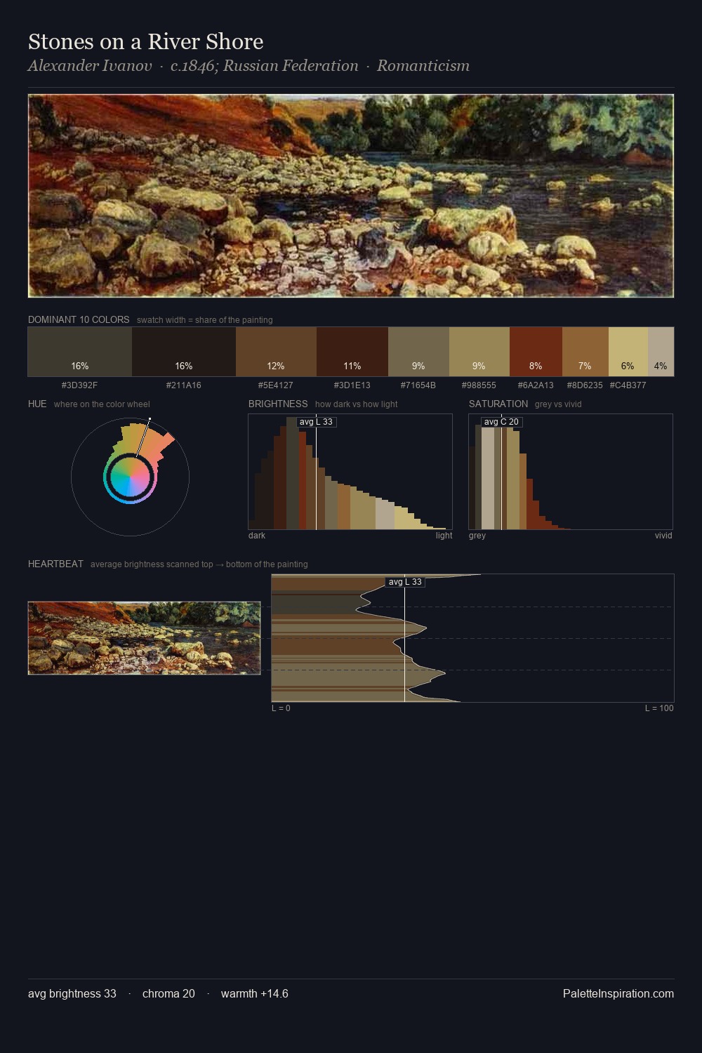
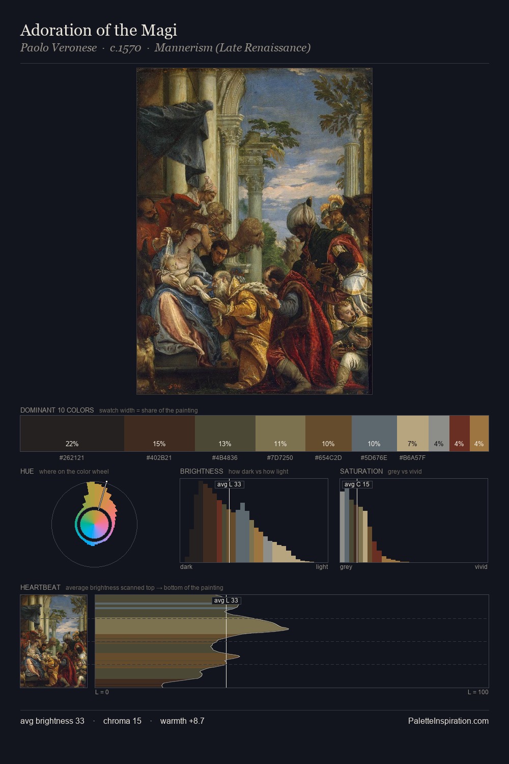
Palette Analysis
The value structure of Otto van Veen is mid-key: quiet, controlled, and cohesive. Blues and teal-greys govern the palette, lending it an aquatic or atmospheric quality. Every colour is desaturated; the palette proceeds through near-neutrals and gently-coloured greys. The highest-chroma note - #9C8053 - appears at just 9.3%, deployed as a precision accent against the quieter ground. 53 units of value spread create a palette that is varied but unified - contrast in the service of harmony. The mid-to-high key, cool bias, and moderate chroma point to outdoor observation - sky and diffused daylight as the dominant light source. This is palette 2 of Otto van Veen's sequence - a single chapter in a chromatic story told across many works.
Example use cases
- theater design
- jewelry brands
- tobacco-adjacent retail
- event branding
- film & entertainment
I Love This!
Use This Palette
Copy, export, or download for your project
Copy, export, or download for your project
Copy:
Download:
Share: