Niko Pirosmani Palette 6

Palette Analysis
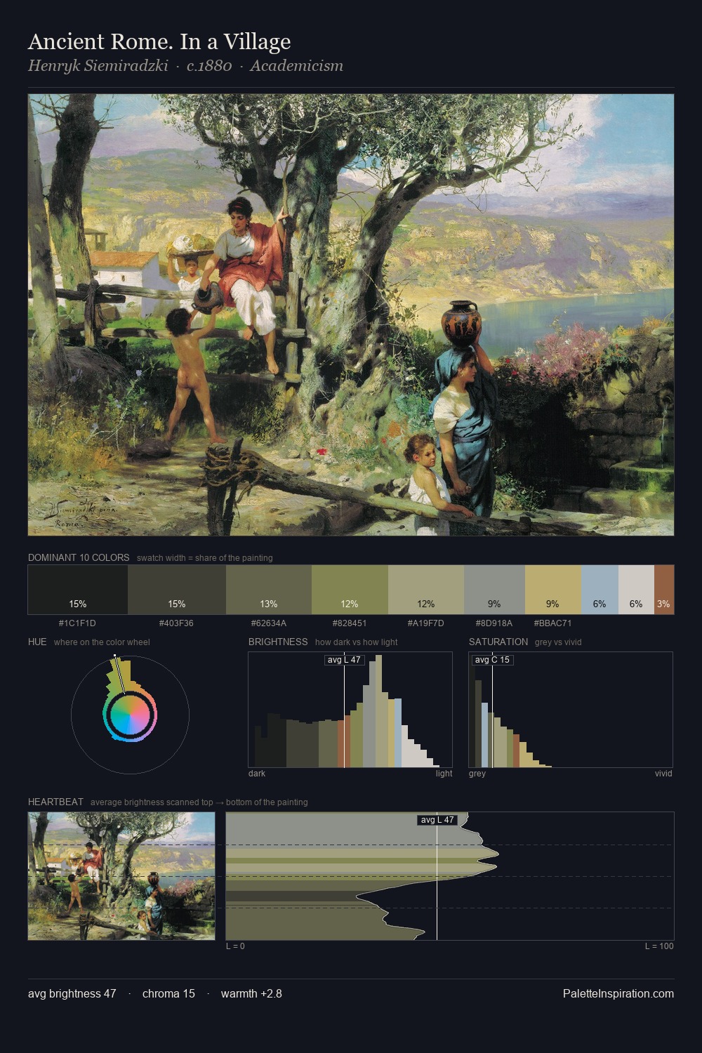
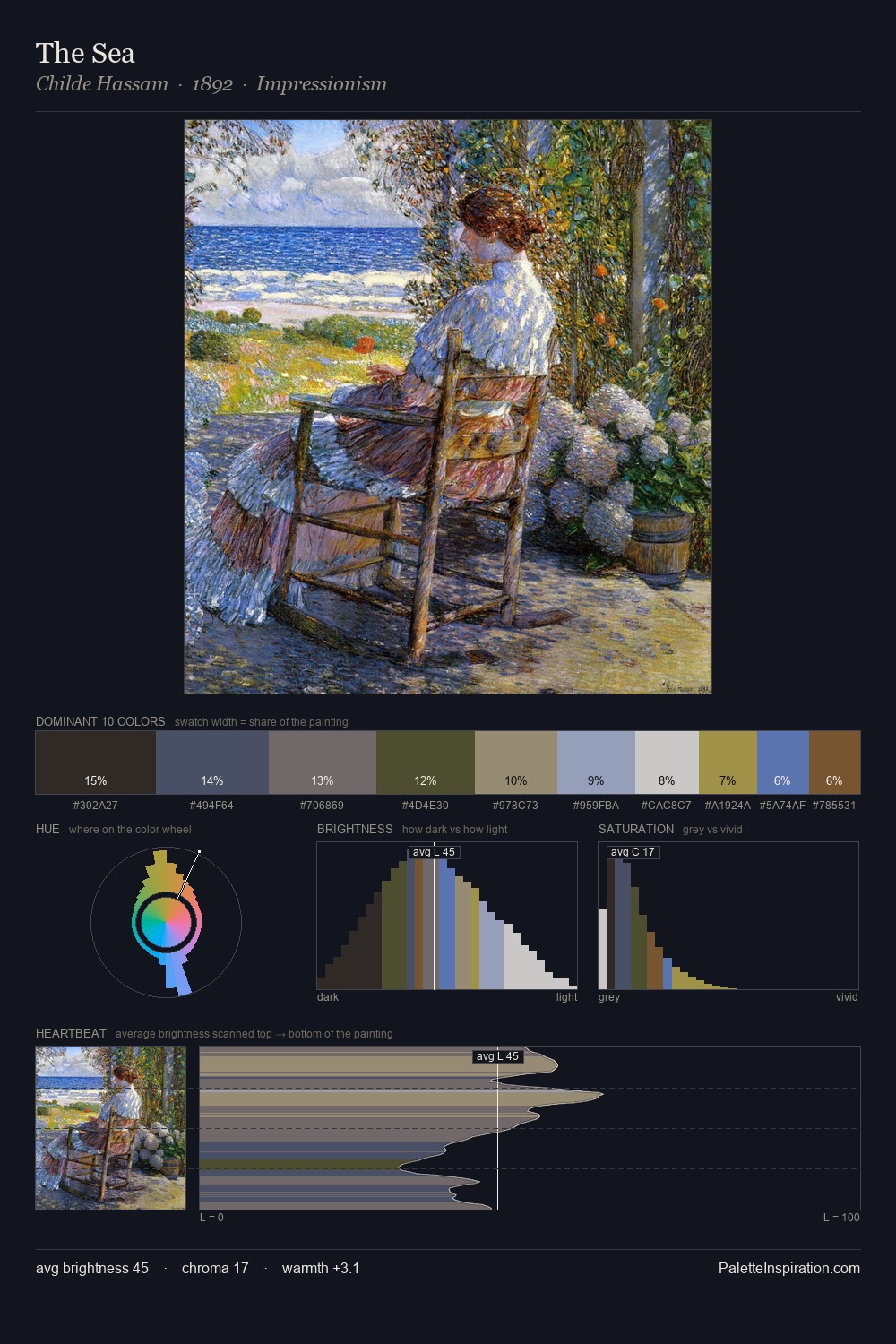
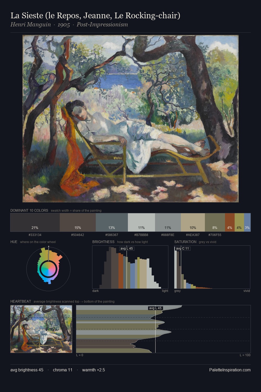
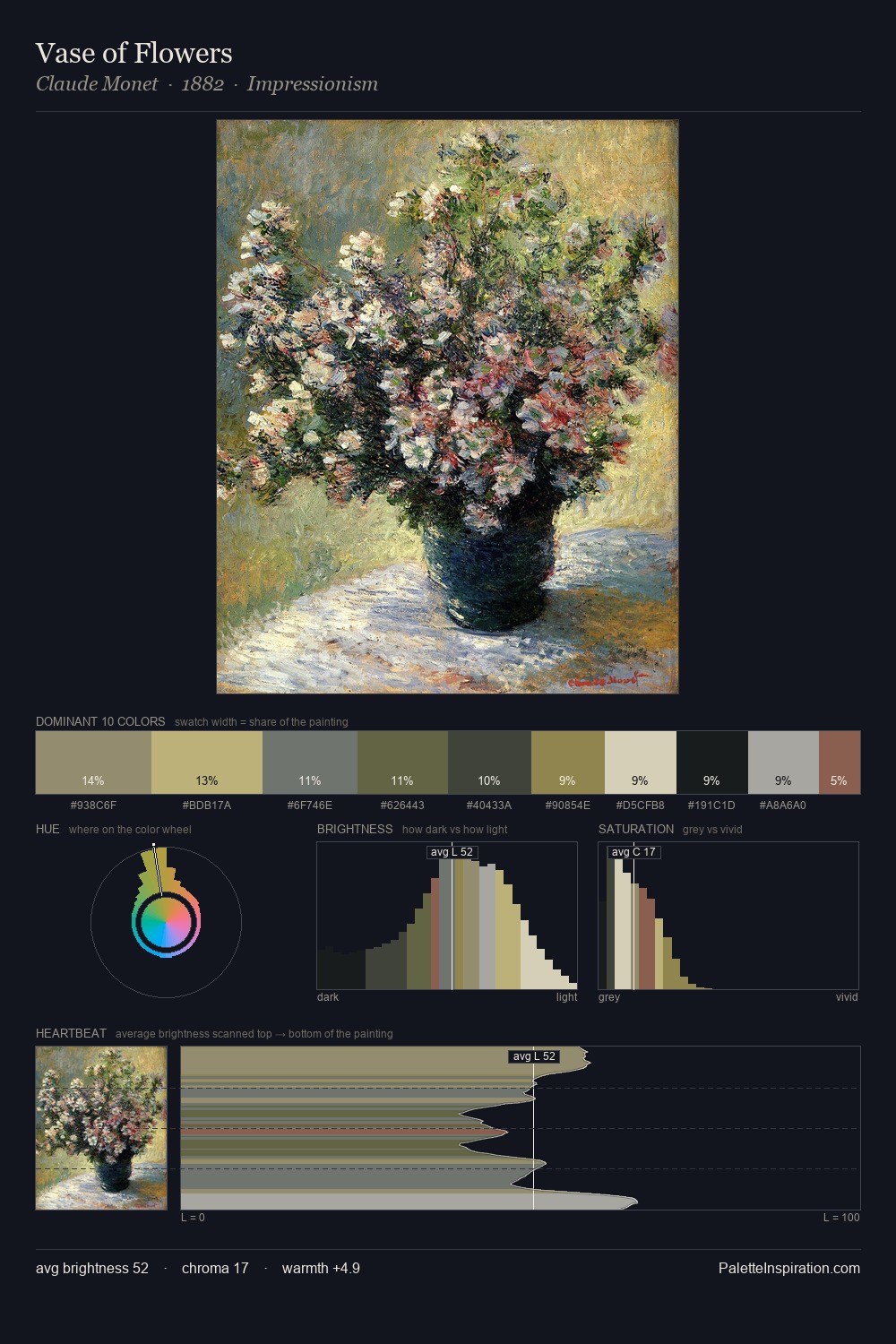
Niko Pirosmani occupies the comfortable middle of the value scale, avoiding both extremes to hold the eye in a sustained middle grey. Blues and teal-greys govern the palette, lending it an aquatic or atmospheric quality. The absence of saturated colour is itself an expressive choice: this is a palette of restraint and atmosphere. At 36.1%, #20201F functions less as a colour accent and more as a complete atmospheric environment. #56593B functions as the palette's exclamation mark: highest chroma, lowest percentage (5.7%). 57 units of value range underpin the palette's structural clarity: the eye always knows where light falls. High luminosity and cool temperature suggest the plein-air condition: unfiltered daylight and open sky. Palette 6 sits within the larger chromatic argument that Niko Pirosmani's complete body of work advances.
Example use cases
- music labels
- luxury hospitality
- editorial photography
- leather goods
- premium streaming
I Love This!
Copy, export, or download for your project