Niko Pirosmani Palette 12

Palette Analysis
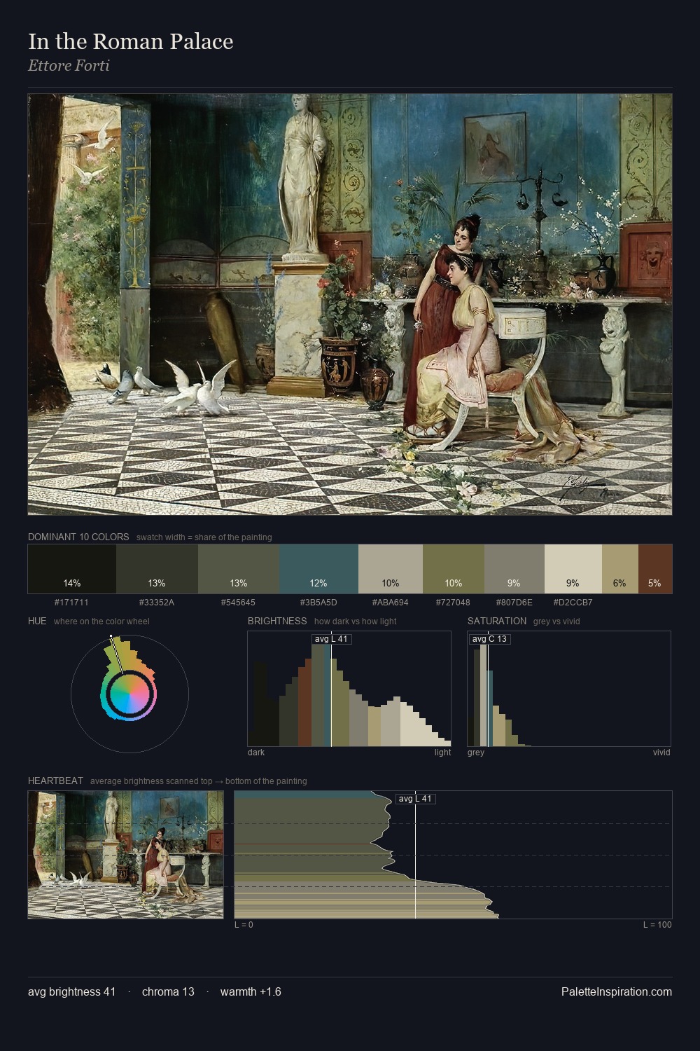
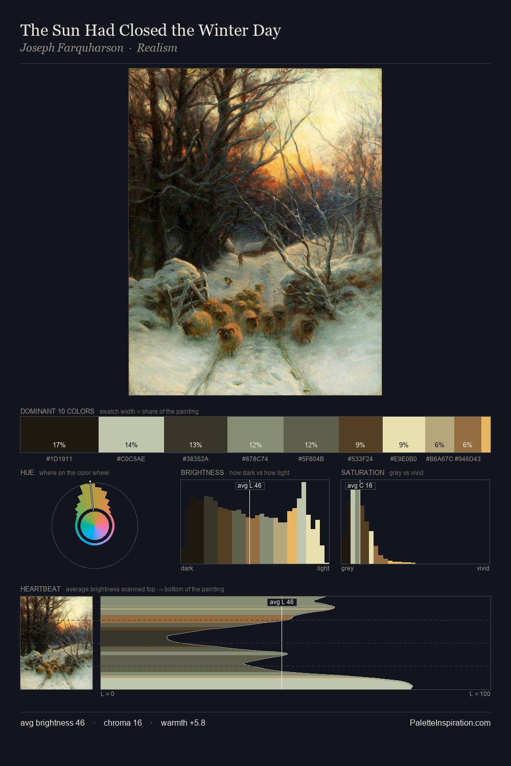
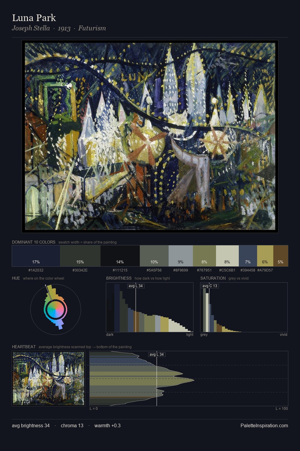
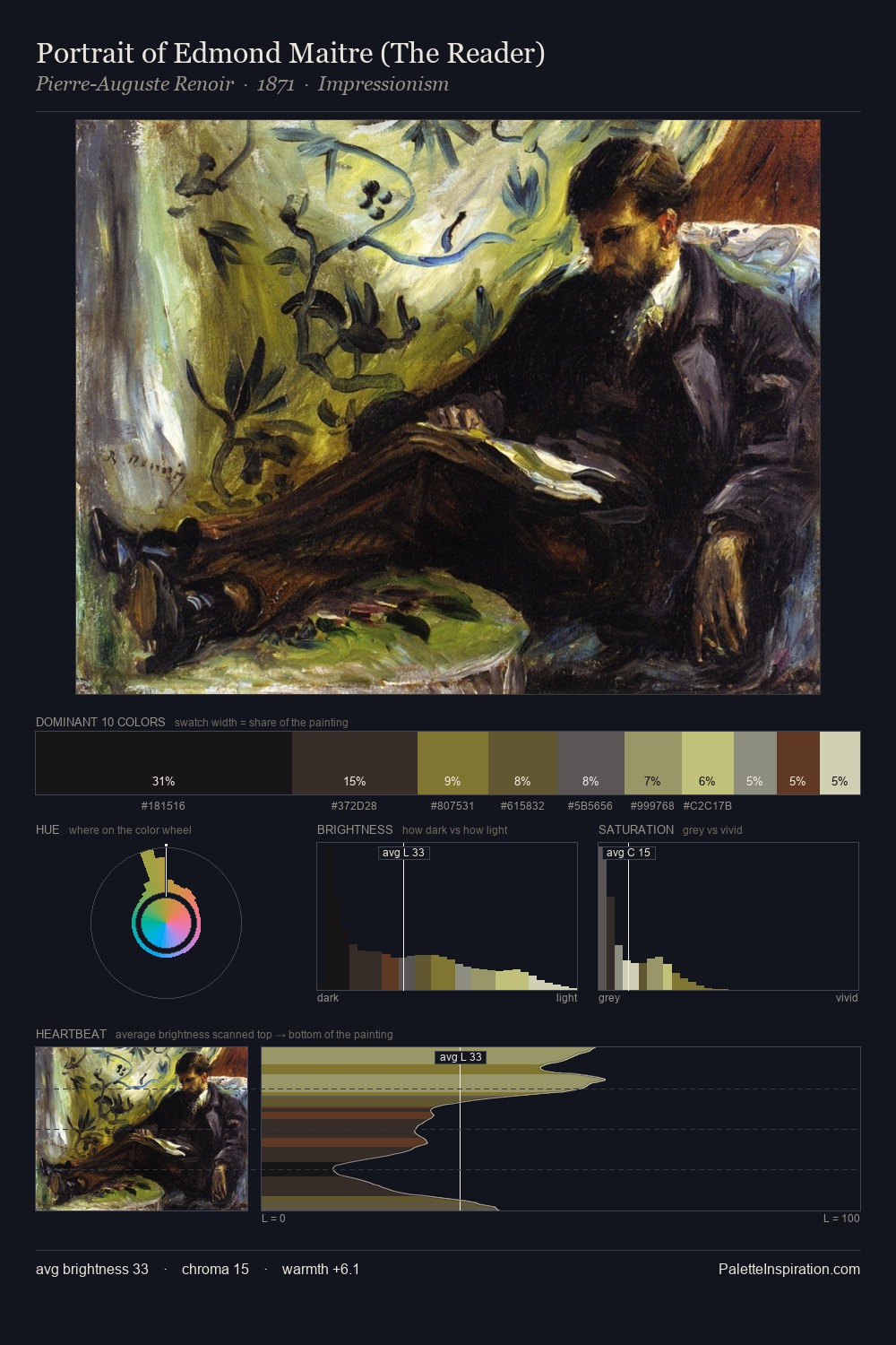
Niko Pirosmani is built on dark foundations, with values clustered toward shadow. Cool hues prevail: blues, greens, and greys anchor the palette's emotional temperature. Chroma is kept low across all colours, producing the soft, enveloping quality that characterises tonal painting. At 32.7%, #101111 functions less as a colour accent and more as a complete atmospheric environment. The saturated accent, #AD9D68, registers at 3.7% - sparse enough to feel like a deliberate surprise. A value spread of 65 units gives the palette both depth and air - shadows are genuinely dark, lights genuinely light. The combination of low values, muted chroma, and compressed range is the signature of the Tonalist mode - painting as atmosphere. In the context of Niko Pirosmani's full range of palettes, group 12 represents one movement in an ongoing chromatic dialogue.
Example use cases
- film & entertainment
- fine dining
- spirits branding
- menswear
- theater design
I Love This!
Copy, export, or download for your project