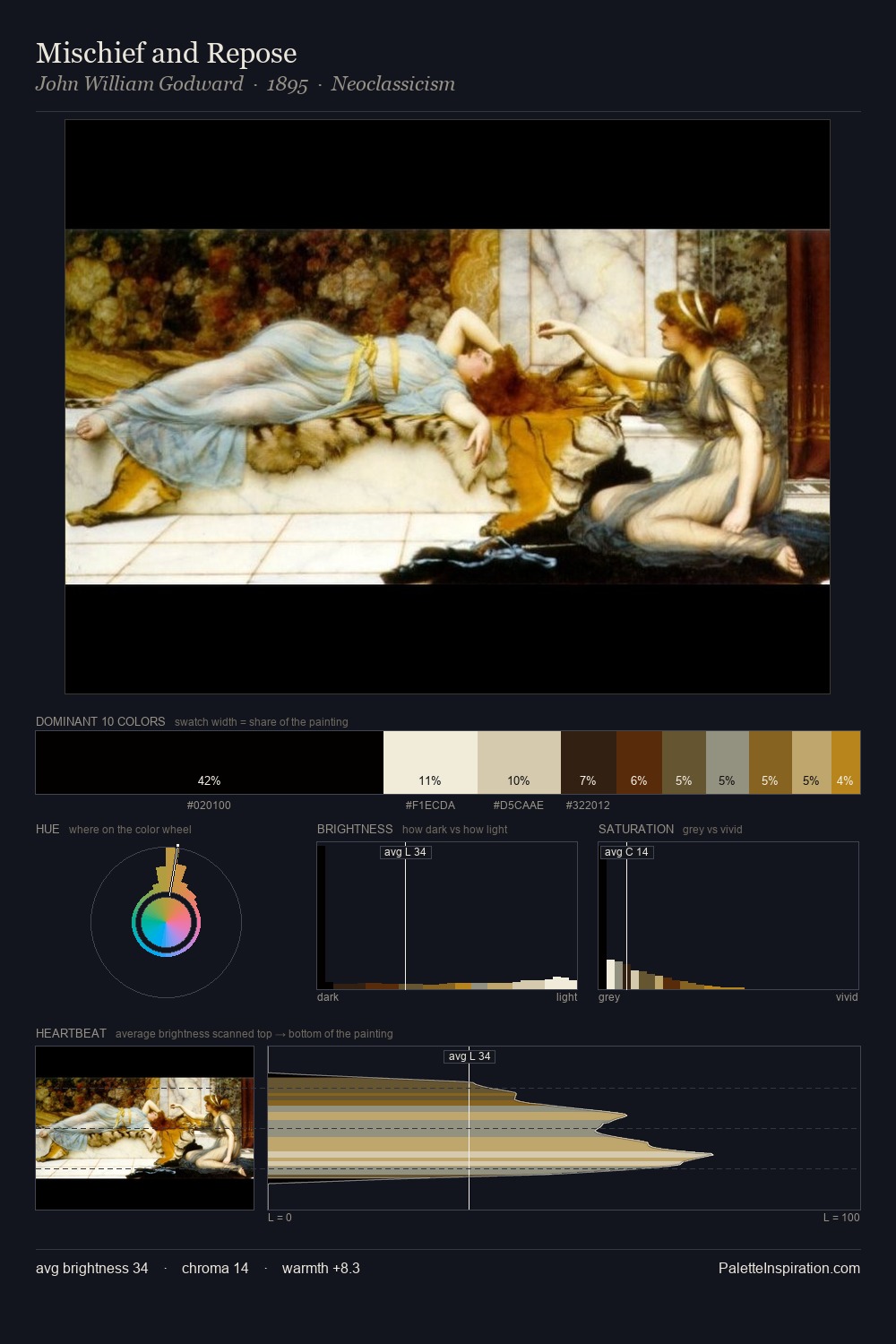
Niko Pirosmani Palette 2

Palette Analysis
Niko Pirosmani distributes its values across the middle register, creating harmony without high contrast. Blues and teal-greys govern the palette, lending it an aquatic or atmospheric quality. All colours lean toward grey, building depth through value rather than colour punch. A single dominant - #13120E at 26.9% - sets the character of the whole composition. The highest-chroma note - #C2922B - appears at just 2.2%, deployed as a precision accent against the quieter ground. From deepest dark to palest light, the palette traverses 73 units of the value scale - a span that creates natural depth. The mid-to-high key, cool bias, and moderate chroma point to outdoor observation - sky and diffused daylight as the dominant light source. Palette 2 sits within the larger chromatic argument that Niko Pirosmani's complete body of work advances.
Example use cases
- theater design
- jewelry brands
- tobacco-adjacent retail
- event branding
- film & entertainment
I Love This!
Copy, export, or download for your project