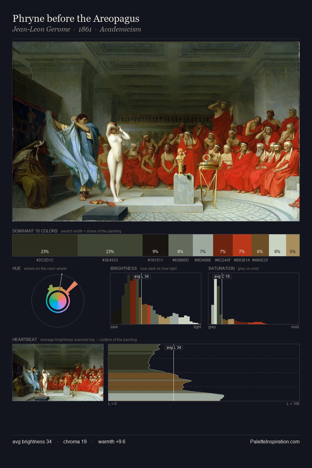
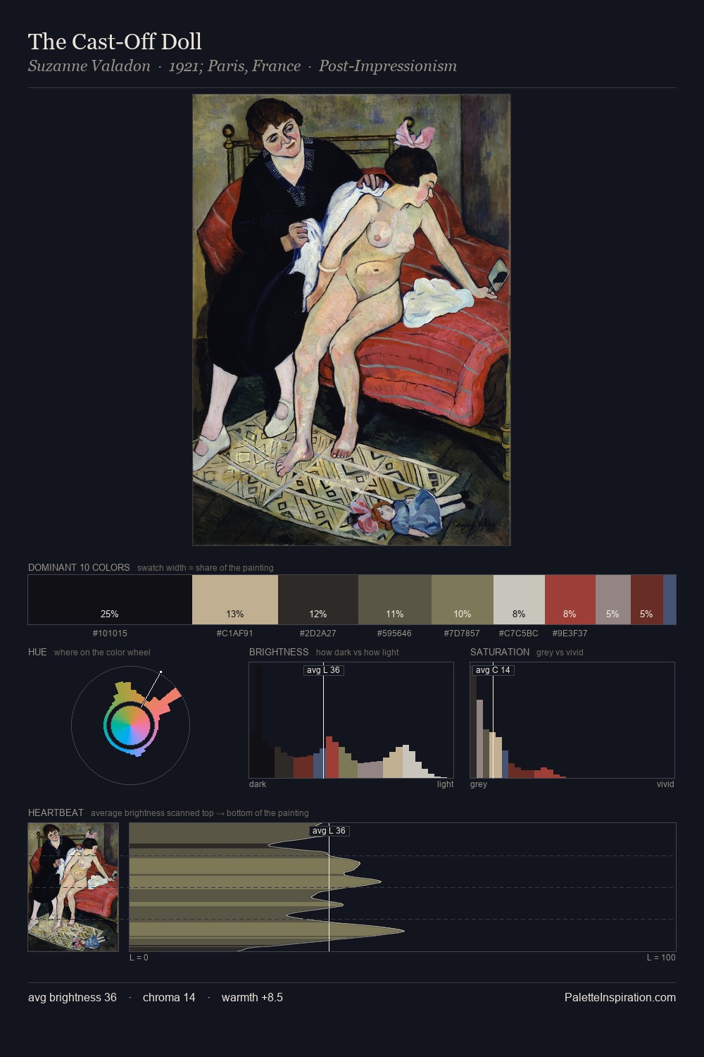
Niko Pirosmani Palette 5

Palette Analysis
Niko Pirosmani sits in the centre of the value range, lending the palette a sense of even, sustained light. Temperature is cool-dominant, with blue and green families claiming the largest areas. Saturation is deliberately withheld - the beauty here lies in the near-monochromatic gradations rather than colour difference. 41.9% of the palette belongs to #090B0B, a concentration that makes it the unmistakable visual centre. The highest-chroma note - #272F13 - appears at just 1.9%, deployed as a precision accent against the quieter ground. 73 units of value range underpin the palette's structural clarity: the eye always knows where light falls. The palette has the character of outdoor light: cool, mid-bright, with colour rendered faithfully rather than expressively. Palette 5 sits within the larger chromatic argument that Niko Pirosmani's complete body of work advances.
Example use cases
- publishing
- corporate identity
- consumer apps
- hospitality
- design agencies
I Love This!
Copy, export, or download for your project