Neo-Impressionism Palette 7
Gleaming Ivory
Gleaming Bright and polished - high-key, often warm, suggesting reflective or luminous surfaces.
Ivory Warm creamy white - the color of natural ivory, warmer than pure white.

Palette Analysis
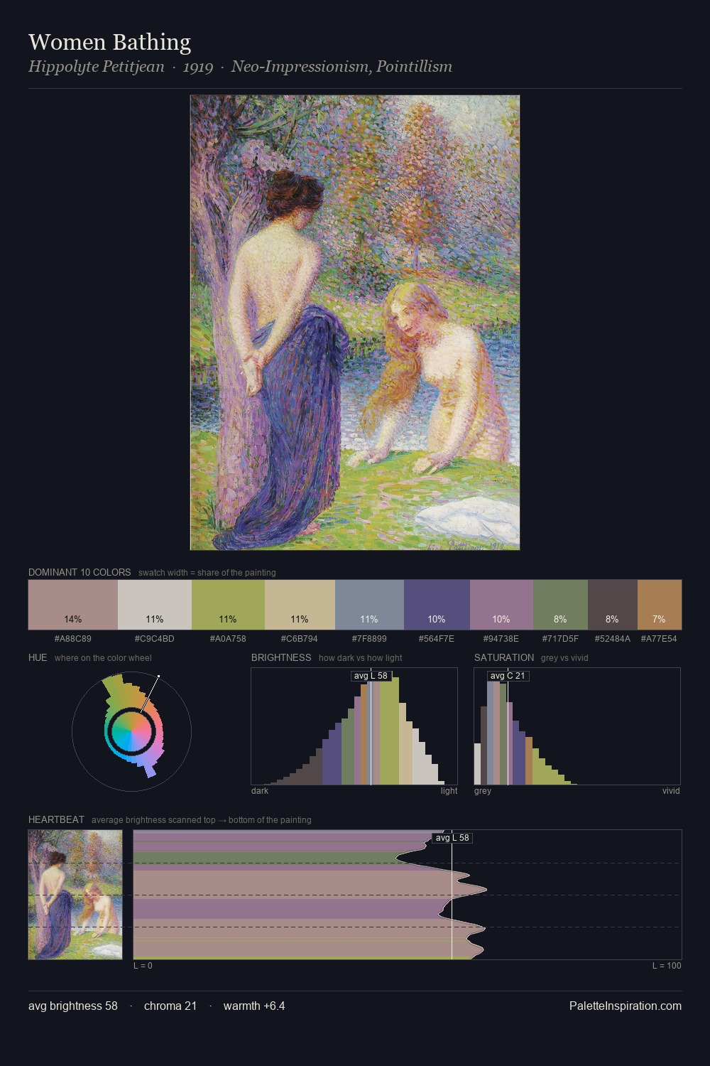
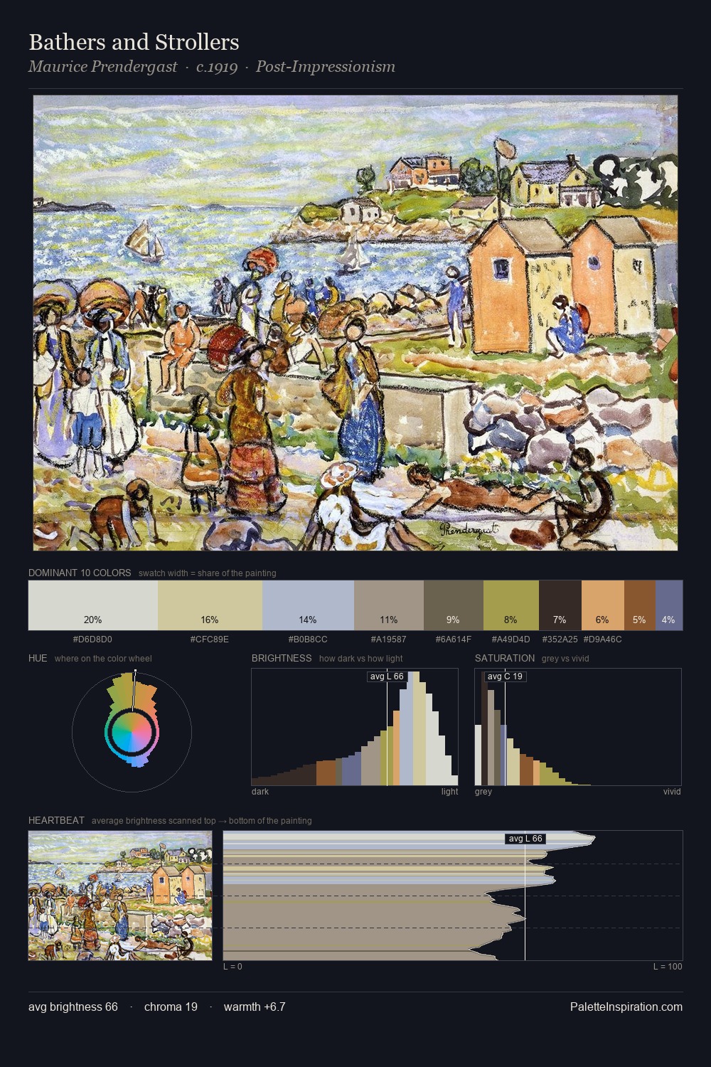
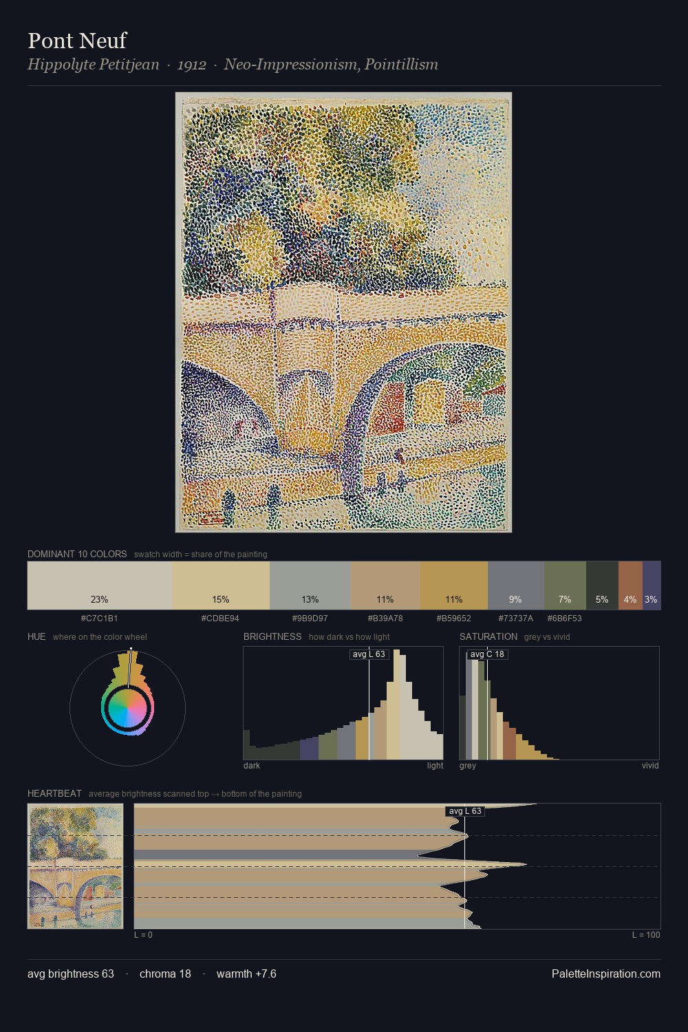
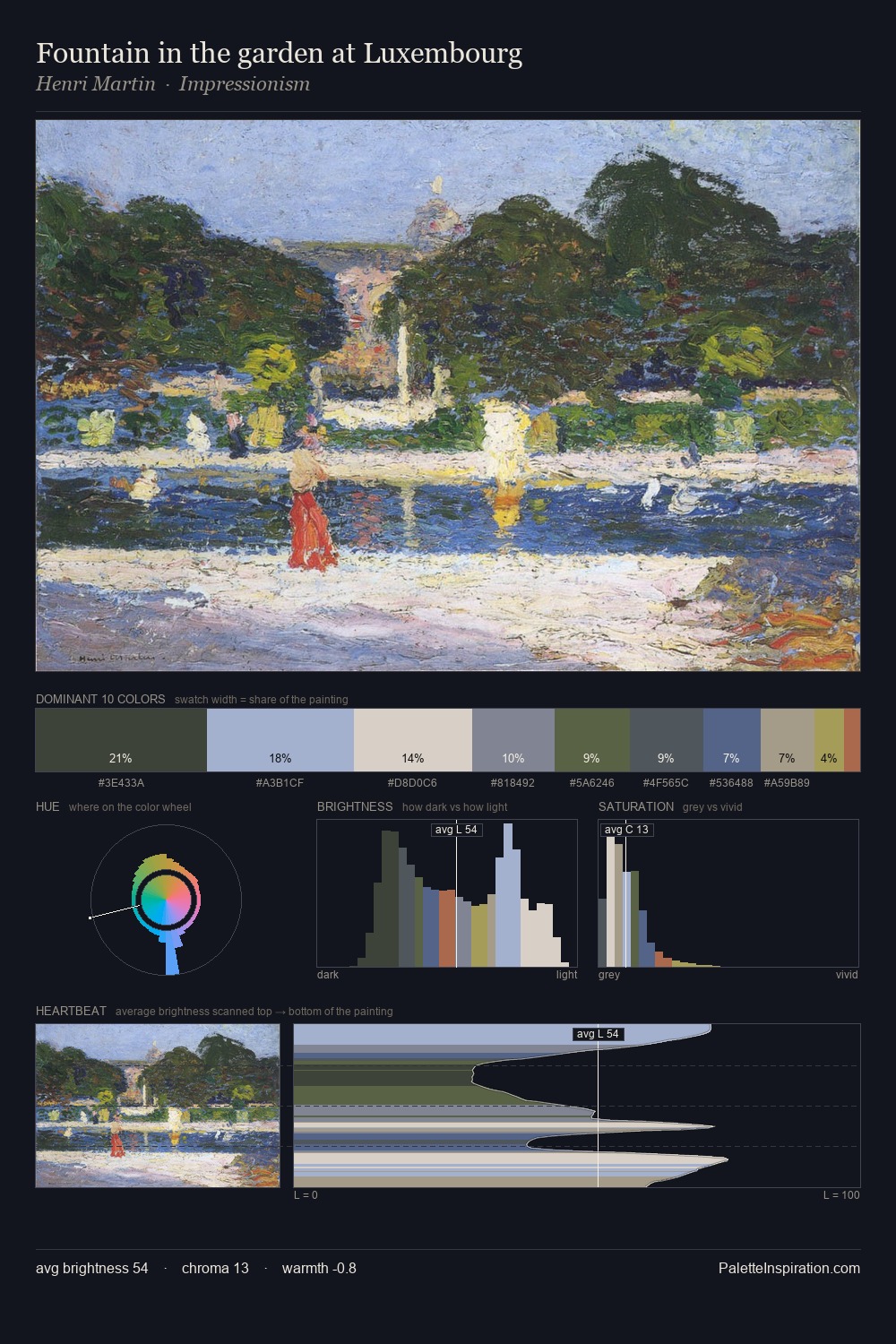
Neo-Impressionism works in the upper reaches of the value scale, creating an atmosphere of brightness and expansiveness. Cool tones set the register here - the blues and greens easily outweigh any warm accents. All colours lean toward grey, building depth through value rather than colour punch. Only 4.1% is devoted to #ABAC5D, yet that small allocation delivers the palette's entire chromatic tension. The full value range is 56 units: broad enough to build convincing three-dimensional form. High luminosity and cool temperature suggest the plein-air condition: unfiltered daylight and open sky.
Example use cases
- florist branding
- event design
- real estate
- jewelry retail
- hospitality branding
I Love This!
Use This Palette
Copy, export, or download for your project
Copy, export, or download for your project
Copy:
Download:
Share: