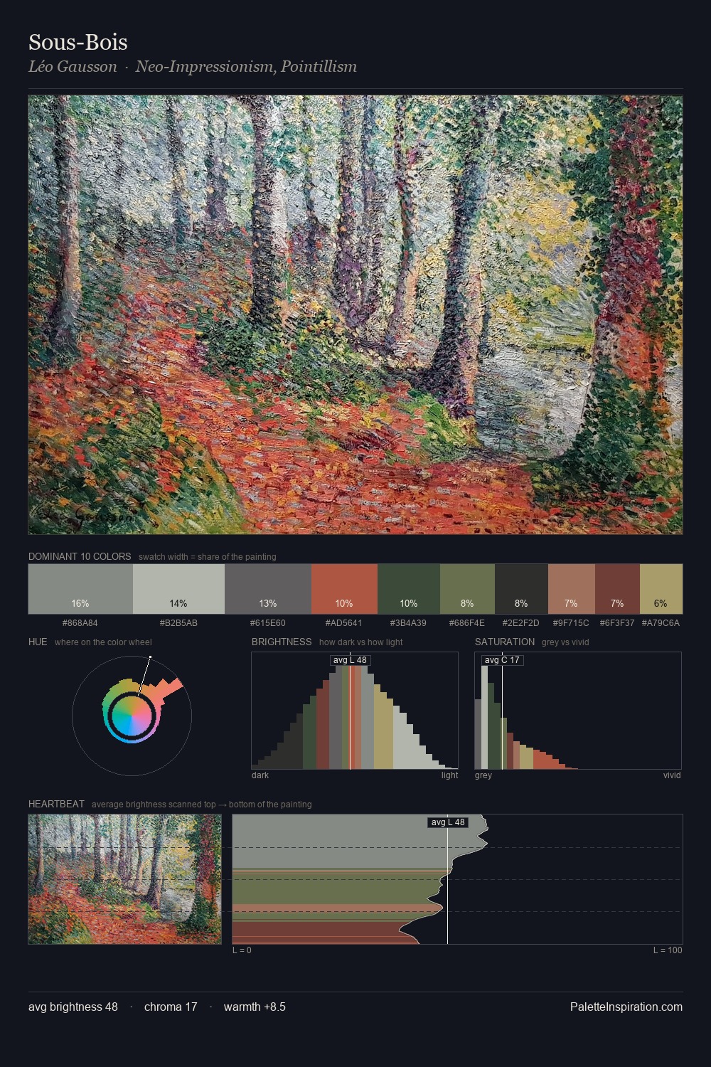
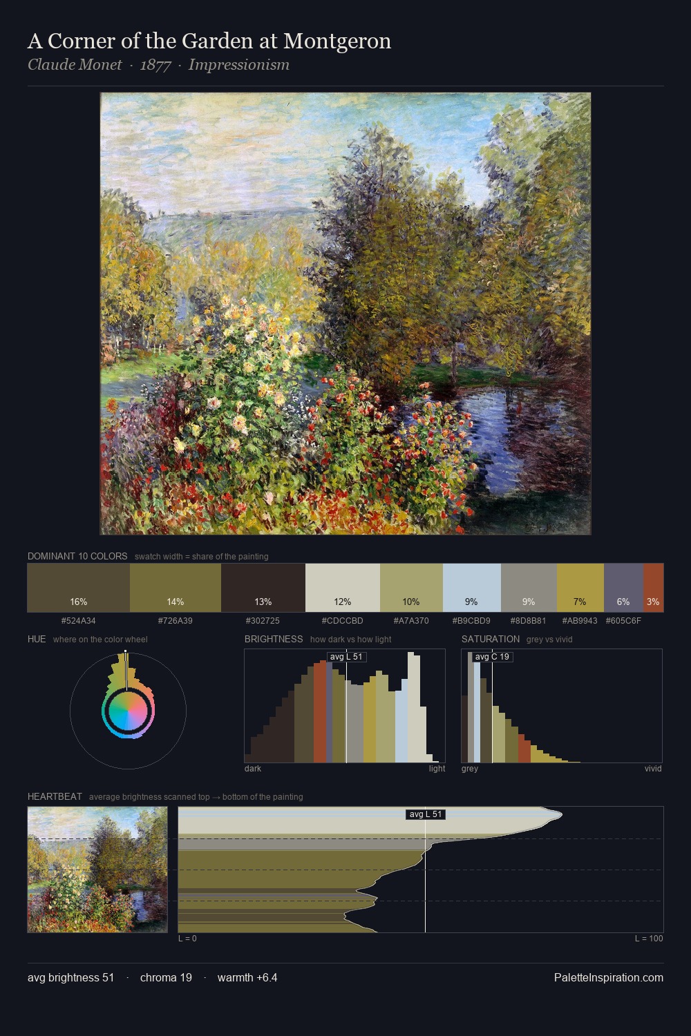
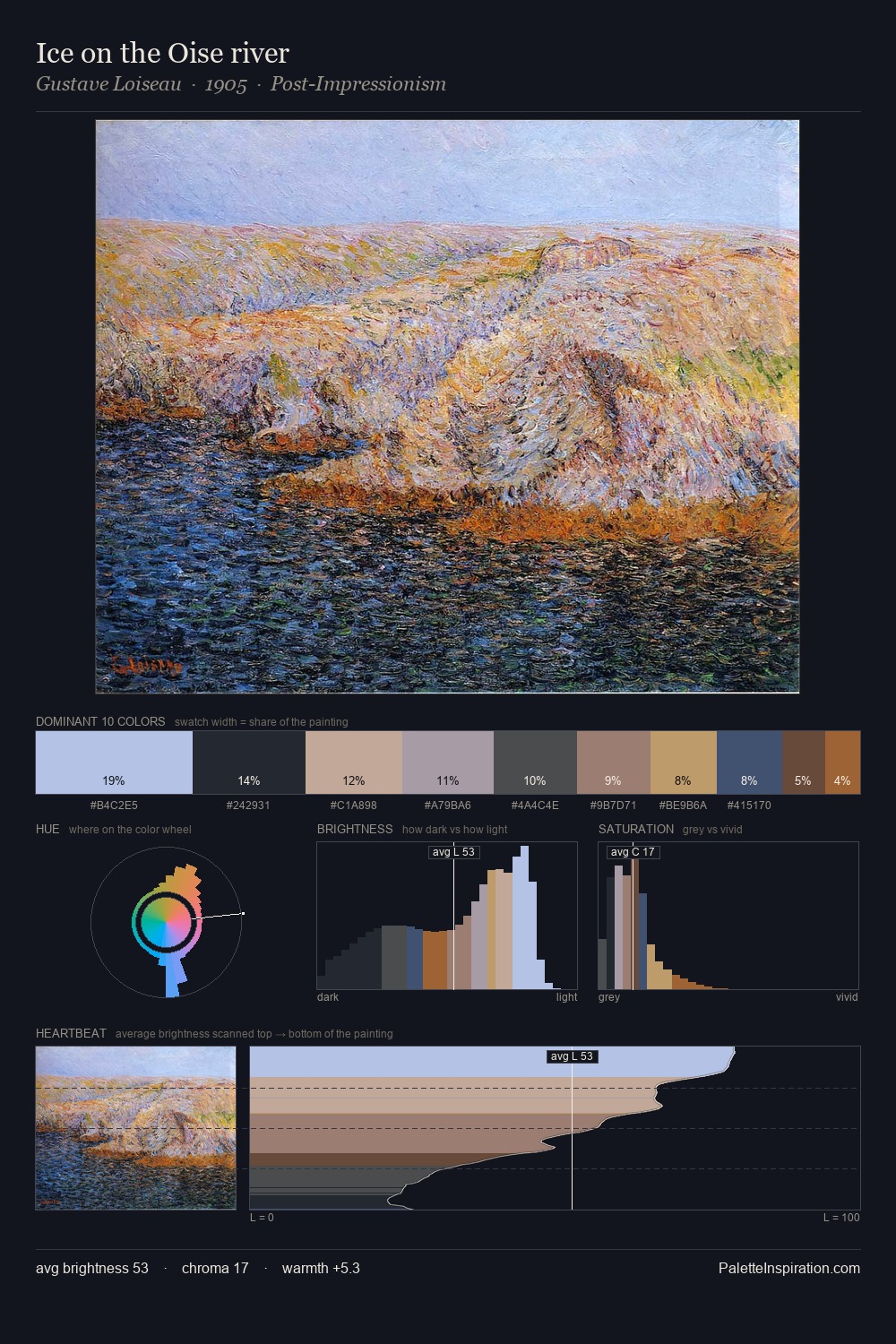
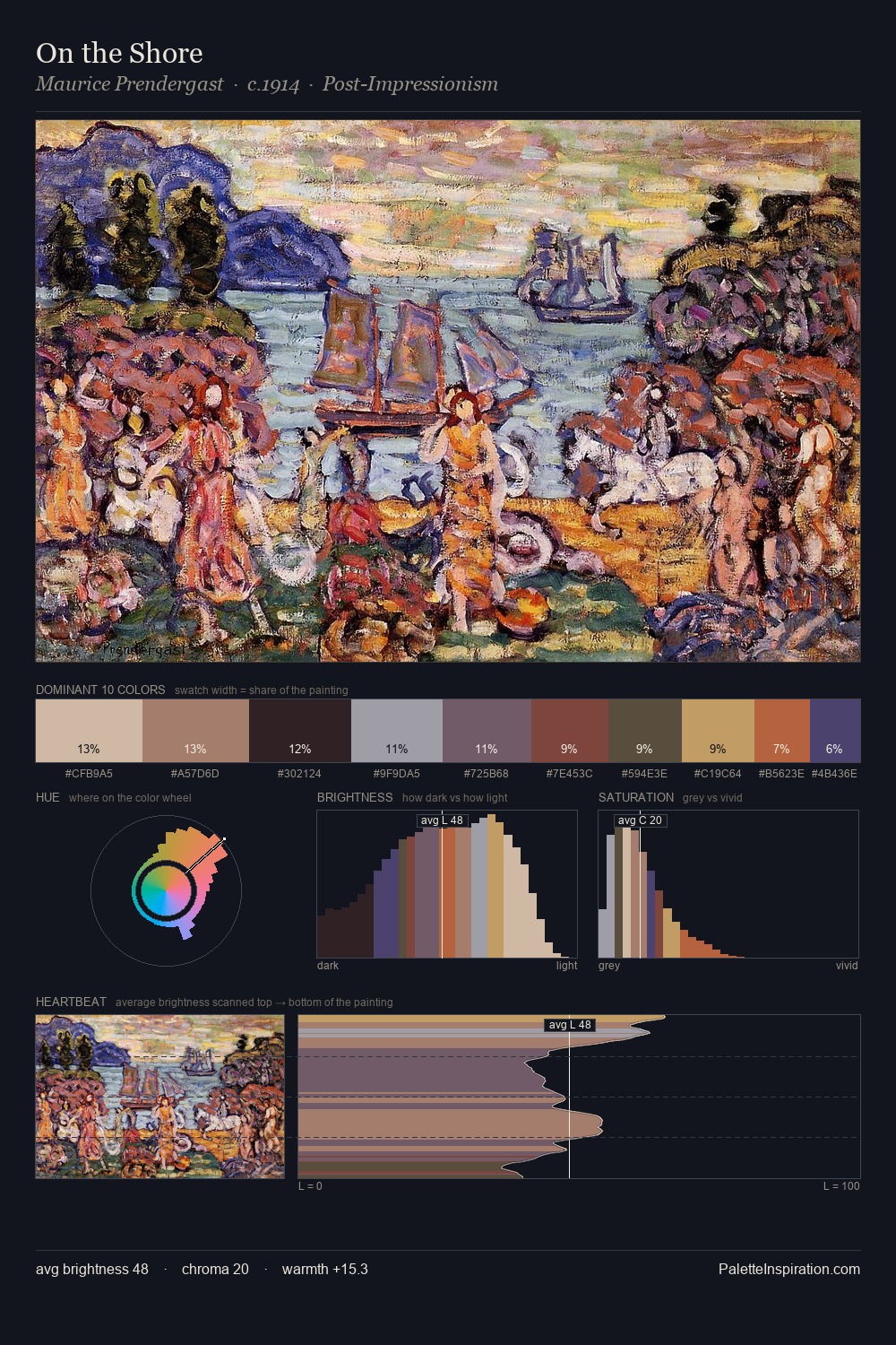
Neo-Impressionism Palette 22
Muted Parchment
Muted Deliberately desaturated - chroma pulled toward gray, the restraint of tonal painting.
Parchment Aged warm neutral - the color of old manuscript parchment, tan and slightly yellowed.

Palette Analysis
Neo-Impressionism keeps values measured and balanced, a hallmark of tonal restraint. Warm and cool are kept in productive tension, creating the kind of chromatic harmony that sustains the eye. The absence of saturated colour is itself an expressive choice: this is a palette of restraint and atmosphere. The highest-chroma note - #6C4B3B - appears at just 11.2%, deployed as a precision accent against the quieter ground. Value range is moderate at 49 units - enough contrast for legibility, not so much as to fragment the tonal unity.
Example use cases
- exhibition design
- foundation branding
- estate management
- art education
- museums & galleries
I Love This!
Use This Palette
Copy, export, or download for your project
Copy, export, or download for your project
Copy:
Download:
Share: