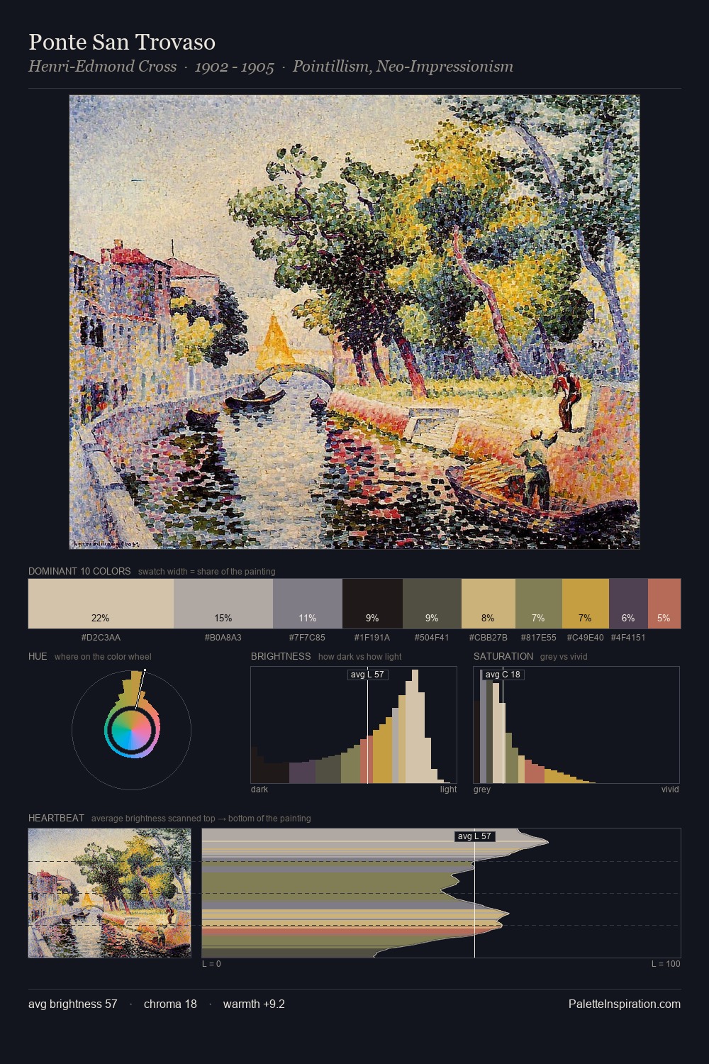
Neo-Impressionism Palette 14
Veiled Bisque
Veiled Partially obscured light - mid-dark with a hazy, scrim-filtered quality.
Bisque Pale warm beige - soft, slightly pinkish neutral, the color of unglazed ceramic.

Palette Analysis
Neo-Impressionism occupies the comfortable middle of the value scale, avoiding both extremes to hold the eye in a sustained middle grey. Cool tones set the register here - the blues and greens easily outweigh any warm accents. Mid-saturation across the board: the palette has colour character without chromatic excess. #C6B481 functions as the palette's exclamation mark: highest chroma, lowest percentage (11.3%). At 41 units across the value scale, the palette keeps contrast readable without letting it dominate. The mid-to-high key, cool bias, and moderate chroma point to outdoor observation - sky and diffused daylight as the dominant light source.
Example use cases
- publishing
- corporate identity
- consumer apps
- hospitality
- design agencies
I Love This!
Use This Palette
Copy, export, or download for your project
Copy, export, or download for your project
Copy:
Download:
Share: