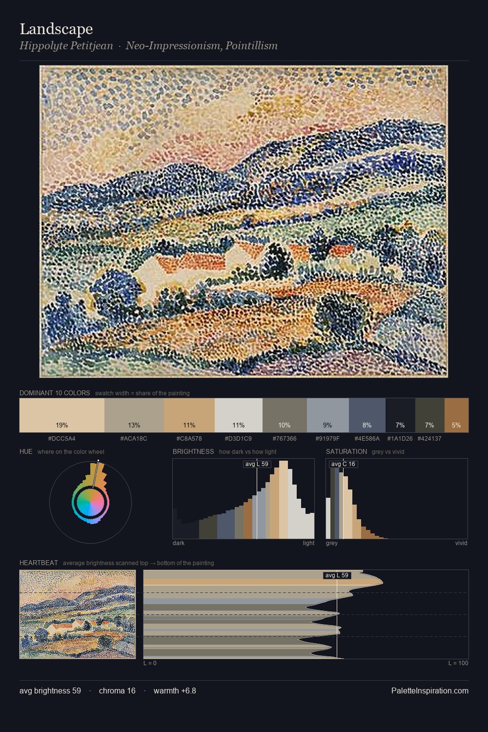
Neo-Impressionism Palette 2
Gleaming Linen
Gleaming Bright and polished - high-key, often warm, suggesting reflective or luminous surfaces.
Linen Warm light neutral - the color of natural linen, slightly warm beige.

Palette Analysis
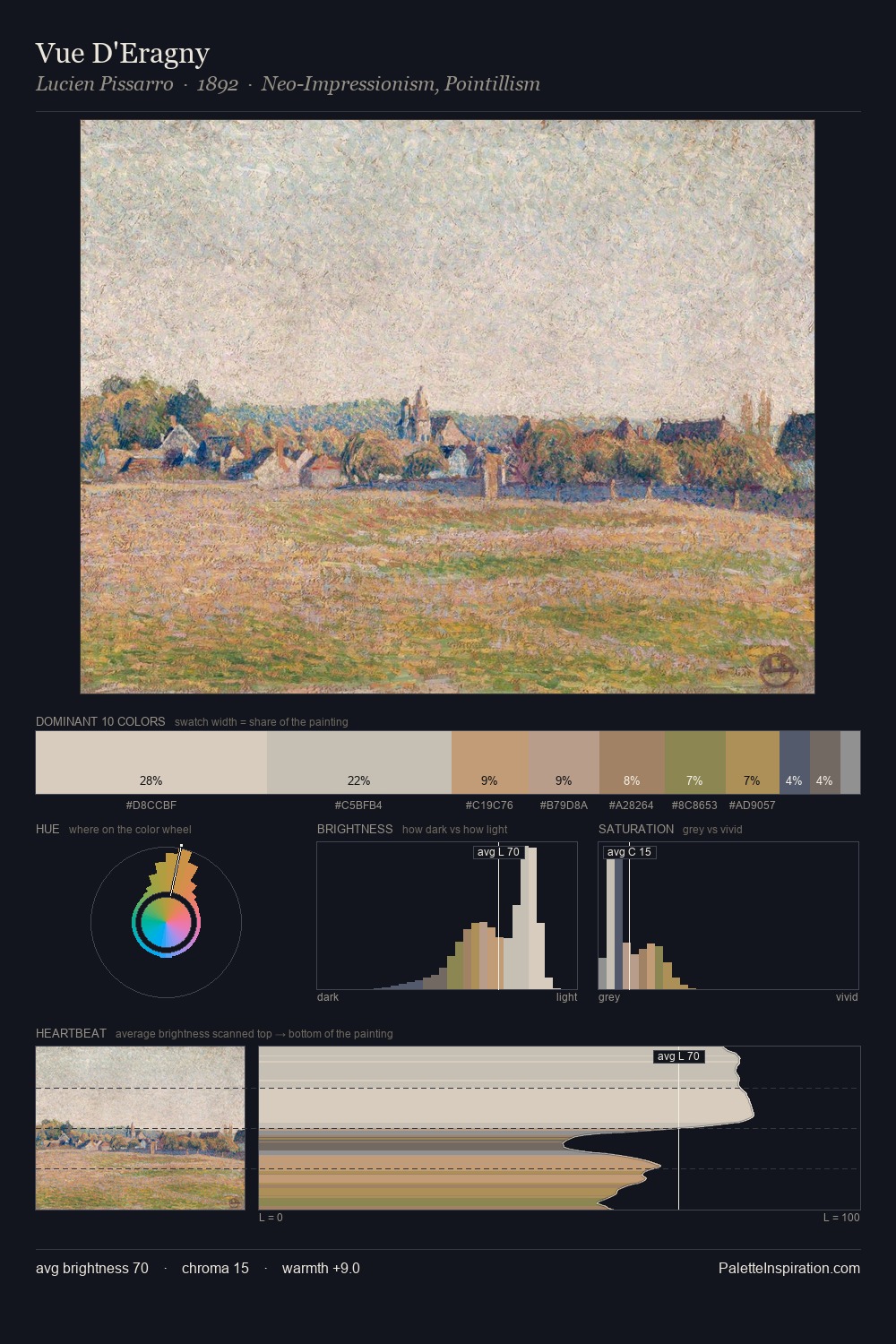
Neo-Impressionism is high-key - luminous, open, and weighted toward light. Neither warm nor cool has the upper hand here; the equilibrium between the two generates the palette's visual energy. Saturation is deliberately withheld - the beauty here lies in the near-monochromatic gradations rather than colour difference. The saturated accent, #C1A06B, registers at 4.1% - sparse enough to feel like a deliberate surprise. Spanning 49 units on the value axis, the palette achieves the balance between tonal flatness and fragmentation.
Example use cases
- florist branding
- event design
- real estate
- jewelry retail
- hospitality branding
I Love This!
Use This Palette
Copy, export, or download for your project
Copy, export, or download for your project
Copy:
Download:
Share: