Neo-Impressionism Palette 12
Soft Ivory
Soft Low-contrast, gentle chroma - mid-key values and low saturation, approachable and calm.
Ivory Warm creamy white - the color of natural ivory, warmer than pure white.

Palette Analysis
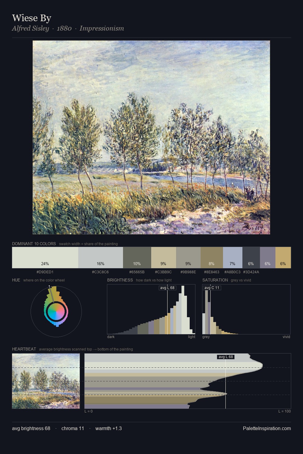
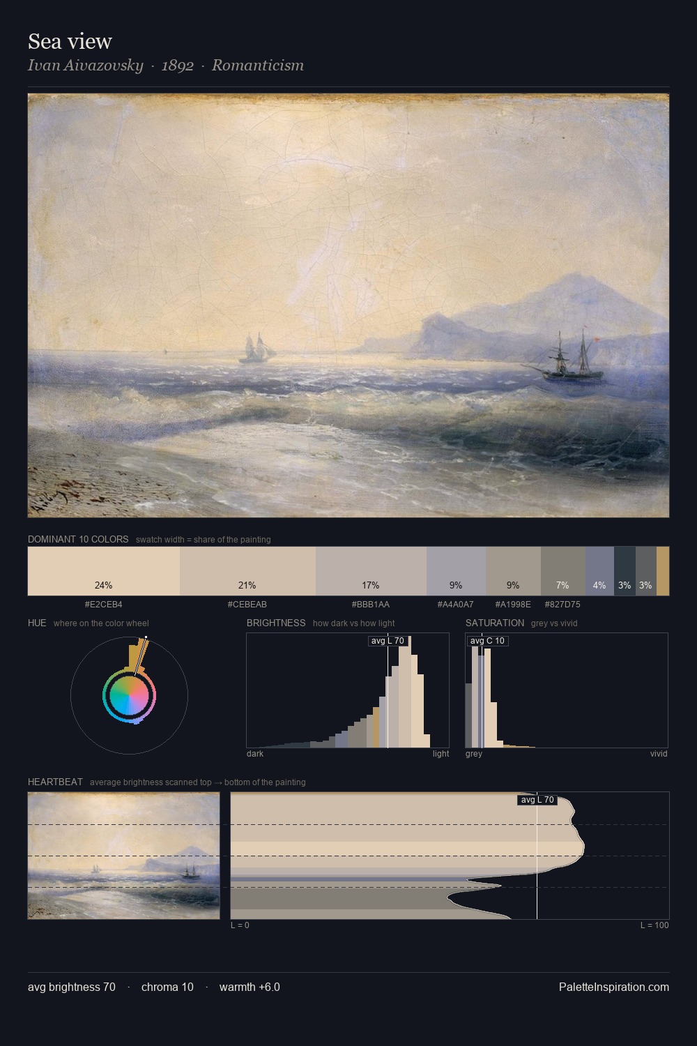
Values in Neo-Impressionism tilt decisively toward white, giving the palette its luminous character. Cool tones set the register here - the blues and greens easily outweigh any warm accents. Every colour is desaturated; the palette proceeds through near-neutrals and gently-coloured greys. #CABB9E delivers the chromatic peak at only 10.3% - a small shot of colour with outsized visual impact. Value range is moderate at 49 units - enough contrast for legibility, not so much as to fragment the tonal unity. The mid-to-high key, cool bias, and moderate chroma point to outdoor observation - sky and diffused daylight as the dominant light source.
Example use cases
- exhibition design
- foundation branding
- estate management
- art education
- museums & galleries
I Love This!
Use This Palette
Copy, export, or download for your project
Copy, export, or download for your project
Copy:
Download:
Share: