Ludolf Backhuysen I Palette 3

Palette Analysis
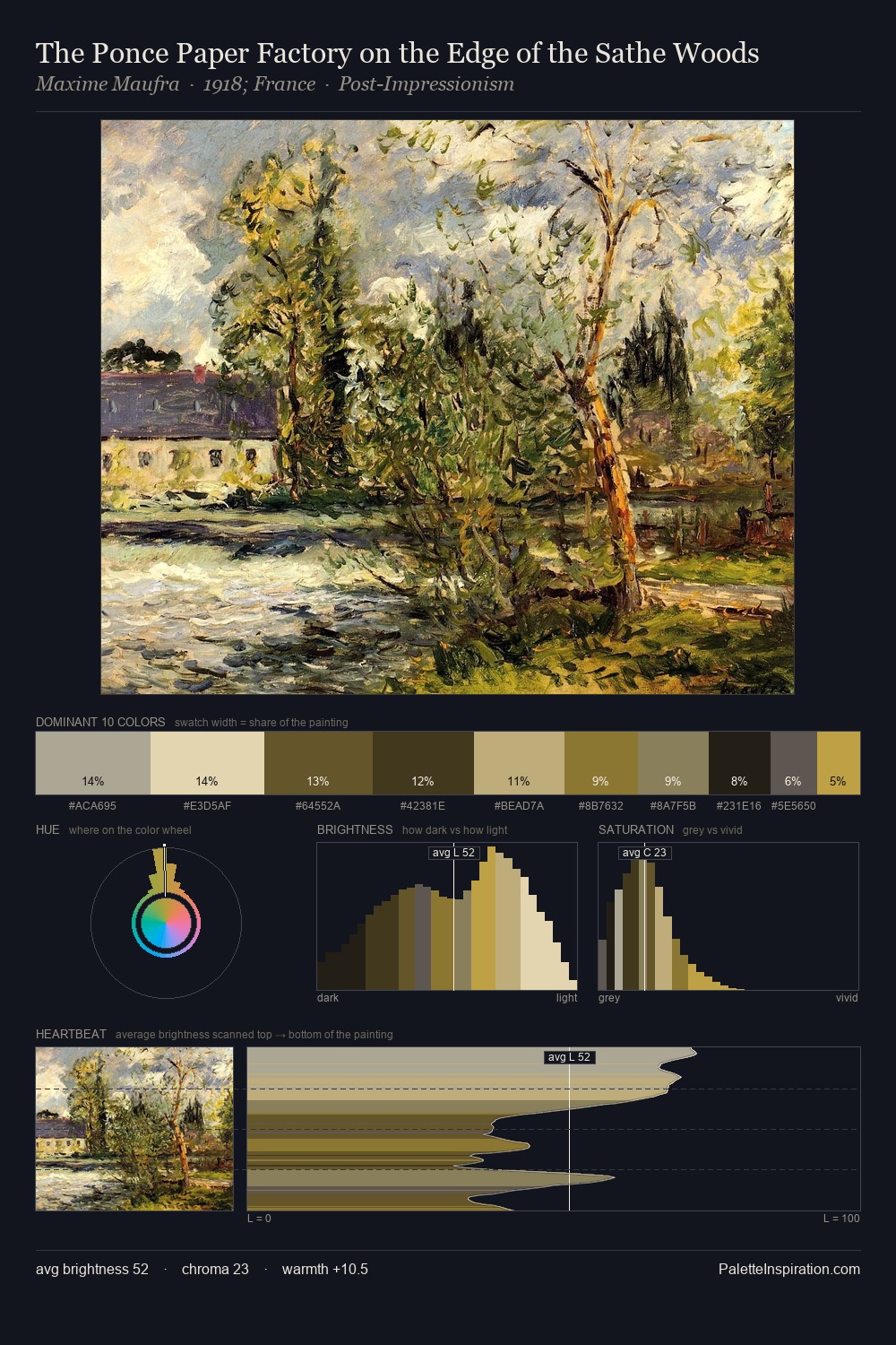
The high-key values of Ludolf Backhuysen I give it an effulgent, almost bleached quality. Ludolf Backhuysen I builds on cool foundations: the palette favours the blue-cyan-green arc. Saturation is deliberately withheld - the beauty here lies in the near-monochromatic gradations rather than colour difference. A single dominant - #B9B4AF at 25.3% - sets the character of the whole composition. Only 4.0% is devoted to #3B3316, yet that small allocation delivers the palette's entire chromatic tension. Value range is moderate at 53 units - enough contrast for legibility, not so much as to fragment the tonal unity. The mid-to-high key, cool bias, and moderate chroma point to outdoor observation - sky and diffused daylight as the dominant light source. Ludolf Backhuysen I's palette 3 carries its own internal logic while remaining in conversation with the artist's broader colour intelligence.
Example use cases
- exhibition design
- foundation branding
- estate management
- art education
- museums & galleries
I Love This!
Copy, export, or download for your project