Ludolf Backhuysen I Palette 2

Palette Analysis
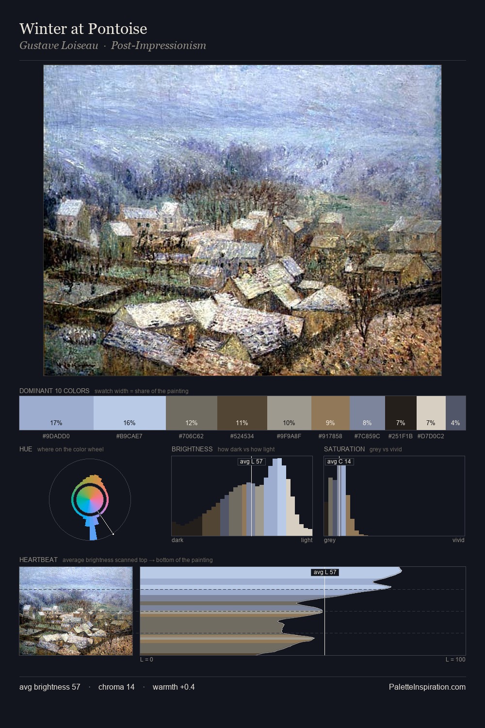
Values in Ludolf Backhuysen I rest in the mid-range - neither dramatically lit nor steeped in shadow. Ludolf Backhuysen I tilts toward cool - blues and silver-greys carry the structural weight. Chroma is kept low across all colours, producing the soft, enveloping quality that characterises tonal painting. The most saturated colour, #B7BBD1, is reserved to 7.2% of the surface, where it acts as a focal punctuation. 56 units of value range underpin the palette's structural clarity: the eye always knows where light falls. The mid-to-high key, cool bias, and moderate chroma point to outdoor observation - sky and diffused daylight as the dominant light source. This is palette 2 of Ludolf Backhuysen I's sequence - a single chapter in a chromatic story told across many works.
Example use cases
- exhibition design
- foundation branding
- estate management
- art education
- museums & galleries
I Love This!
Copy, export, or download for your project