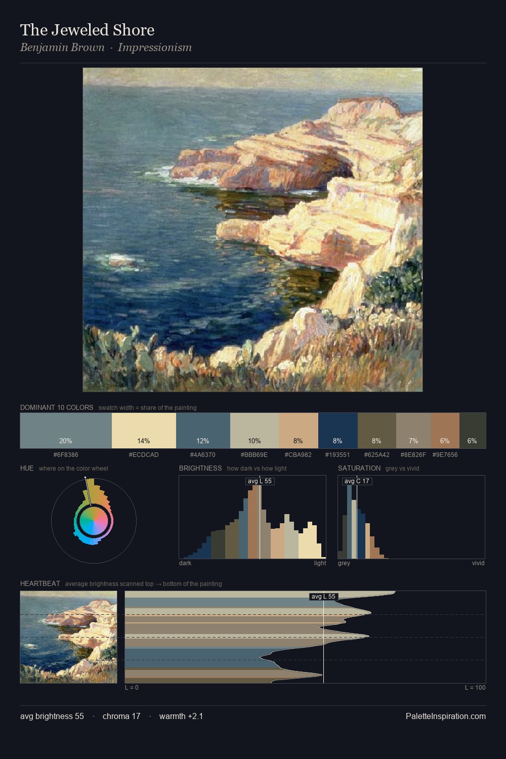
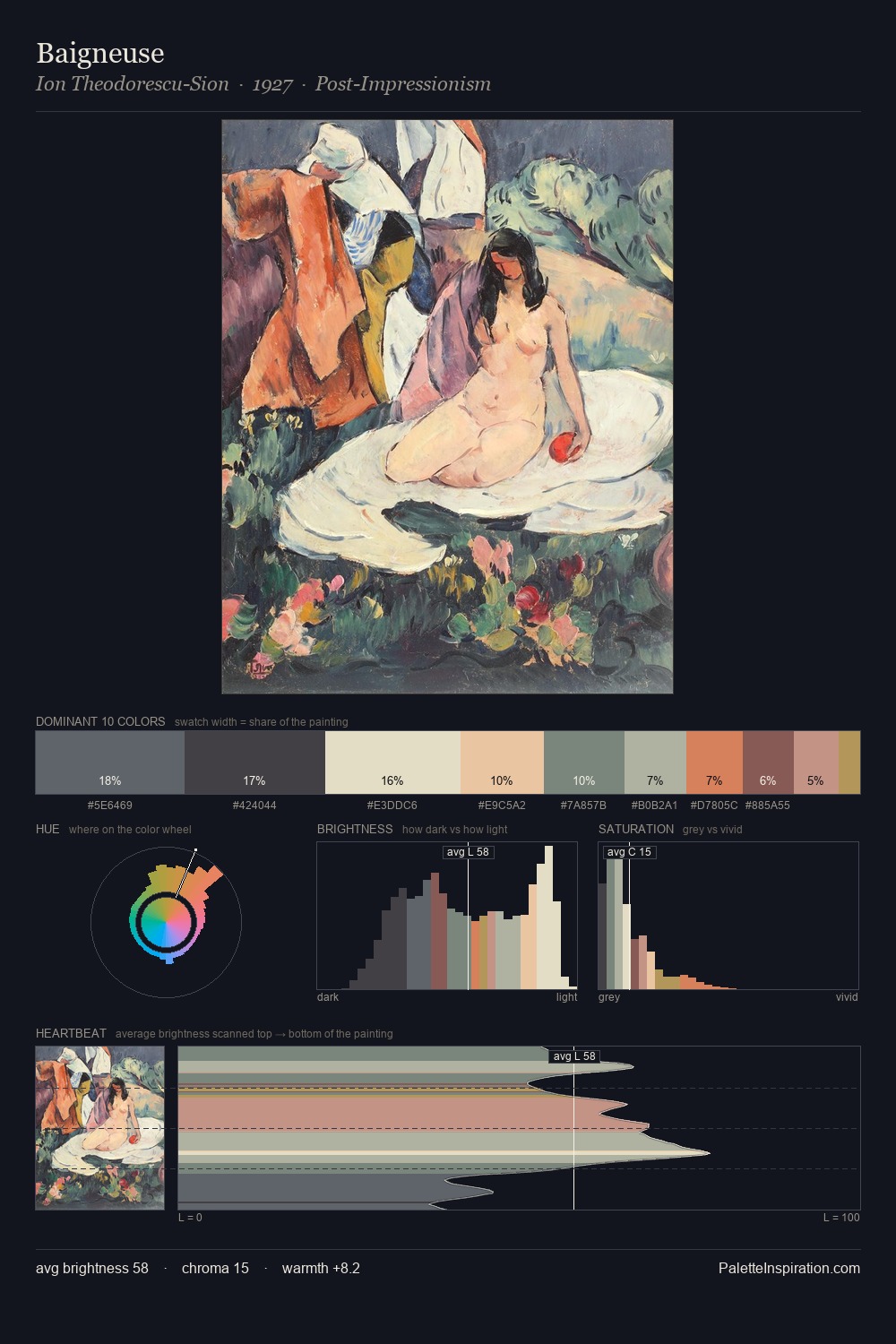
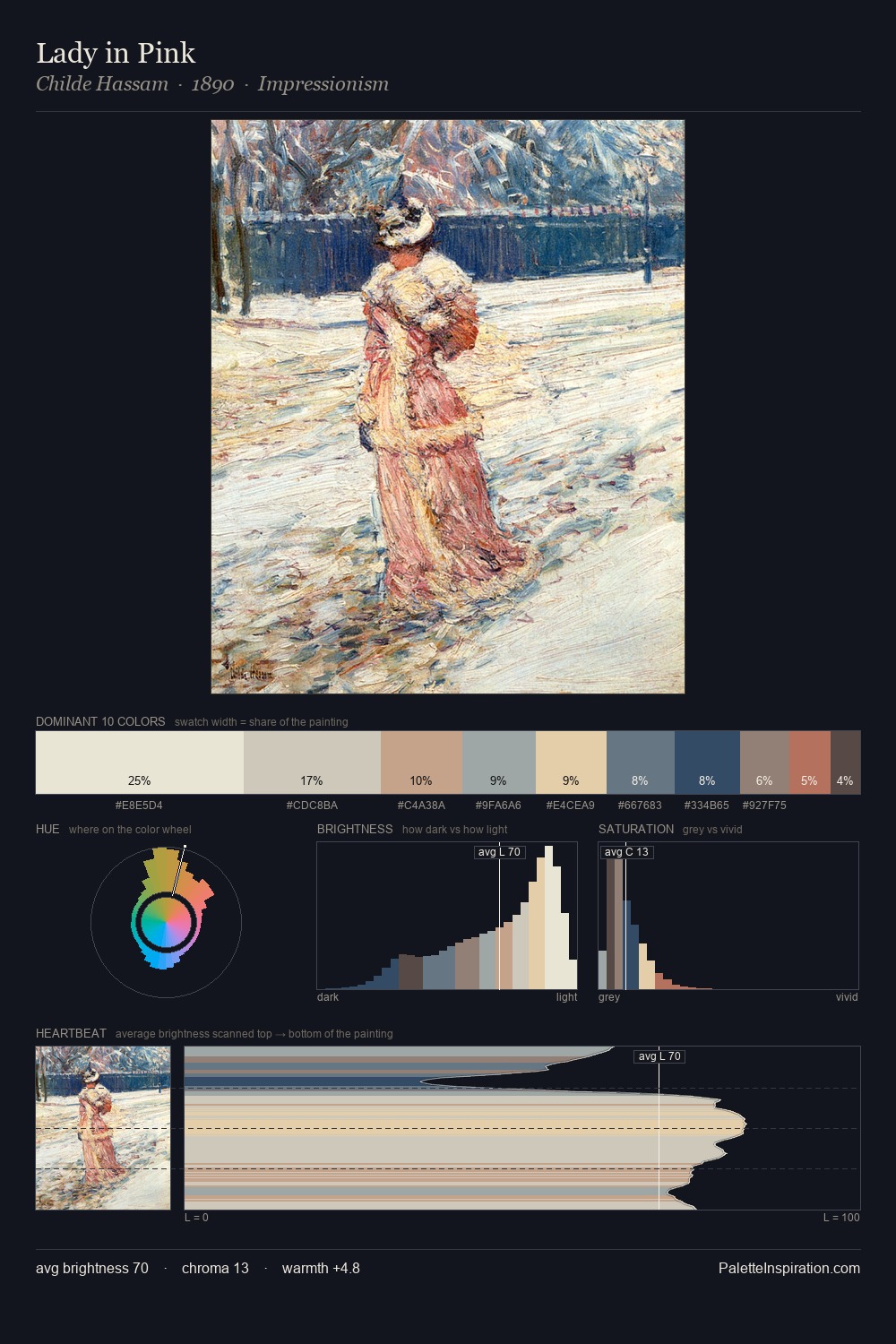
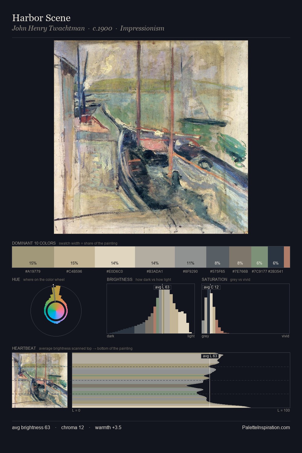
Katsushika Hokusai Palette 3
Soft Ivory
Soft Low-contrast, gentle chroma - mid-key values and low saturation, approachable and calm.
Ivory Warm creamy white - the color of natural ivory, warmer than pure white.

Palette Analysis
Katsushika Hokusai is strongly light-biased - shadow is suggested rather than declared. Neither warm nor cool has the upper hand here; the equilibrium between the two generates the palette's visual energy. Chroma hovers near zero; colour declares itself through subtle shifts in hue rather than outright saturation. #2B3446 delivers the chromatic peak at only 4.4% - a small shot of colour with outsized visual impact. The full value range is 58 units: broad enough to build convincing three-dimensional form. Palette 3 sits within the larger chromatic argument that Katsushika Hokusai's complete body of work advances.
Example use cases
- craft & artisan brands
- specialty coffee
- home goods
- lifestyle retail
- ceramics & pottery
I Love This!
Use This Palette
Copy, export, or download for your project
Copy, export, or download for your project
Copy:
Download:
Share: