Katsushika Hokusai Palette 1

Palette Analysis
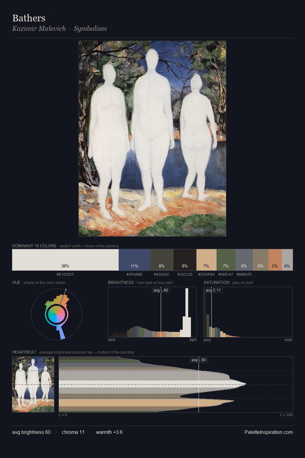
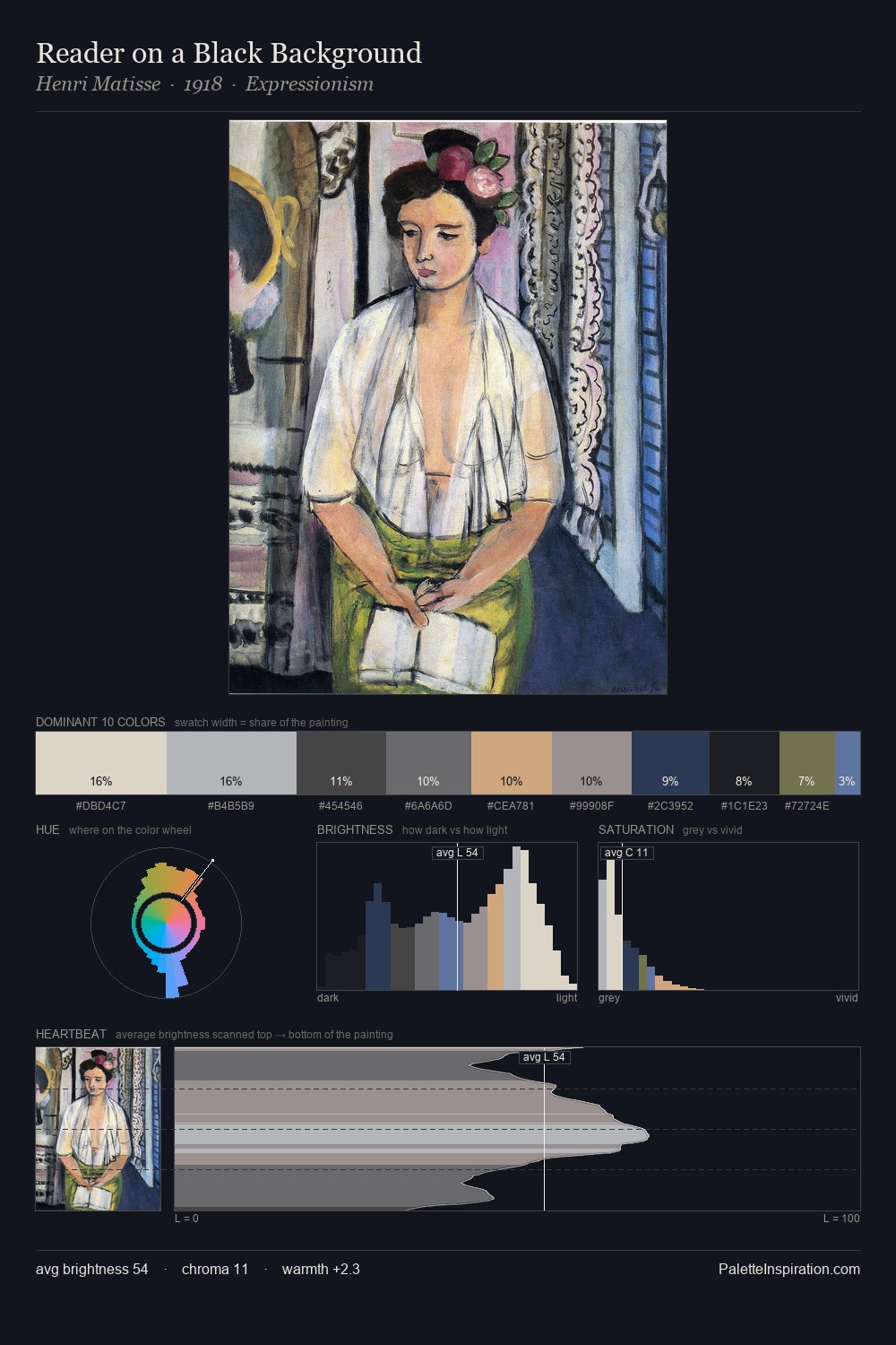
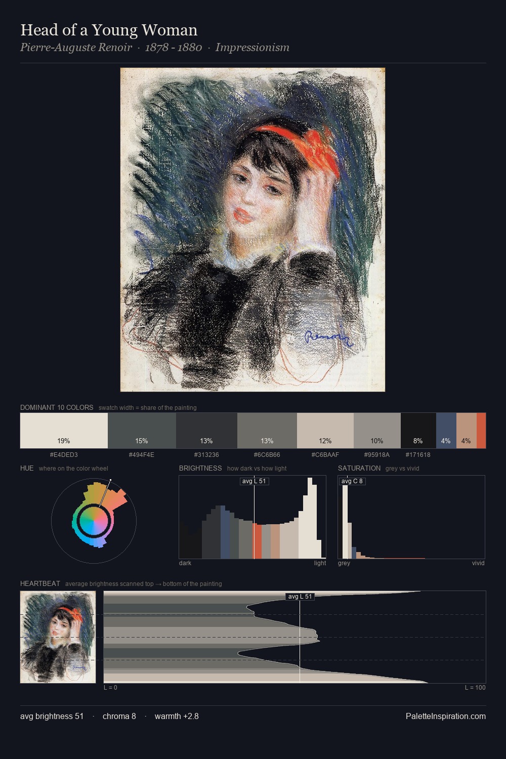
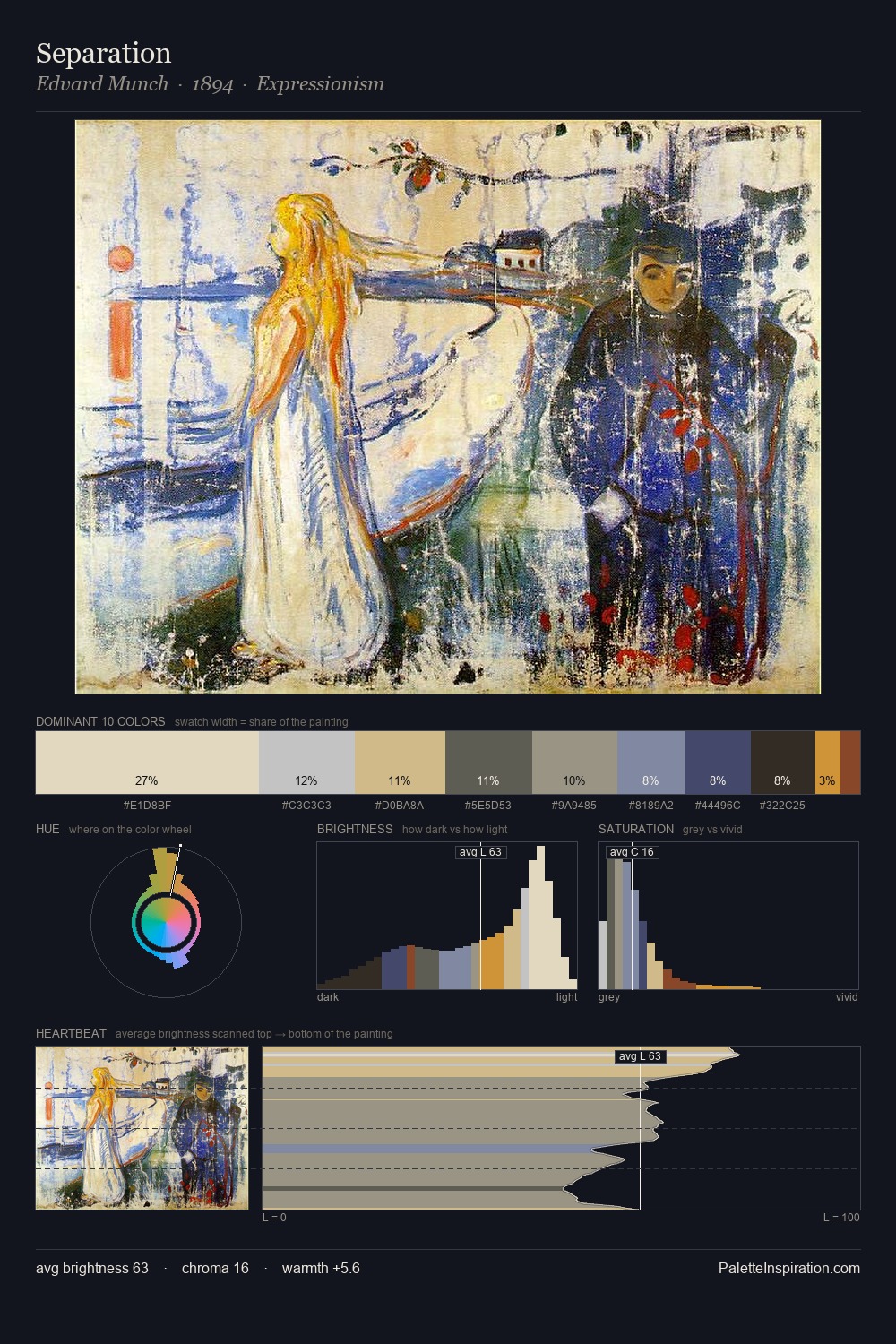
Katsushika Hokusai is high in key: pale, luminous, and filled with optical air. Heat pervades this palette; warm chromatic identities outweigh cool ones at almost every weight. Muted throughout, the palette achieves its effects through value and temperature rather than chromatic force. The dominant colour, #BAADB1, takes 25.1% of the total area, establishing the overall mood before any other hue is introduced. #375070 delivers the chromatic peak at only 4.7% - a small shot of colour with outsized visual impact. The value range spans 70 units across the palette, providing the full gamut from deep shadow to near-white and ensuring clear tonal hierarchy. This is palette 1 of Katsushika Hokusai's sequence - a single chapter in a chromatic story told across many works.
Example use cases
- publishing
- corporate identity
- consumer apps
- hospitality
- design agencies
I Love This!
Copy, export, or download for your project