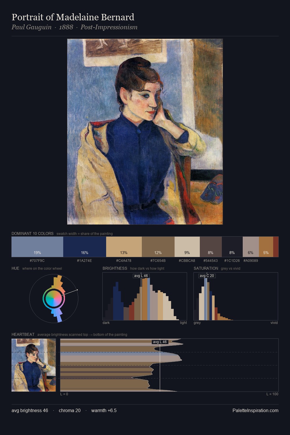
Katsushika Hokusai Palette 13

Palette Analysis
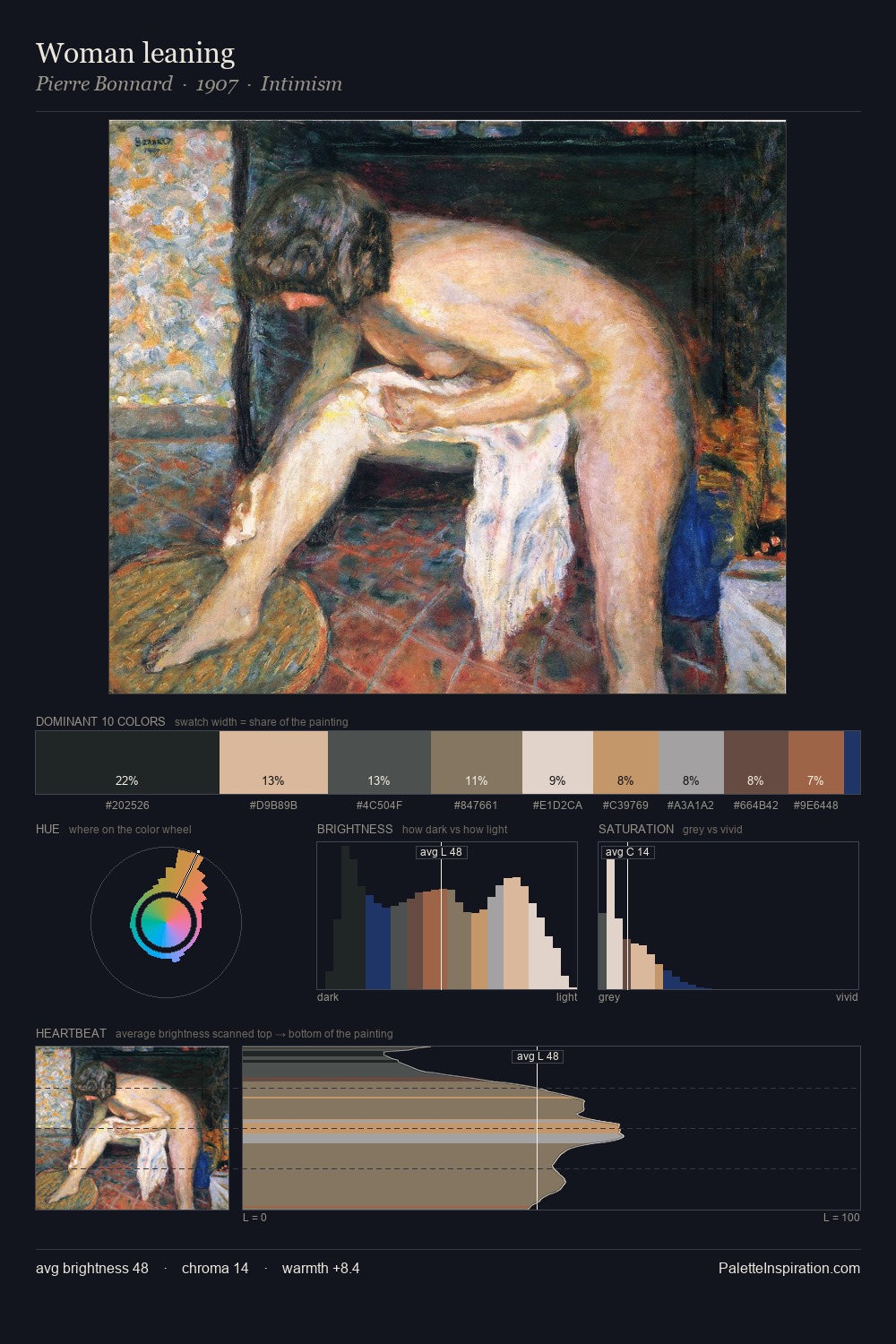
Katsushika Hokusai distributes its values across the middle register, creating harmony without high contrast. Neither warm nor cool has the upper hand here; the equilibrium between the two generates the palette's visual energy. Every colour is desaturated; the palette proceeds through near-neutrals and gently-coloured greys. Katsushika Hokusai gives 25.7% of the composition to a single #D1BFB2 - a decisive chromatic anchor. The most saturated colour, #1B224D, is reserved to 5.3% of the surface, where it acts as a focal punctuation. At 63 units of value range, the palette has the tonal breadth to sustain complex spatial readings. This is palette 13 of Katsushika Hokusai's sequence - a single chapter in a chromatic story told across many works.
Example use cases
- food packaging
- leather accessories
- travel & outdoor
- natural cosmetics
- interior design
I Love This!
Copy, export, or download for your project