Karl Edvard Diriks Palette 1

Palette Analysis
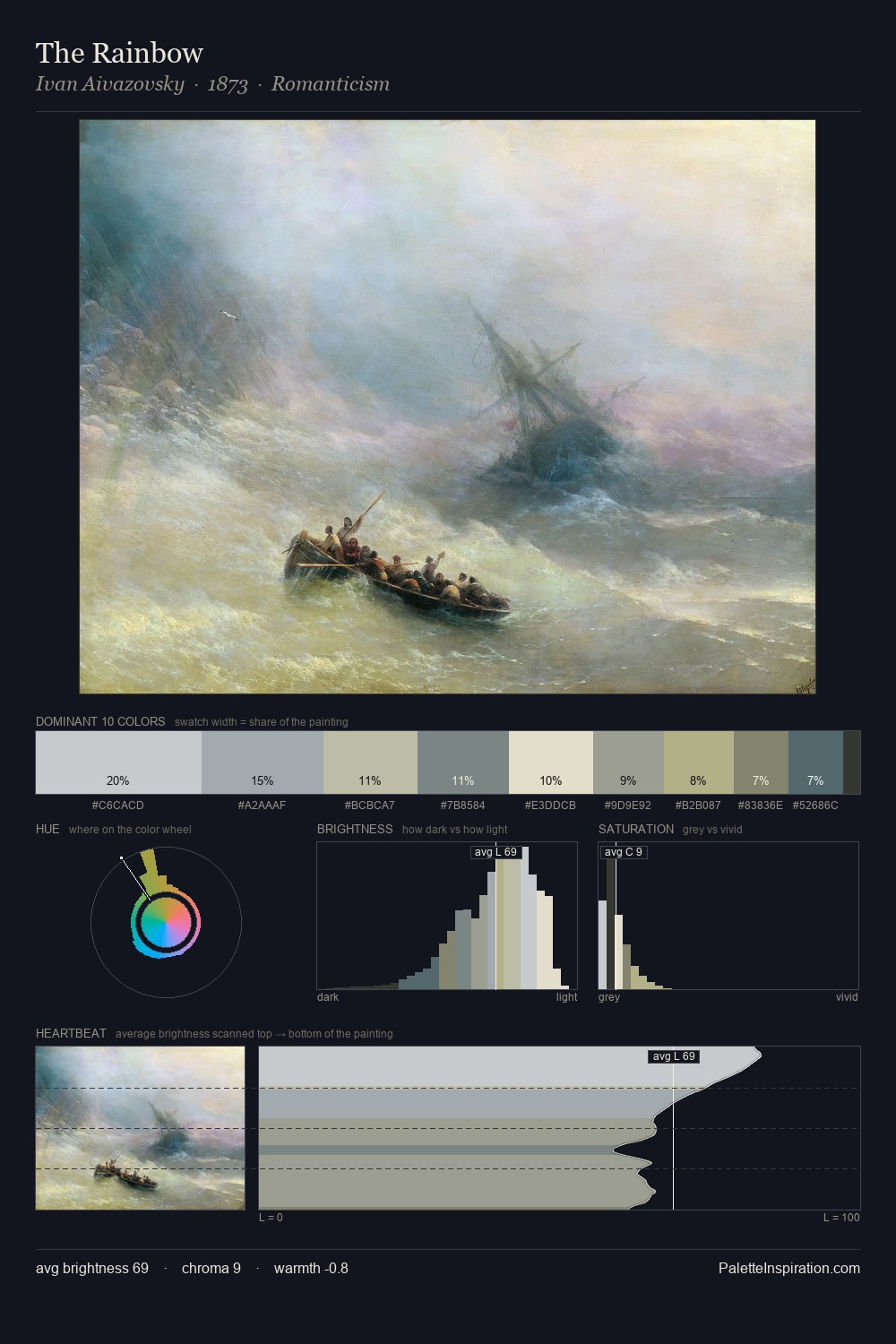
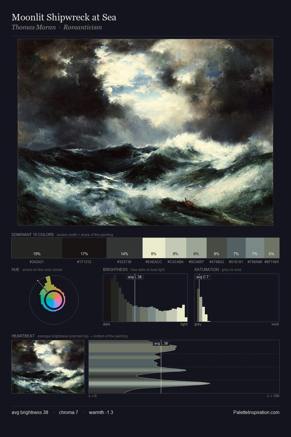
Karl Edvard Diriks works in the upper reaches of the value scale, creating an atmosphere of brightness and expansiveness. Karl Edvard Diriks builds on cool foundations: the palette favours the blue-cyan-green arc. Chroma is kept low across all colours, producing the soft, enveloping quality that characterises tonal painting. #CBC7AC functions as the palette's exclamation mark: highest chroma, lowest percentage (10.3%). The value range spans 57 units across the palette, providing the full gamut from deep shadow to near-white and ensuring clear tonal hierarchy. The mid-to-high key, cool bias, and moderate chroma point to outdoor observation - sky and diffused daylight as the dominant light source. This is palette 1 of Karl Edvard Diriks's sequence - a single chapter in a chromatic story told across many works.
Example use cases
- exhibition design
- foundation branding
- estate management
- art education
- museums & galleries
I Love This!
Copy, export, or download for your project