Karl Edvard Diriks Palette 2

Palette Analysis
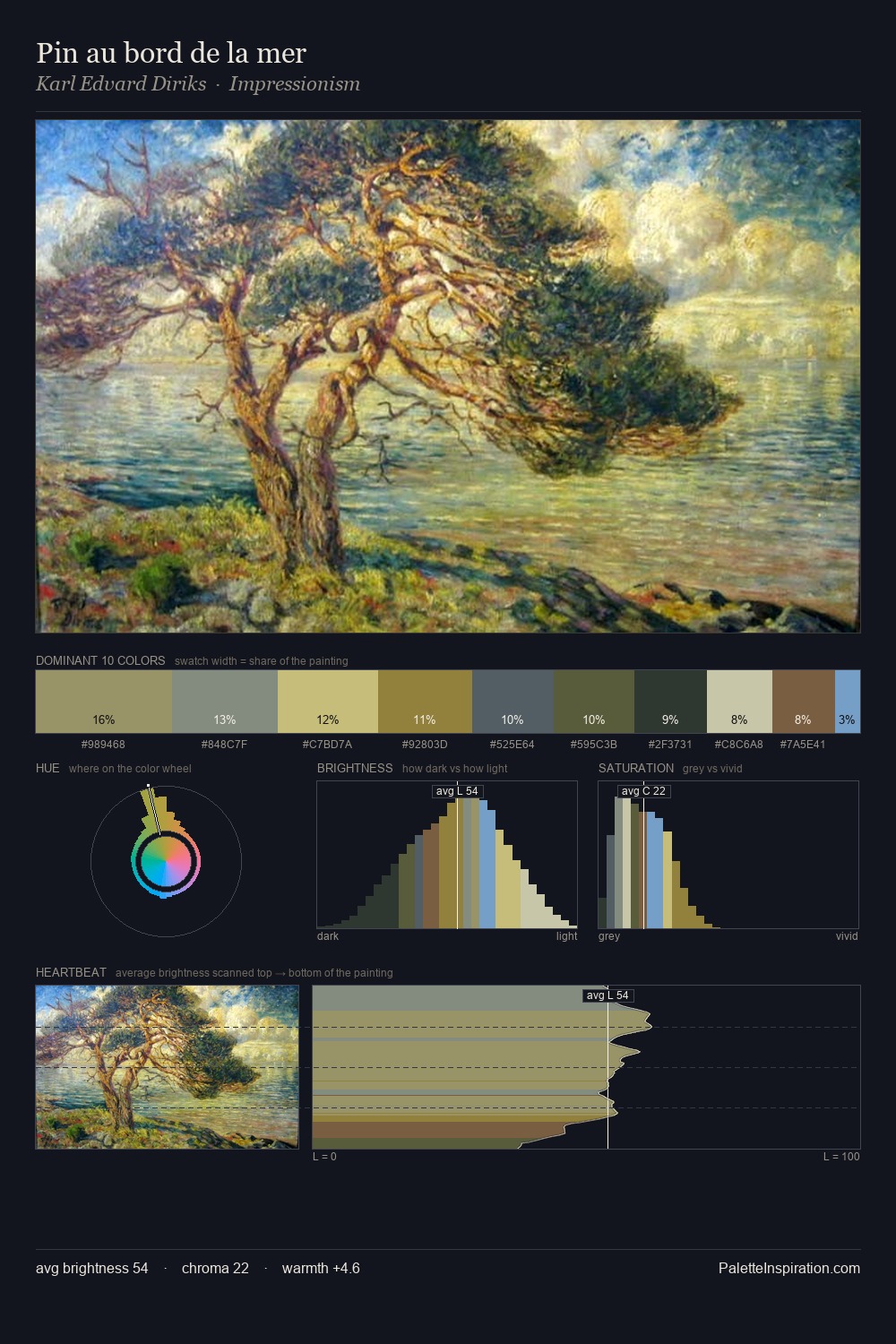
The value structure of Karl Edvard Diriks is mid-key: quiet, controlled, and cohesive. A distinctly cool atmosphere runs through this palette: sky, water, and mist given colour form. The absence of saturated colour is itself an expressive choice: this is a palette of restraint and atmosphere. The highest-chroma note - #726E3C - appears at just 9.4%, deployed as a precision accent against the quieter ground. At 50 units across the value scale, the palette keeps contrast readable without letting it dominate. The mid-to-high key, cool bias, and moderate chroma point to outdoor observation - sky and diffused daylight as the dominant light source. Palette 2 sits within the larger chromatic argument that Karl Edvard Diriks's complete body of work advances.
Example use cases
- boutique hospitality
- film production
- menswear
- art prints & posters
- heritage brands
I Love This!
Copy, export, or download for your project