Karl Edvard Diriks Palette 5
Veiled Bisque
Veiled Partially obscured light - mid-dark with a hazy, scrim-filtered quality.
Bisque Pale warm beige - soft, slightly pinkish neutral, the color of unglazed ceramic.

Palette Analysis
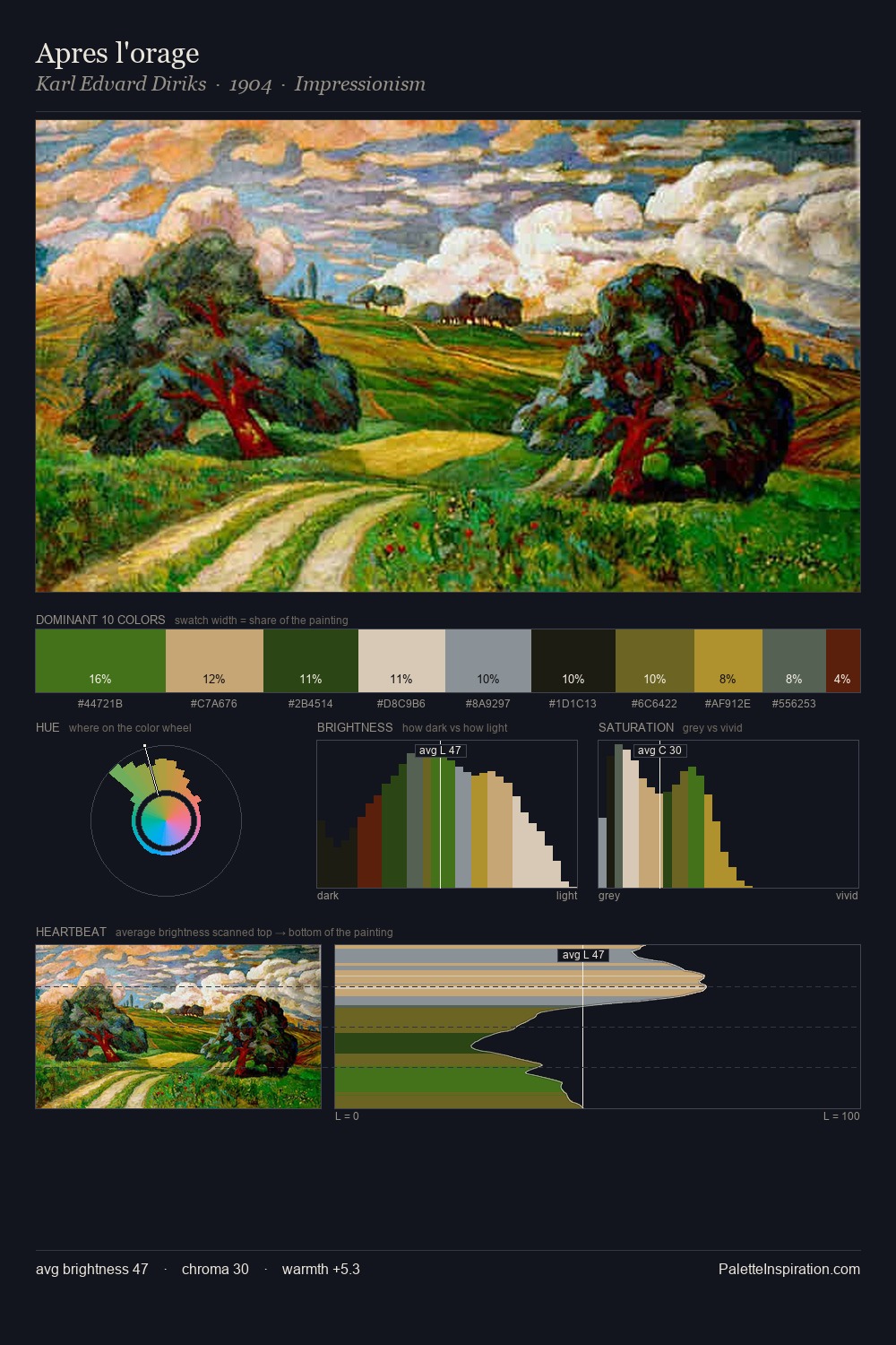
Karl Edvard Diriks keeps values measured and balanced, a hallmark of tonal restraint. Karl Edvard Diriks tilts toward cool - blues and silver-greys carry the structural weight. Chroma is moderate: colours carry enough saturation to be read as colour, but the palette stops well short of garish intensity. #621C0B functions as the palette's exclamation mark: highest chroma, lowest percentage (4.2%). The full value range is 67 units: broad enough to build convincing three-dimensional form. The mid-to-high key, cool bias, and moderate chroma point to outdoor observation - sky and diffused daylight as the dominant light source. Palette 5 sits within the larger chromatic argument that Karl Edvard Diriks's complete body of work advances.
Example use cases
- theater design
- jewelry brands
- tobacco-adjacent retail
- event branding
- film & entertainment
I Love This!
Use This Palette
Copy, export, or download for your project
Copy, export, or download for your project
Copy:
Download:
Share: