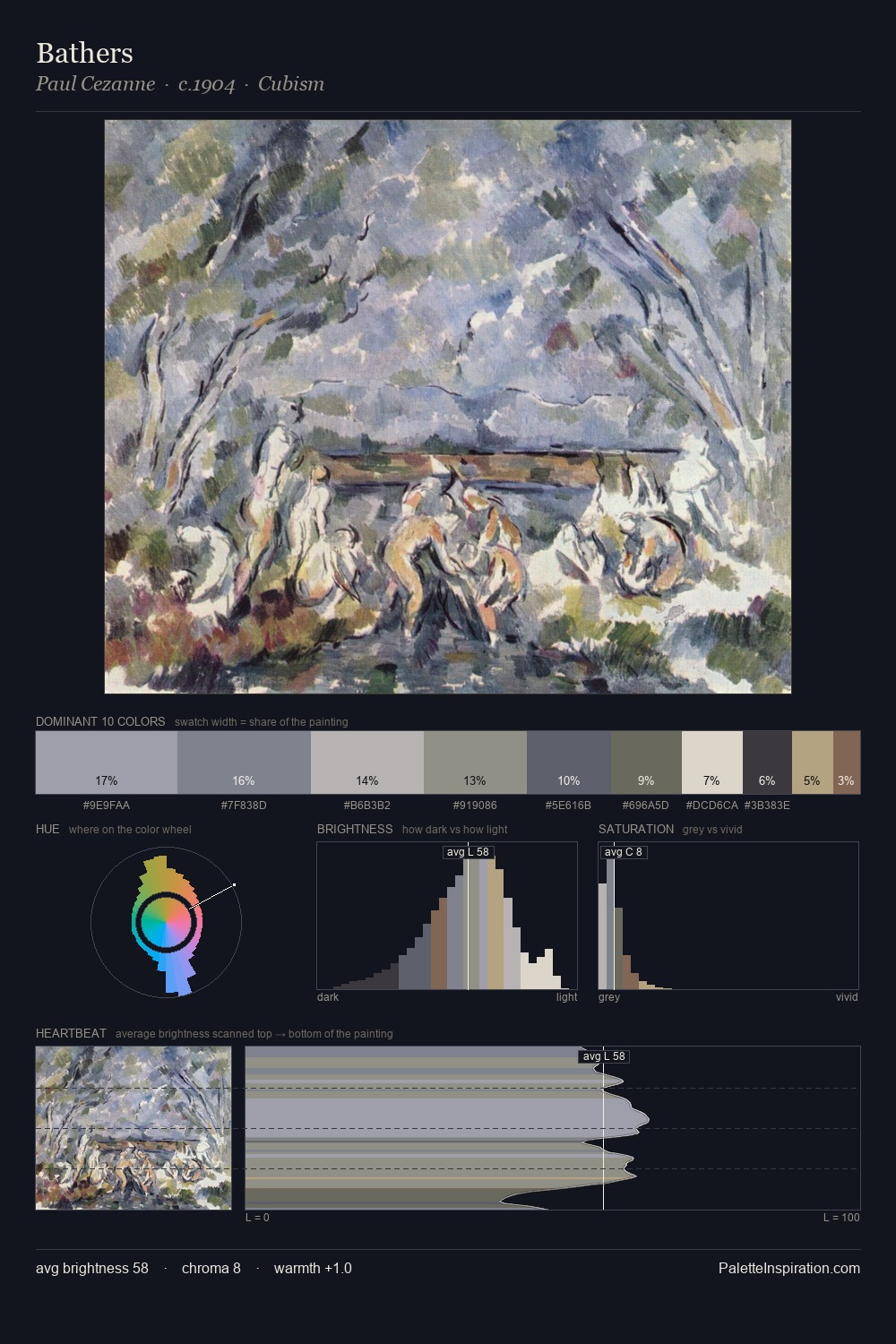
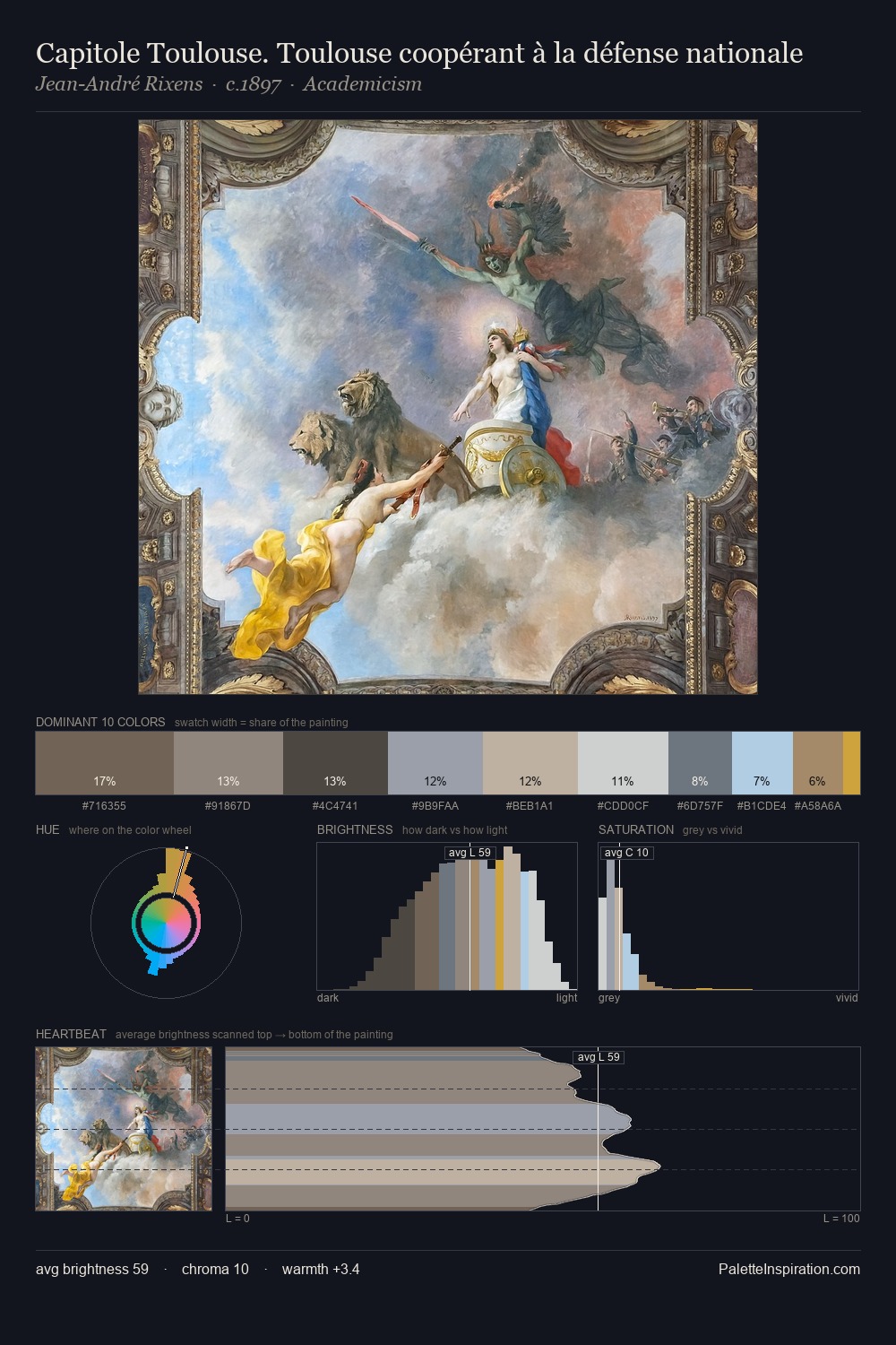
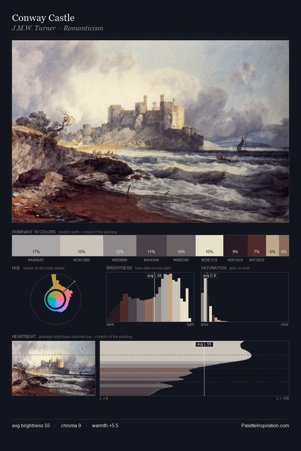
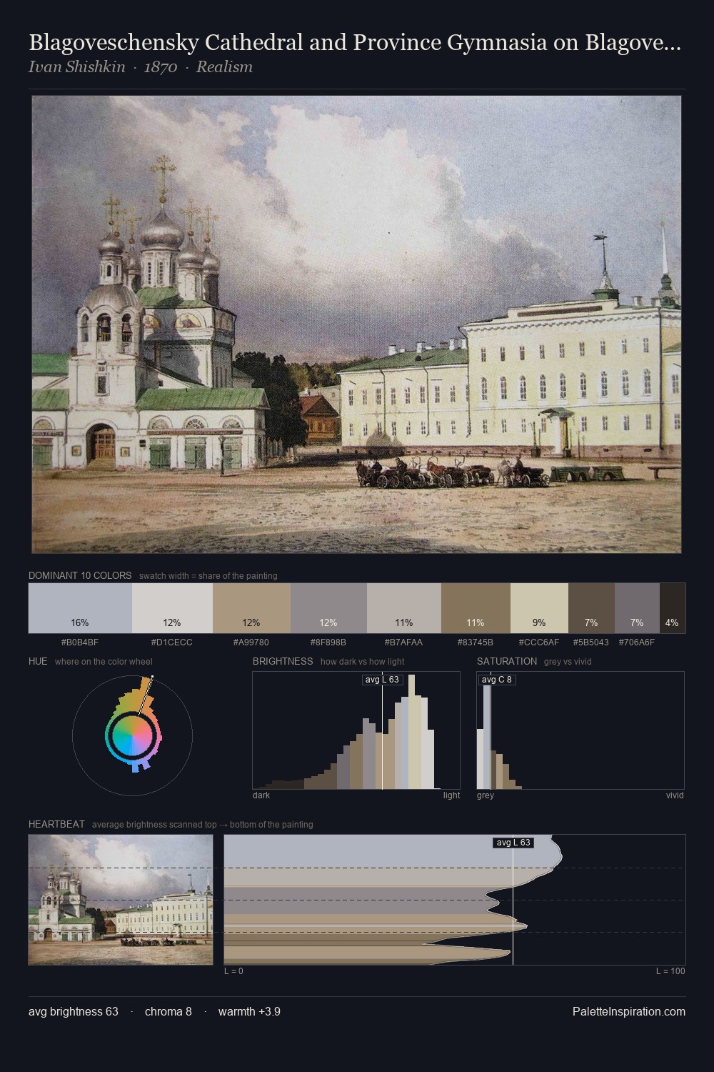
Pieter Wenning Palette 1
Pale Vellum
Pale High-key and low-chroma - delicate, bleached, washed with light.
Vellum Smooth pale tan - the color of prepared calf-skin vellum, warmer than parchment.

Palette Analysis
The high-key values of Pieter Wenning give it an effulgent, almost bleached quality. Neither warm nor cool has the upper hand here; the equilibrium between the two generates the palette's visual energy. The absence of saturated colour is itself an expressive choice: this is a palette of restraint and atmosphere. #BAA287 functions as the palette's exclamation mark: highest chroma, lowest percentage (8.3%). 45 units of value spread create a palette that is varied but unified - contrast in the service of harmony. In the context of Pieter Wenning's full range of palettes, group 1 represents one movement in an ongoing chromatic dialogue.
Example use cases
- archival print
- university identity
- rare books
- cultural institutions
- nonprofit identity
I Love This!
Use This Palette
Copy, export, or download for your project
Copy, export, or download for your project
Copy:
Download:
Share: