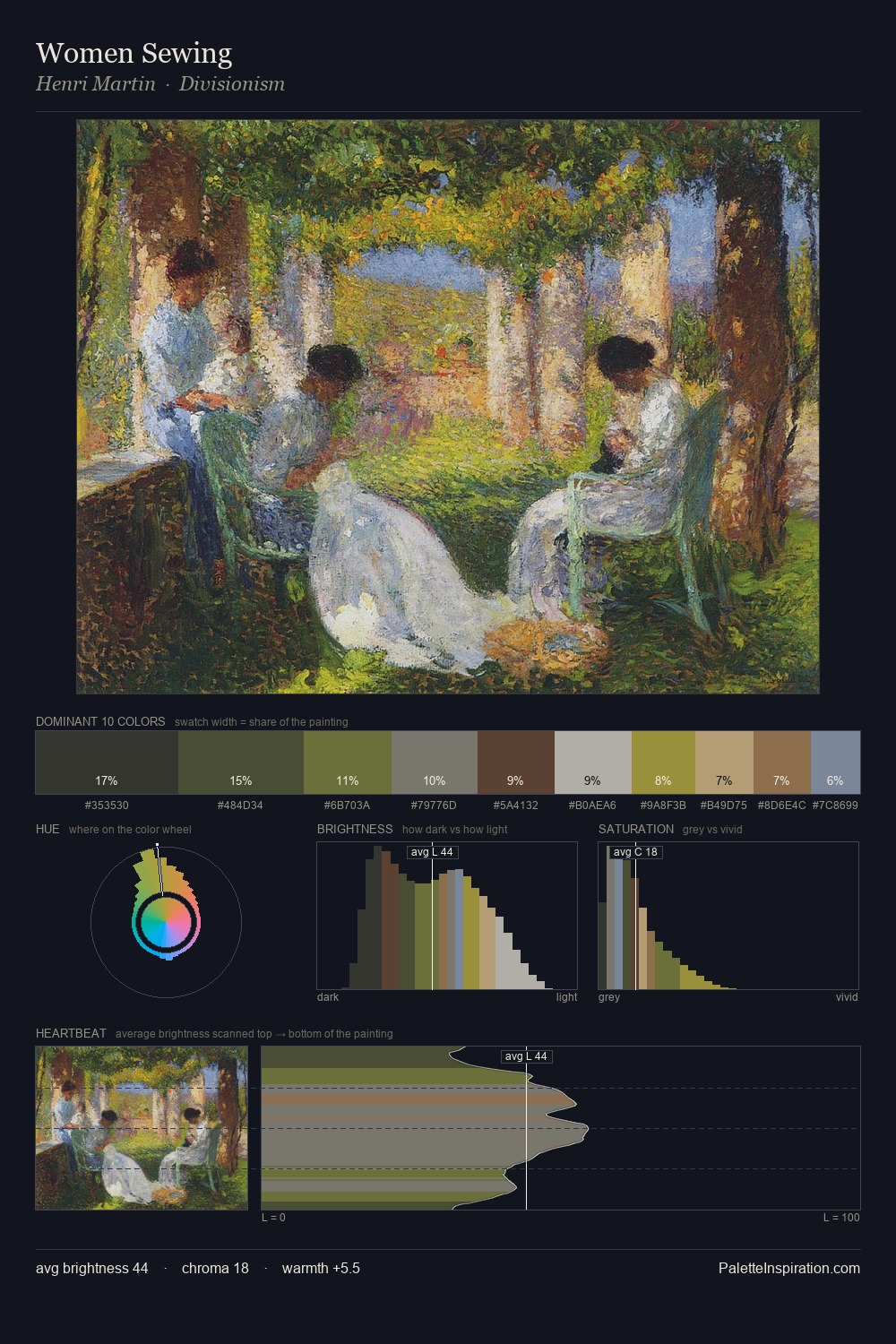
Pieter Wenning Palette 6

Palette Analysis
Pieter Wenning sits in the centre of the value range, lending the palette a sense of even, sustained light. Cool hues prevail: blues, greens, and greys anchor the palette's emotional temperature. Chroma is kept low across all colours, producing the soft, enveloping quality that characterises tonal painting. At 4.2%, #926345 carries the palette's sharpest chromatic charge: an accent that earns its place precisely because it is withheld. 48 units of value spread create a palette that is varied but unified - contrast in the service of harmony. The mid-to-high key, cool bias, and moderate chroma point to outdoor observation - sky and diffused daylight as the dominant light source. Pieter Wenning's palette 6 carries its own internal logic while remaining in conversation with the artist's broader colour intelligence.
Example use cases
- mental health
- medical devices
- insurance
- scientific publishing
- government services
I Love This!
Copy, export, or download for your project