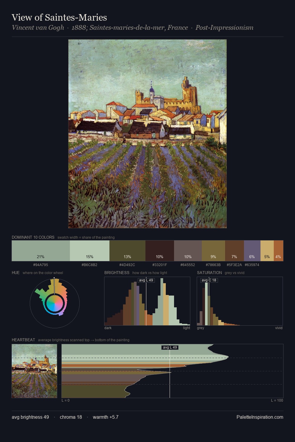
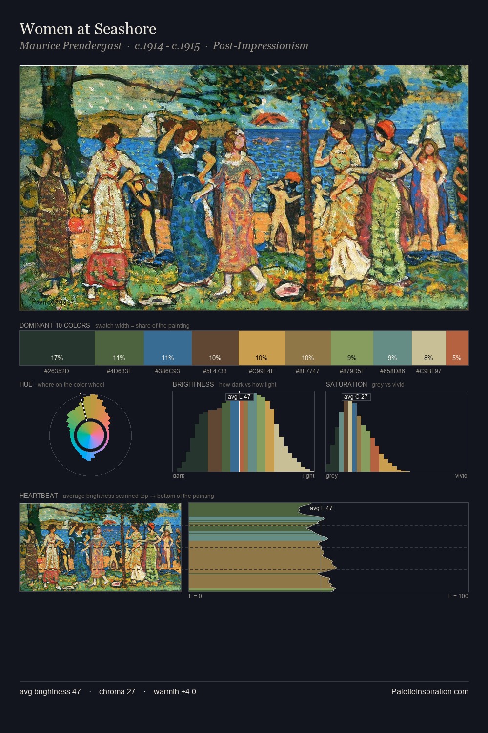
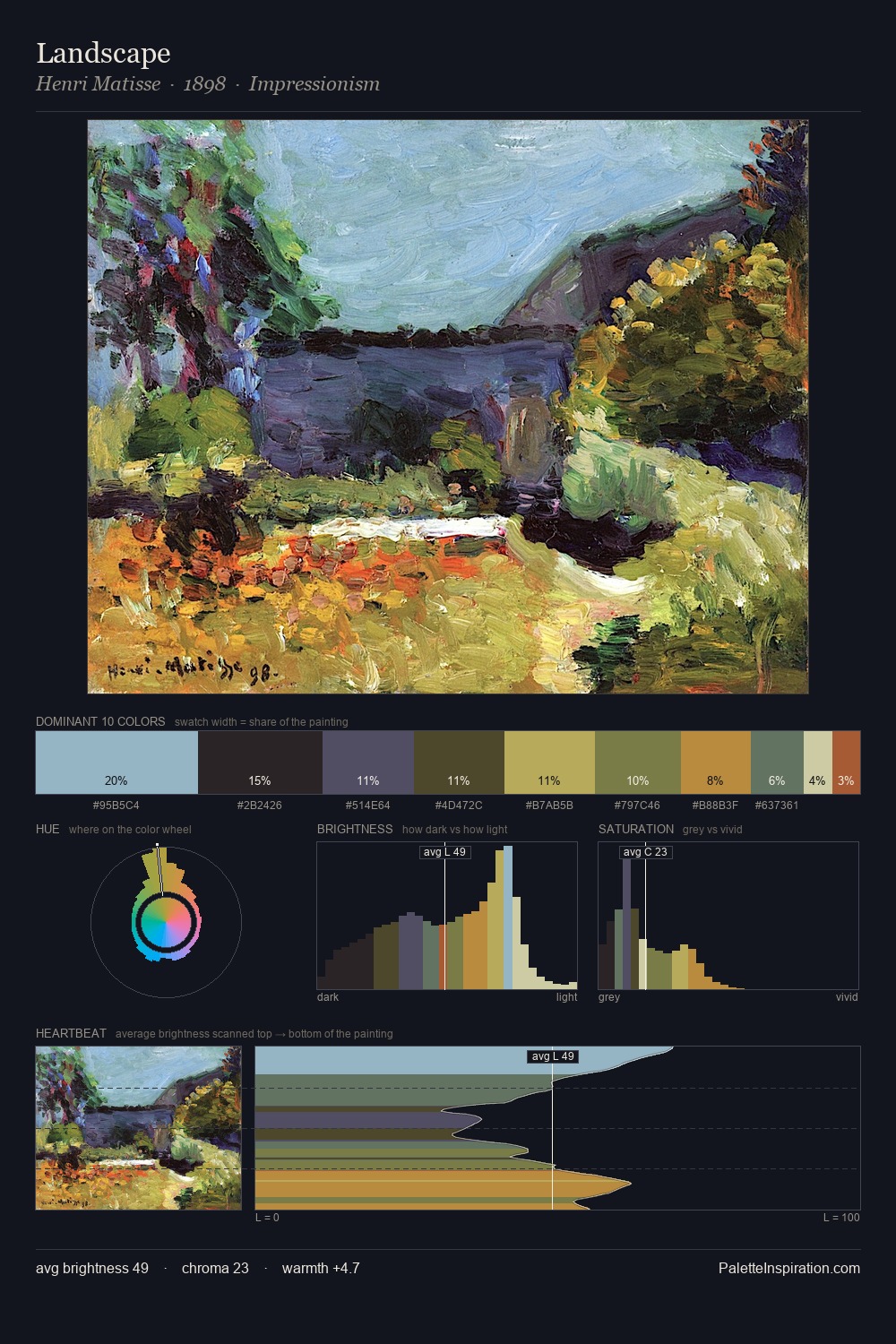
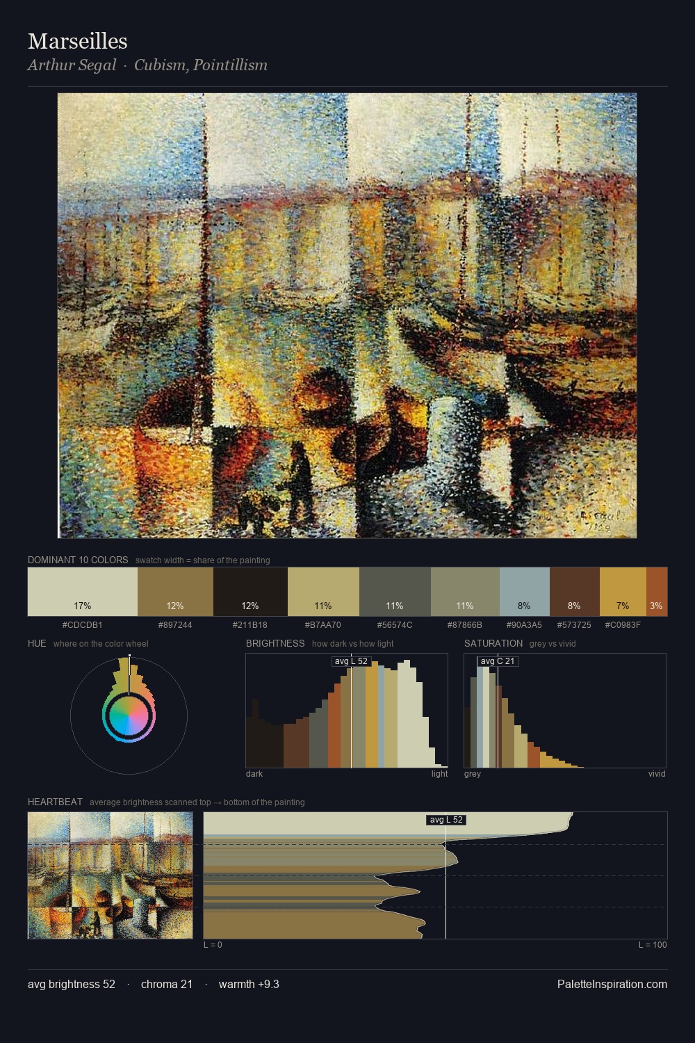
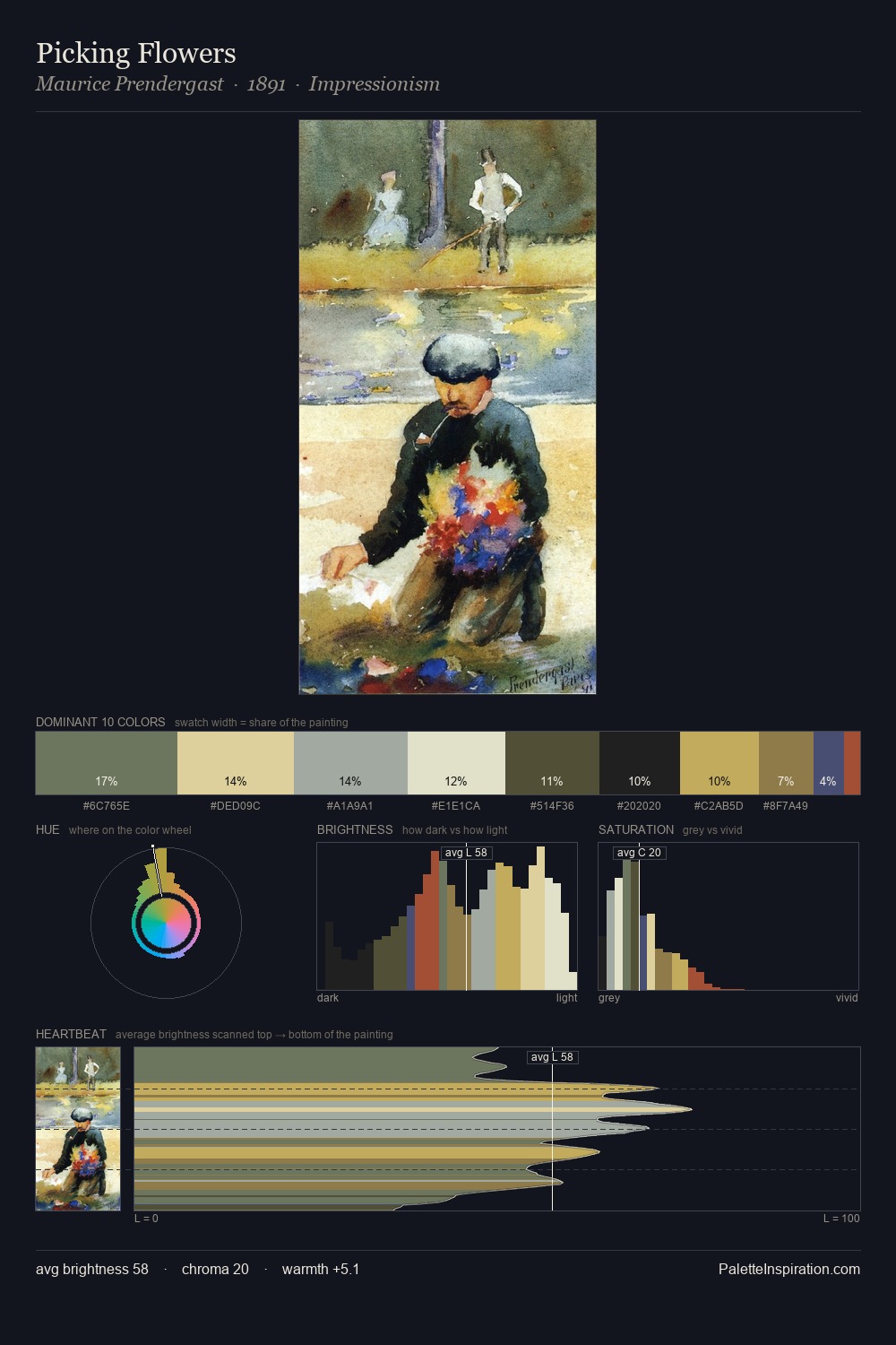
Pieter Wenning Palette 4

Palette Analysis
Pieter Wenning sits in the centre of the value range, lending the palette a sense of even, sustained light. Cool tones set the register here - the blues and greens easily outweigh any warm accents. Mid-saturation across the board: the palette has colour character without chromatic excess. Only 3.3% is devoted to #9D5525, yet that small allocation delivers the palette's entire chromatic tension. From deepest dark to palest light, the palette traverses 60 units of the value scale - a span that creates natural depth. High luminosity and cool temperature suggest the plein-air condition: unfiltered daylight and open sky. Pieter Wenning's palette 4 carries its own internal logic while remaining in conversation with the artist's broader colour intelligence.
Example use cases
- craft & artisan brands
- specialty coffee
- home goods
- lifestyle retail
- ceramics & pottery
I Love This!
Copy, export, or download for your project