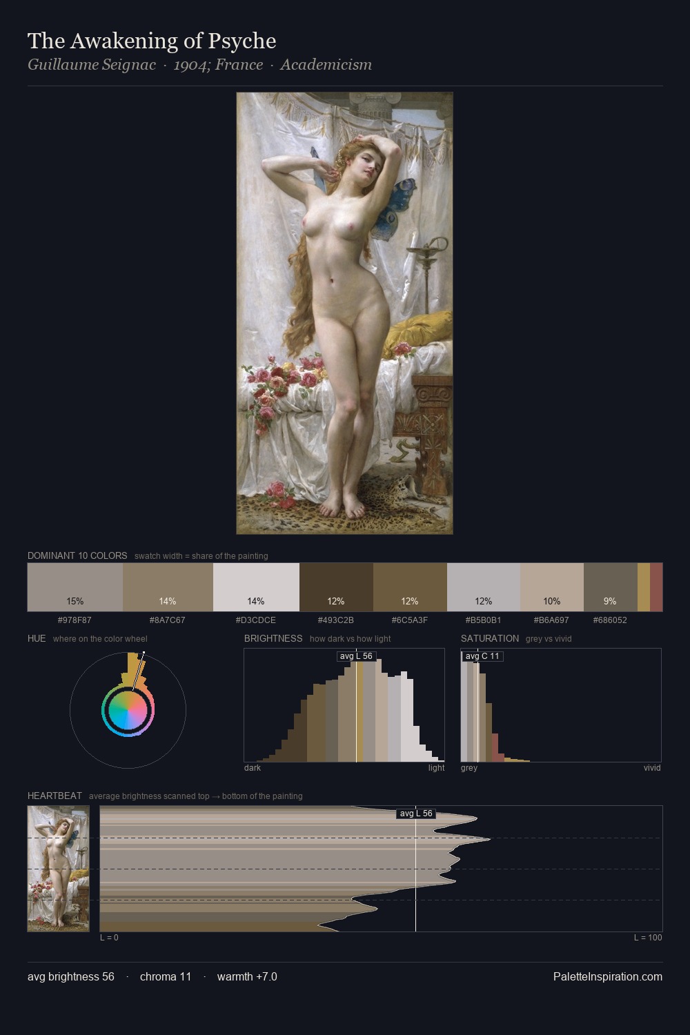
Abraham Manievich Palette 2

Palette Analysis
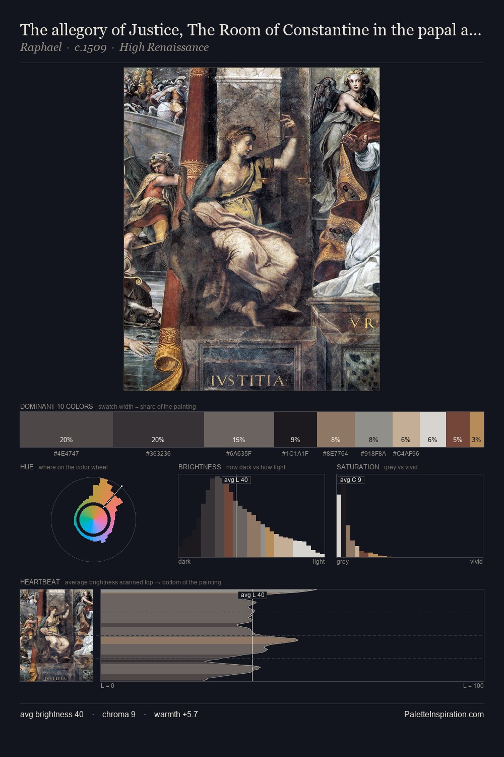
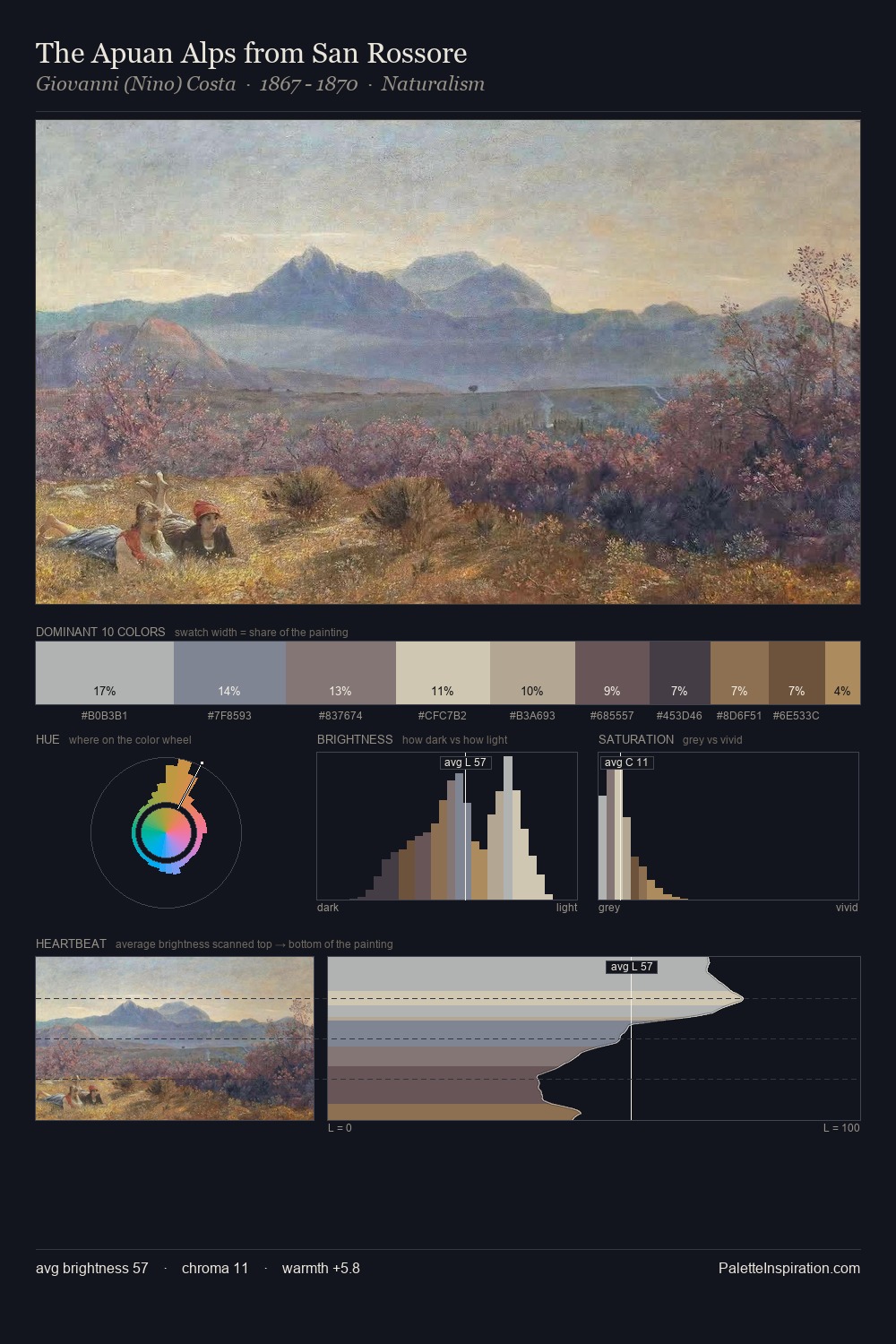
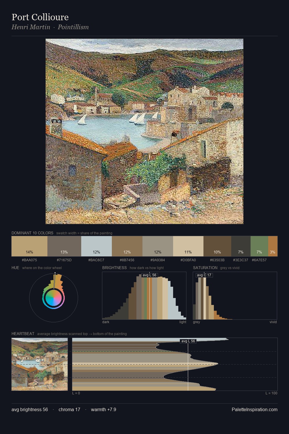
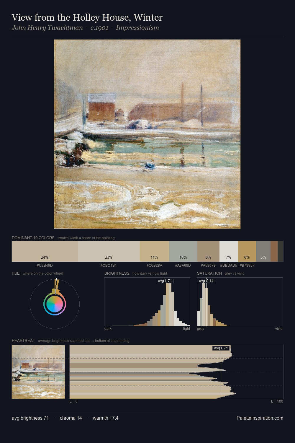
Abraham Manievich is high in key: pale, luminous, and filled with optical air. Blues and teal-greys govern the palette, lending it an aquatic or atmospheric quality. Chroma is kept low across all colours, producing the soft, enveloping quality that characterises tonal painting. Only 3.4% is devoted to #7F5342, yet that small allocation delivers the palette's entire chromatic tension. Spanning 46 units on the value axis, the palette achieves the balance between tonal flatness and fragmentation. The mid-to-high key, cool bias, and moderate chroma point to outdoor observation - sky and diffused daylight as the dominant light source. Abraham Manievich's palette 2 carries its own internal logic while remaining in conversation with the artist's broader colour intelligence.
Example use cases
- archival print
- university identity
- rare books
- cultural institutions
- nonprofit identity
I Love This!
Copy, export, or download for your project