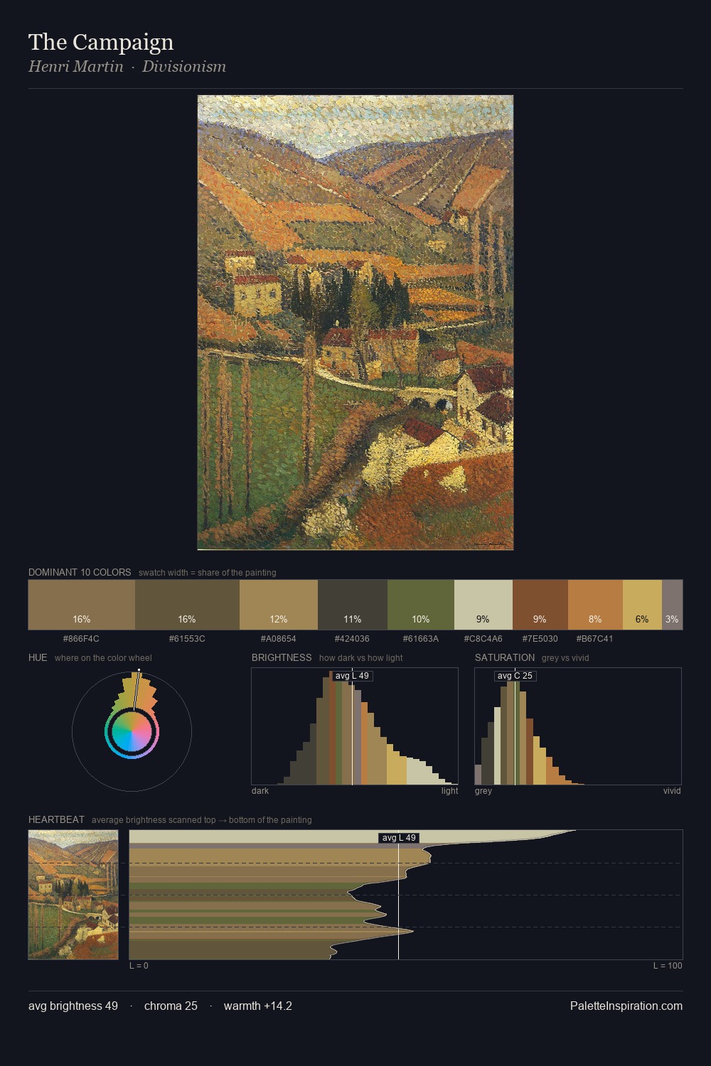
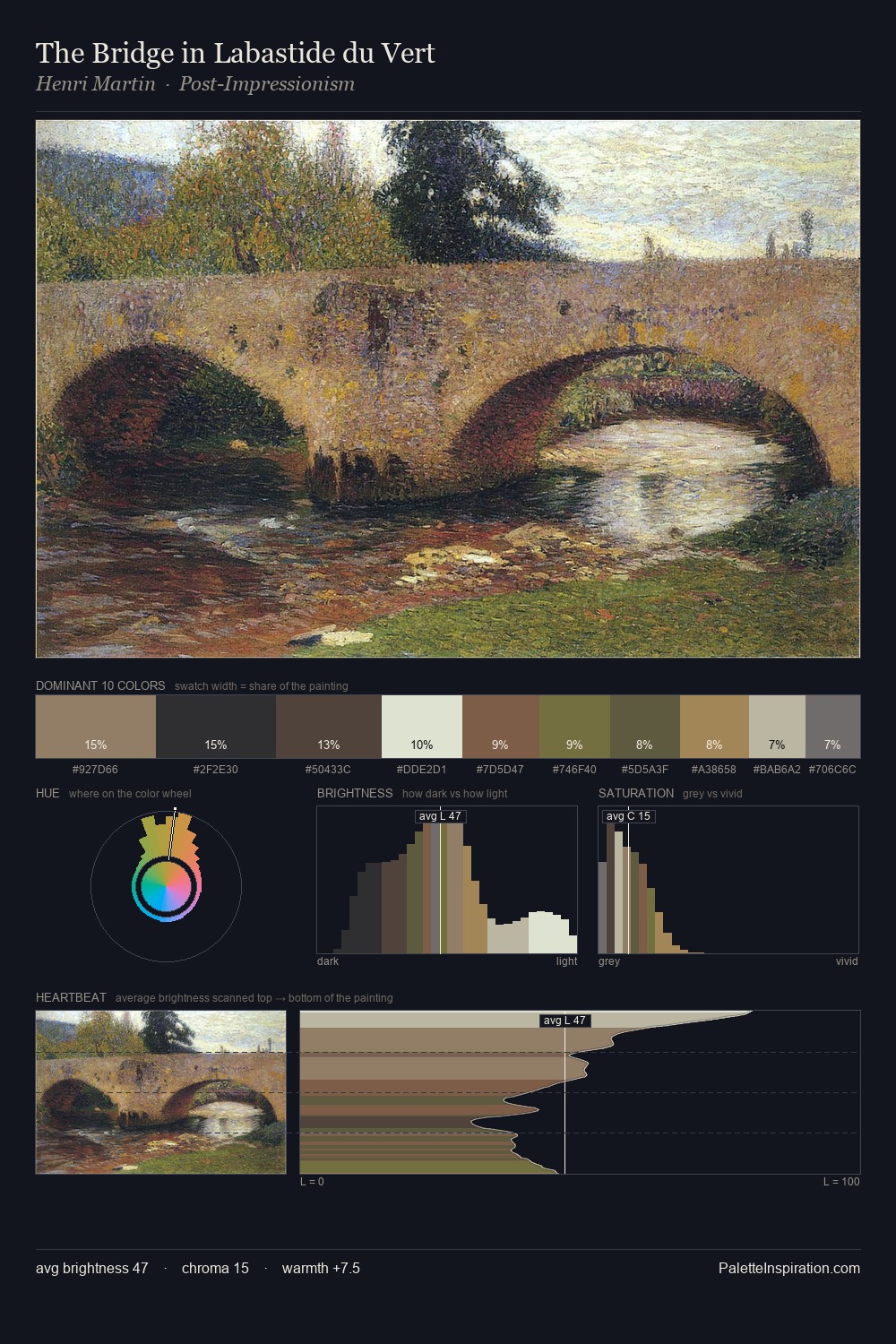
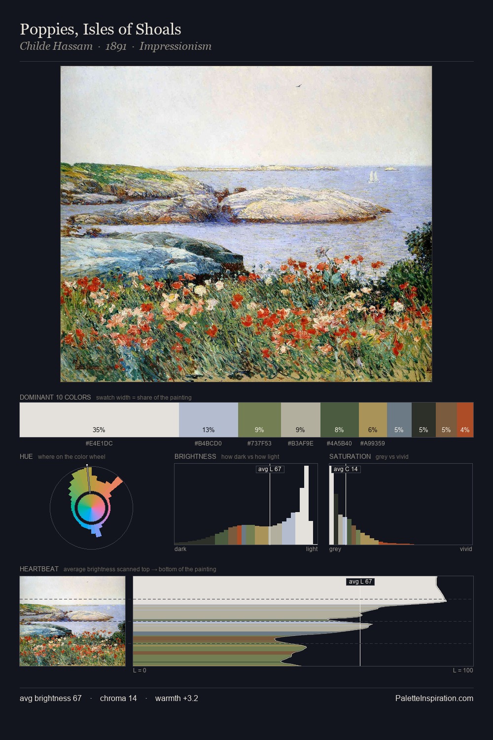
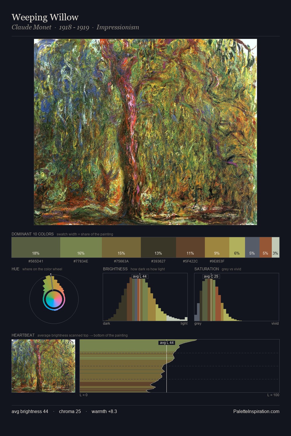
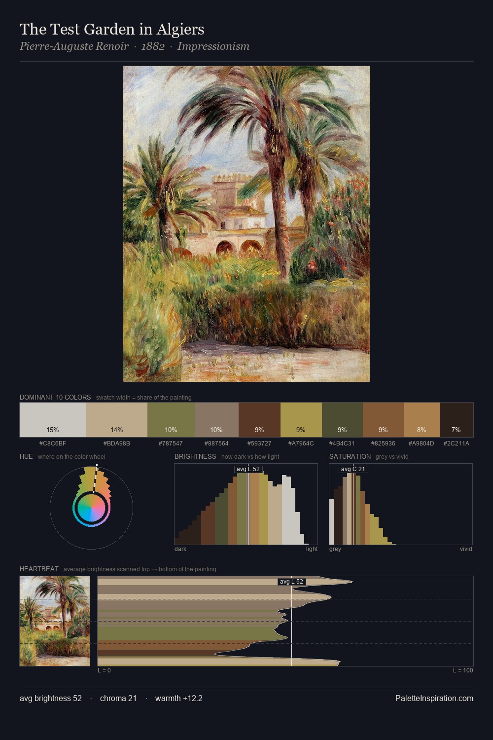
John Frederick Lewis Palette 7

Palette Analysis
John Frederick Lewis is strongly light-biased - shadow is suggested rather than declared. Blues and teal-greys govern the palette, lending it an aquatic or atmospheric quality. Chroma is kept low across all colours, producing the soft, enveloping quality that characterises tonal painting. #D5DFD3 claims 35.8% of the surface, functioning as the work's tonal foundation. At 4.7%, #AE8752 carries the palette's sharpest chromatic charge: an accent that earns its place precisely because it is withheld. 58 units of value range underpin the palette's structural clarity: the eye always knows where light falls. High luminosity and cool temperature suggest the plein-air condition: unfiltered daylight and open sky. This is palette 7 of John Frederick Lewis's sequence - a single chapter in a chromatic story told across many works.
Example use cases
- archival print
- university identity
- rare books
- cultural institutions
- nonprofit identity
I Love This!
Copy, export, or download for your project