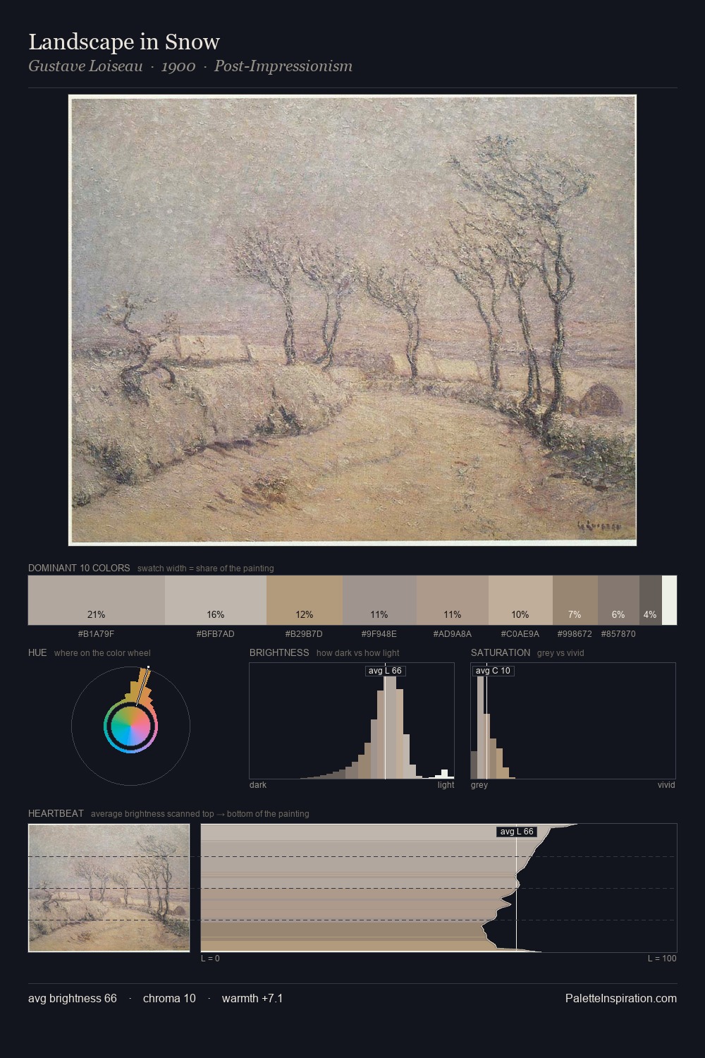
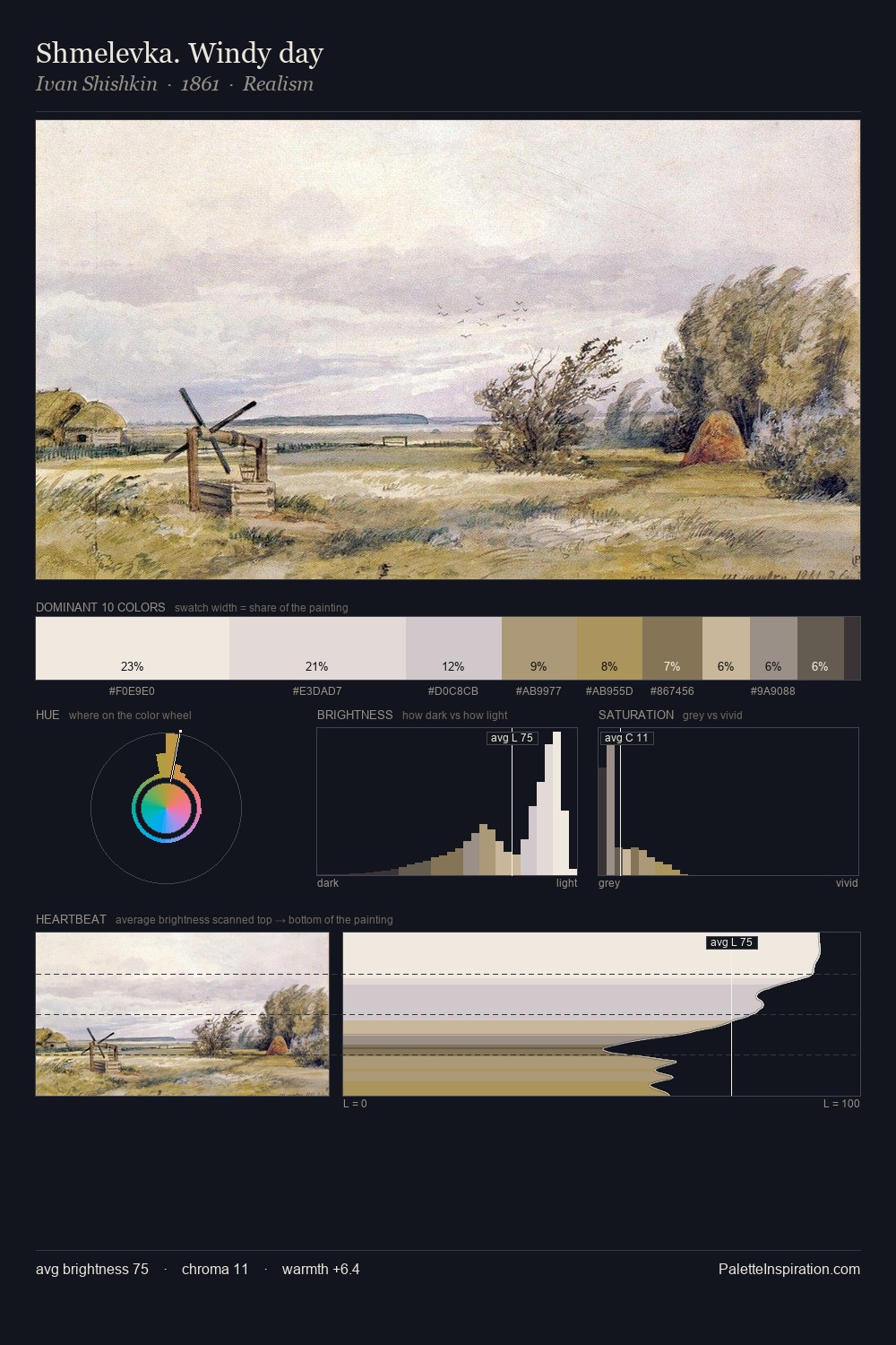
John Frederick Lewis Palette 1

Palette Analysis
John Frederick Lewis works in the upper reaches of the value scale, creating an atmosphere of brightness and expansiveness. Warm hues command this palette; John Frederick Lewis favours the reds, oranges, and yellows of firelight and earth. Saturation is deliberately withheld - the beauty here lies in the near-monochromatic gradations rather than colour difference. #FDFCFB claims 49.6% of the surface, functioning as the work's tonal foundation. Only 2.2% is devoted to #AD9276, yet that small allocation delivers the palette's entire chromatic tension. A value spread of 59 units gives the palette both depth and air - shadows are genuinely dark, lights genuinely light. Palette 1 sits within the larger chromatic argument that John Frederick Lewis's complete body of work advances.
Example use cases
- food packaging
- leather accessories
- travel & outdoor
- natural cosmetics
- interior design
I Love This!
Copy, export, or download for your project